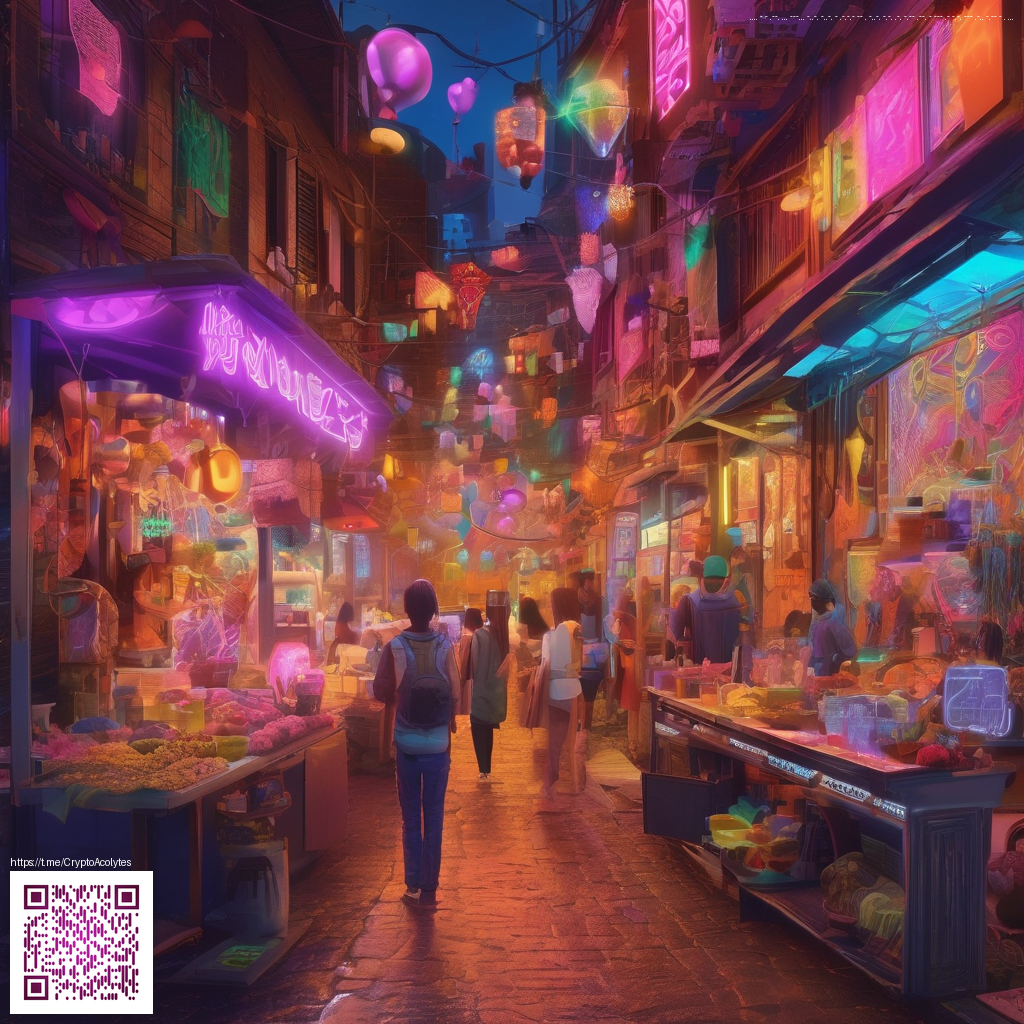
Depth and Layering: Techniques to Elevate Digital Scrapbooks
When you’re crafting digital scrapbooks, depth isn’t about adding more pieces of content. It’s about creating a convincing space on a flat canvas where elements interact and guide the viewer’s eye. The most compelling pages use deliberate layering, tactile textures, and thoughtful light-and-shadow cues to mimic the feel of real-world scrapbooks. The goal is to invite a closer look and reward careful observation with a sense of immersion.
Layering fundamentals: stacking with intention
Start with a solid base, then think in terms of foreground, middle ground, and background. A common approach is to place a subtle background texture or photo wash, followed by mid-tone elements like journaling strips or decorative stickers, and finally a few high-contrast foreground pieces that draw attention. The key is to control opacity and blending so that each layer communicates without overpowering the others.
- Use translucent layers (low opacity) to let the underlying content breathe.
- Encourage movement with gentle overlaps and staggered edges that imply depth.
- Group related elements to keep the composition cohesive and easy to adjust.
Depth is not about quantity. It’s about how you arrange rhythm, space, and texture so the viewer’s eye flows naturally across the page.
Texture tricks: tactile cues in a digital medium
Texture is your best friend for conveying depth. Incorporate paper grain, fabric weaves, or subtle grunge textures to simulate a tangible surface. Digital textures work well when layered with soft light or overlay blending modes to add character without muddying colors. A delicate speckle or vellum-like veil in the upper layers can create the sense of physical material while preserving readability of text blocks.
- Experiment with scanned textures or high-resolution brushes to add irregularities that feel real.
- Balance texture density: heavier textures in the background and lighter textures in the foreground.
- Keep textures subtle enough to avoid competition with focal imagery.
Texture should enhance, not overwhelm. A well-textured page whispers its depth rather than shouting for attention.
Shadows, light, and the art of subtle contrast
Shadows anchor elements in space. Soft drops shadows beneath layered pieces create separation, while highlights on raised edges suggest light catching on a curved surface. In digital scrapbooking, you don’t need photorealistic lighting to imply depth—you just need convincing cues. Use gentle directional lighting cues and consistent shadow angles to maintain coherence across the composition.
- Cast shadows on offset layers to suggest distance from the plane.
- Apply inner shadows to give depth to buttons, ribbons, or tags.
- Use a slightly cool tone for backgrounds and warm tones for foregrounds to enhance depth perception.
Color and contrast as depth cues
Color temperature and contrast are powerful depth signals. Cooler hues tend to recede, while warmer tones advance toward the viewer. A restrained palette, paired with selective saturation, helps the eye distinguish planes without introducing visual chaos. In practice, you can push depth by placing a saturated accent element on the foreground and allowing more desaturated tones in the back.
Depth is a dialogue between color, texture, and light. When these elements talk in harmony, the page feels alive.
Workflow tips for efficient depth-building
Adopt a repeatable process so depth becomes a natural outcome rather than a conscious effort on every page:
- Start with a foundational grid or guideline to align layers consistently.
- Build in passes: base composition, texture pass, shadow pass, and highlight pass.
- Use clipping masks and layer folders to experiment without losing the original content.
As you experiment, consider physical comfort during long creative sessions. A comfortable setup supports deeper focus and steadier hands, which translates into more thoughtful layering decisions. For example, a product like the Ergonomic Memory Foam Wrist Rest Mouse Pad can help reduce fatigue, keeping you in a flow state longer as you finesse textures and shadows. If you want to explore more on how to structure your workspace for creativity, this in-depth guide offers actionable tips you can apply to your own projects.
When you’re ready to put these ideas into practice, start with a simple three-layer setup and layer gradually. With patience, your digital scrapbooks can achieve a tangible sense of depth that invites viewers to linger and explore every careful detail.