Image courtesy of Scryfall.com
Art Direction in Humorous MTG Cards
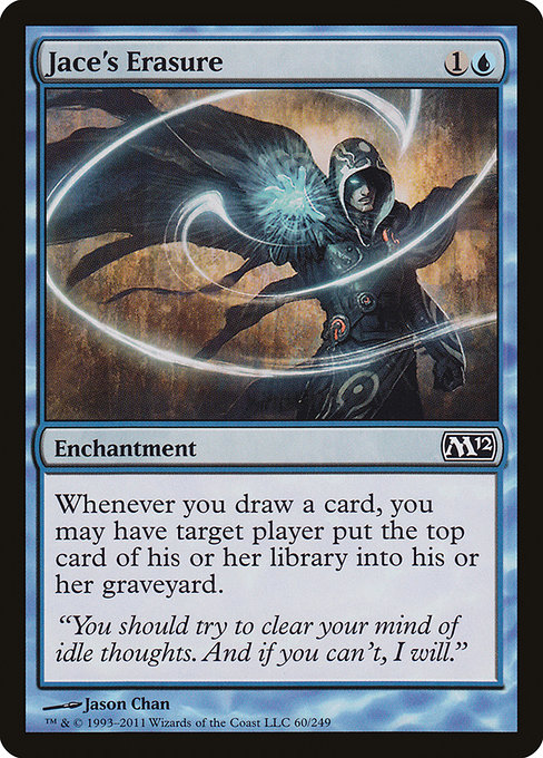
When we talk about humor in Magic: The Gathering, it’s often the flavor text that crackles with wit or the playful symmetry between mechanics and art. Yet the true magic happens when art direction quietly underpins the joke, guiding your eye and your mood before you ever read an ability. Jace's Erasure, a blue common from Magic 2012 (M12), is a perfect illustration of how humor can be woven into the visual language of a card, long before the mill trick becomes a strategic consideration on the table 🧙♂️. The moment you glimpse the illustration by Jason Chan, you sense a calm, cool blue that promises intellect, misdirection, and a wink. It’s humor that feels earned, not forced, and that’s the core of successful art direction in funny MTG cards 🔵🎨.
Set against the cool constellations of blue mana, Jace's Erasure uses a restrained composition that foregrounds intellect over brute force. The card’s frame and color identity quicken the mind’s eye—blue is all about information, timing, and subtle power plays—and the art reinforces that mood. The humorous edge isn’t in a flashy explosion; it’s in the quiet suggestion that erasing someone else’s draw or forcing a mill isn't merely a win condition, it’s a sly commentary on the meta-game of reading minds and counting cards. This is humor-as-structure: a joke built into a design that rewards players who notice the craft behind the surface gag 🧠💎.
Design Cues: Color, Composition, and Humor
- Color identity: The blue palette signals intellect, control, and tempo—perfect for a mill-enchantment that interacts with every card draw. The hue choices feel deliberate: cool teals and deep blues create a mood of calm omniscience, even when a player is about to mill someone else’s deck. 🧙♂️
- Typography and space: In the M12 era, the card shows clean type and elegant margins that leave space for the artistry to breathe. The humor lands in the contrast between the surface calm and the “mill” mechanic’s sharper undercurrent, inviting a double-take as you read the ability. The spacing helps you savor the joke without feeling slapped by the text.
- Iconography and novelty: The mill mechanic is a familiar blue trick, but the art often softens the edge with playful expression or a hint of cognitive mischief. Jason Chan’s brushwork leans into that mischief—artfully ambiguous, never cartoonish—so the humor lands as friendly, not frantic. 🎭
- Narrative through a single moment: The image captures a moment of quiet power rather than a dramatic spell effect. This restraint is central to humor in card art: a wink that invites interpretation rather than a loud proclamation. It’s the difference between a joke you tell and a joke that sits in the room, waiting for the punchline to reveal itself. ⚡
Flavor Text and Narrative Voice
The flavor text on Jace's Erasure—“You should try to clear your mind of idle thoughts. And if you can't, I will.”—reads like a mentor’s dry aside, a line that would feel right at home in a witty blue spell. That voice anchors the humor in the card’s world, letting art do the heavy lifting while the words deliver the tease. The art direction supports this voice by presenting a calm, confident Jace-adjacent aura, rather than a chaotic or chaoticly humorous scene. The result is a card that reads well on the table and in the lore, where even a mill effect can feel like a polite nod to the strategist’s mindset 🧩🔥.
“Humor in art isn’t about pandering; it’s about sharpening the mind’s eye—a little wink that says, We’re all here for the game, and we’re here to have fun.”
From a collector’s lens, the common rarity of Jace's Erasure in Magic 2012 doesn’t mean it skimps on charm. The foil version, though pricier, captures the same mood with a gloss that makes the blue color pop, elevating the humorous concept to a collectible moment that resonates with players who love both the strategic depth of mill and the joy of clever art. The card’s ability—“Whenever you draw a card, you may have target player mill a card”—plays into a broader theme of control and timing that blue players savor, and the art direction makes that savoring feel like a shared joke with the card’s story and its audience 🎲💎.
Art Direction and the Life of a Card
Humor in card art isn’t a one-and-done trick. It’s a living conversation between illustration, flavor, and playstyle. Jace's Erasure demonstrates how a single image can support a narrative about memory, mind, and the sly manipulation of draws, all while remaining accessible to players who are picking up blue for the first time. The art’s quiet confidence invites players to lean into the tactical joy of milling, while the humor makes the practice feel shareable rather than sterile. This balance—clarity, charm, and a hint of mischief—defines how art direction can elevate a humorous card from “neat” to “iconic” 🧙♂️⚔️.
For fans who chase the aesthetic story behind a deck, the look of a blue common like Jace's Erasure becomes a touchstone. It’s the kind of piece that you might recall when you shuffle, predictably unfolding in your mind as you count cards and weigh tempo against inevitability. The art direction doesn’t shout; it serenades you with a cool whisper, a reminder that magic—and humor—are best enjoyed with a well-calibrated sense of style 🎨💧.
As a small bit of cross-promotion that still fits the mood, those who adore the cool, modern vibe of Jace’s Erasure and its blue flair may appreciate pairing their collection with aesthetically tuned accessories that echo that aesthetic. If you’re chasing a design-forward look for your everyday carry, consider the Neon Slim Phone Case for iPhone 16 with its glossy Lexan finish—the kind of sleek, luminous accessory that mirrors the crisp lines and quiet confidence of a well-articulated blue card. A little shine goes a long way when your deck’s mood is pure blue steel 🔷💡.