Image courtesy of Scryfall.com
Art and Identity: Blood Celebrant in Legions' Grim Visual Language
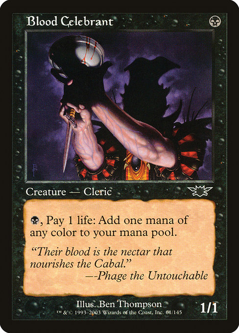
When the Legions block rolled onto the scene, fans recognized a shift toward a ritualistic, ominous vibe—a world where power is negotiated in candlelight and blood is a resource as real as mana. Blood Celebrant sits at the heart of that mood. The 1997-era frame, with its stark borders and restrained typography, makes the card feel like an artifact from a shadowed cabal—a perfect anchor for the set’s aesthetic. Ben Thompson’s illustration places a cloaked figure at the center, the figure’s posture and gaze deliberately measured, almost ceremonial, as if the moment is less about combat and more about a vow being sworn to the Cabal. 🧙🔥
The artwork’s contrast is what sells Legions’ grim identity: deep blacks, pale bone whites, and a few crimson highlights that glow like sigils under torchlight. It’s not a moment of panic or fury; it’s a quiet ritual, a moment of intention before action. This restraint is precisely what makes the set memorable: each card is steeped in a mood that feels cohesive—where even a simple creature card can carry the weight of a faction’s secret history. The visual language is enough to spark a narrative in players’ minds before the first line of flavor text is read, and that narrative thread threads through the entire Legions block. 🎨
Design, Mechanics, and Thematic Harmony
Blood Celebrant isn’t merely atmospheric; its mechanics echo Legions’ thematic backbone. With a mana cost of {B}, the card arrives as a one-drop that can become more than it seems via a single life payment: "{B}, Pay 1 life: Add one mana of any color." That ability is quintessentially black in its elegance: small, efficient, and capable of enabling powerful plays if you’ve navigated the life-total cost wisely. In a world where color fixing can feel expensive, a tiny creature that acts as a flexible mana spigot greenlights splashy multicolor strategies without bending the mana base too aggressively. It’s a design that rewards careful budgeting and a willingness to lean into risk for payoff. ⚔️💎
From a practical standpoint, Blood Celebrant shines in decks that can leverage life as a resource without overexposing themselves to the consequences. It’s a natural fit for midrange or combo-oriented black decks that want to reach a critical mass of colors quickly, or for five-color shards that need a reliable way to access any color at the moment a crucial spell lands. The card’s design is a study in tasteful efficiency: a small body, a potent, color-flexible ability, and a flavor-driven reason to embrace life as fuel for power. It’s the kind of card that many players reach for when they want a dash of inevitability without sacrificing tempo. 🎲
Flavor, Lore, and the Visual Narrative
“Their blood is the nectar that nourishes the Cabal.” — Phage the Untouchable
The flavor text anchors Blood Celebrant in a lore universe where power is literally sustained by blood and ritual. The Cabal’s image—secretive, patient, and calculating—runs parallel to the card’s own playstyle: a dependable source of mana that becomes more flexible as the game unfolds. The art’s ceremonial vibe—robes, sigils, and torchlight—complements the flavor text by suggesting that every use of this creature is a small rite, a step in a longer, more dangerous choreography of magic and manipulation. This synergy between flavor and function helps Legions’ world feel tangible: you’re not playing in a generic fantasy space, you’re stepping into a living, breathing cabal’s hall where even a single mana tap might tilt the balance of power. 🕯️🖤
From a collectible standpoint, Blood Celebrant sits in the common slot, but its foil version—like many Legions cards—carries a particular sheen that captures the set’s dramatic mood. The artwork’s impact remains a talking point for collectors who prize cohesive visual storytelling across a block, and the card’s mechanical flexibility adds to its lasting appeal in casual and cube environments alike. The synergy of art, lore, and practical use makes it a standout example of how Legions choreographed its grim visual identity across multiple card types. 🎨💎
Visual Identity Across Legions: A Cohesive Grim Aesthetic
Legions established a cohesive, somber aesthetic that leaned into the Cabal as a central faction—ritual stones, sigils etched in stone, and a color palette that paired inky black with stark crimson accents. Blood Celebrant encapsulates that mood in a single frame: a creature that looks ready to perform a rite, a body language that communicates both devotion and calculation, and an aura that feels ancient and powerful at once. The card’s border treatment, typography, and general vibe echo across the set, turning each legal play into a small narrative beat within a larger, spectral drama. It’s a visual language that invites players to tell stories as they play, and that’s part of what keeps Legions in the conversation among long-time fans. ⚔️🧭
For players who love the tactile and the thematic, Blood Celebrant remains a favorite example of how a simple creature can carry a “world-building” mandate in addition to practical gameplay. Its presence is a reminder of how a well-crafted art direction can elevate a card from “good” to “memorable”—a small piece of a much larger puzzle that is MTG’s multiverse. 🧙♀️🎲