Visual Composition and Art Direction in Book Devourer
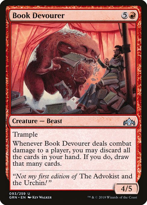
Image courtesy of Scryfall.com
For MTG fans who love a card that feels like a cinematic moment as soon as it lands, the artwork on Book Devourer delivers a masterclass in visual storytelling. Painted by Kev Walker for Guilds of Ravnica, this red-beast encounter uses a disciplined balance of scale, color, and motion to translate a spicy tribal flavor into a single, unforgettable image. The creature’s hulking form dominates the frame, yet the composition never loses sight of the library’s urgent detail: crumpled book pages, glowing runes, and embers that hint at a mana-fueled appetite. It’s a reminder that in Magic, art direction isn’t just about pretty shapes—it’s about crafting a moment that invites a story to unfold in your head 🧙🔥💎.
Setting the Scene: Guilds of Ravnica and the red appetite ⚔️
Book Devourer lives in Guilds of Ravnica, a set built on the interwoven intrigues of the city-plane’s five guilds. In red, you typically expect ferocity, speed, and a taste for the dramatic—traits that Book Devourer embraces with gusto. The juxtaposition of a scholarly environment (a library) with a voracious predator suggests a clash between knowledge and appetite, a theme red often leans into when it veers toward chaotic, high-impact effects. The artwork uses a warm, sunburst palette—crimson, burnt orange, and touches of gold—to push the creature forward as the focal point, while the surrounding environment blazes with a combustible energy. It’s a visual argument that knowledge can be destructive in the right circumstances, and that power often arrives wearing a set of razor-sharp teeth 🧙🔥🎨.
Composition as Conversation: The artful balance of chaos and control
Walker’s composition leans into a dynamic diagonal axis that drives the eye from the beast’s maw to the library’s perilous shelves. The creature’s mass anchors the left side of the frame, creating an implicit triangle with the jagged shelves and the curling pages on the right. This triangular tension is a time-honored trick in visual design: it guides the viewer’s gaze in a controlled arc, ensuring you notice both the threat and the setting without getting overwhelmed. The background’s softer glow contrasts with the beast’s dark silhouette, allowing the creature to feel simultaneously grounded in the scene and larger-than-life—a classic “hero moment” you want to build a deck around 🧙♀️⚔️.
The choice to render the shelves and books in motion—scattered pages, overturned tomes, and curling bindings—lends the piece a kinetic pulse. It’s not merely a static monster; it’s a force of consequence sweeping through a domain that once housed quiet study and ritual knowledge. That visual storytelling nods to the card’s flavor as well: a creature that converts confrontation into a cascade of choices—the moment you deal damage becomes a leap into hand management and card draw. The art makes the rules feel inevitable, and that is the essence of good card design in playability and in ornamental storytelling 🎲🧠.
Art Direction: Kev Walker’s signature touch and the red-beast vibe 🎨
Kev Walker’s illustration for this card captures a bold, almost Baron Munchausen-like grandeur—an oversized creature with an almost mythic appetite. The lines are crisp, the lighting deliberate, and the creature’s posture reads as a predatory sprint frozen in a moment of savage triumph. Walker’s red palette isn’t merely color; it’s atmosphere. The heat, the glow, and the charring on the edges of the books read as mana-tinged aura—the visual shorthand for a red spellscape where risk and reward are never far apart. The art direction turns the mechanical text into a sensory event: the moment the beast tastes knowledge, the frame suggests a cascade of decisions and consequences that players will feel when they draw into their next hand 🧙🔥.
Gameplay Pulse: The card’s mechanical poetry in red tempo
Beyond the visual spectacle, the card’s text crystallizes a dramatic beat: “Trample. Whenever this creature deals combat damage to a player, you may discard all the cards in your hand. If you do, draw that many cards.” That sentence is a mouthful of potential and peril, perfectly suited to red’s penchant for explosive card advantage. The art hints at this risk-reward dynamic—sight of a library being savaged foreshadows the gamble you take when you swing into an opponent. In practical terms, Book Devourer asks you to embrace bold sequencing: you build toward a meaningful hit, possibly throwing your hand away to refill the grip with fresh options. Your deck choice, thus, should lean into acceleration and card-selection to maximize the payoff when the trigger resolves. It’s not just a creature; it’s a mini-archetype in a six-mana body, offering a taste of big-turn upside that red decks crave ⚔️🧙♂️.
In practice, this means pairing Book Devourer with ways to quickly discover and deploy critical answers, or with payoffs that reward discarding—things that make you comfortable with a shorter-term hand but a longer-term gain. Cards that help you fuel the discard-for-draw engine or that provide card-advantage engines when you’ve whittled down your grip become strong companions. The result is a midrange or control-friendly red shell that can sprint into a late-game draw advantage while still presenting a threatening, trampling body on the battlefield. The image reinforces that sense of dual path—attack now, or risk a bigger payoff later with a reloaded hand ⚡🎯.
Flavor, Lore, and Collectibility: A richer context for the art
The flavor text—“Not my first edition of The Advokist and the Urchin!”—sprinkles a bit of Ravnican whimsy into the otherwise feral tableau. It nods to the nuts-and-bolts culture of the city’s bibliophilic lore and the evergreen joke about readers chasing rare editions amid calamitous chaos. Collectors appreciate the card’s foil options and rarity—uncommon, with foil and nonfoil finishes—because the artwork holds up beautifully in both print and foil. From a lore perspective, the art and text together create a micro-myth: a creature so hungry for knowledge that it treats the act of reading as a combat transaction, trading a hand for a skyline of new possibilities. In EDH and other formats, that thematic resonance makes it a memorable, conversation-sparking piece—one you’ll still be describing at the kitchen table after a long night of drafting 🧩💎.
Closing Notes for Visual Ethos and Collection Strategy
Book Devourer stands as a striking case study in how MTG art direction can fuse thematic storytelling with practical, mechanical design. The creature’s red, trampling momentum is mirrored in the dynamic composition, the warm theatrical lighting, and the library’s chaotic coda. If you’re collecting or studying artwork, this piece is a reminder that great card art pushes you to think in narrative frames: what just happened, what could happen next, and how the image and rules interact to create a compelling play experience. And if you’re keen to explore more, the cross-promotional product weaved into this feature invites you to explore practical, real-world design and display items that echo the same spirit of bold, tactile engagement that MTG art delivers in every draft, sealed, and commander night 🧙♂️🎨.
If you’re curious to dive deeper into the collector’s side of things, check the card’s marketplace listings and the EDHREC pages that track its relevance in various commander configurations. The synergy of art, rules, and community is what keeps this universe alive and evolving—one card, one frame, onega at a time ⚔️🪄.