Image courtesy of Scryfall.com
Art as Identity: How Caltrops Helps Define Seventh Edition’s Visual Language
In the grand tapestry of Magic: The Gathering, a card’s artwork often does more than decorate a spell or an artifact. It whispers the set’s personality, its underlying themes, and the kind of strategic imagination the designers hoped to spark in players. Seventh Edition, a core-set pillar that arrived with a crisp, practical ethos, used its art to anchor a particular sense of playability and iteration. Within that visual ecosystem, Caltrops stands out as a vivid lens into how the set balanced robust mechanics with a feel of tangible, engineered danger. 🧙🔥💎
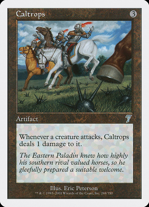
The piece by Eric Peterson is quintessentially Seventh Edition in its approach: clean lines, a focus on form, and a metallic sheen that reads as both weapon and tool. The image’s subject—a compact artifact—reads as a parable of the set’s larger design language: artifacts are not mere junk in the toolbox; they are deliberate, engineered elements whose presence can shift how combat resolves on the battlefield. The stark contrast between the gleaming metal and the darker backdrop mirrors a broader aesthetic in Seventh Edition where clarity and readability took precedence, ensuring players could quickly parse a card’s function even in a fast-paced match. ⚔️🎨
How the Set’s Visual Identity is Woven into Caltrops
Seventh Edition was designed to be approachable for new players while still satisfying veteran collectors who valued a clean, confident look and a dependable rule set. The artifact’s art embodies that dual mission. The device in the image suggests something practical, almost industrial: a tool with a specific job, not a fantastical contraption with hidden gears and impossible magic. This grounded representation aligns with the set’s broader visual identity, which favored legible silhouettes and a restrained color palette that communicates function before flavor. The absence of bright, flashy hues reinforces the sense that Seventh Edition’s artifacts are enduring fixtures—reliable, repeatable, and deeply integrated into the fabric of the rules. 🧭
The frame and border cues also matter here. Seventh Edition cards from this period often carry a 1997-style frame with a white border, a design choice that delivers a crisp, modern look while nodding to the game’s long-standing heritage. Caltrops, as an uncommon artifact, sits confidently within that framework: unassuming in mana cost ({3}), colorless in identity, but vivid in its consequence. The card’s ability—“Whenever a creature attacks, this artifact deals 1 damage to it.”—uses a clean, mechanical effect that the visual identity can reinforce: a set that prizes clarity on both text and art. The image’s metallic luster and the artifact’s compact silhouette serve as a visual shorthand for the card’s proactive defense—how a single artifact can influence the tempo of combat. 🔧🧙♀️
Flavor Text and Mythic Silence: The Narrative Layer
“The Eastern Paladin knew how highly his southern rival valued horses, so he gleefully prepared a suitable welcome.”
Flavor text in Seventh Edition often plays with historical or martial motifs, grounding mechanical concepts in a playful, almost historical texture. Here, the line evokes a frontier sense of strategy—calibrated traps, careful positioning, and a willingness to use the terrain against an opponent’s momentum. While the art communicates a state of readiness—the trap ready to bite when the enemy charges—the flavor text adds a narrative layer that makes the set feel lived-in. The visual and textual cues together emphasize that this is an era where artifacts aren’t mere “cards”; they are instruments within a larger theatre of conflict, capable of turning the tide of a duel as attackers ride into their own momentum. 🗡️🎲
The Intersection of Mechanics and Aesthetics
In gameplay terms, Caltrops is a straightforward creature-control instrument embedded in a colorless identity. For players, the card’s presence signals a philosophy: you don’t need flashy color to create tension; you need a concept that makes people pause mid-attack. The art’s emphasis on edges and a compact silhouette mirrors the card’s mechanical bite—an extra 1 damage to attackers creates a predictable risk in combat, which can shape how an opponent chooses to engage. This visual-aesthetic-to-mechanics linkage is a hallmark of Seventh Edition’s design philosophy, where artistry supports strategic clarity. The look of the artifact reinforces the message: sometimes the most effective defense is a well-placed trap, not a grand spell. 🧨💎
The Collectible Ethos: Visual Identity Across the Set
Seventh Edition was a bridge between older, more ornate frame styles and a newer era of streamlined card art. Caltrops embodies that bridge—an artifact with a no-nonsense silhouette, a neutral mana cost, and a flavor-rich backstory that invites players to imagine a battlefield where every piece has a purpose. For collectors, the card’s position as an uncommon artifact from a pivotal core set makes it a reminder of how even the smallest piece of art can hold wider significance in a given block or set history. The image itself, with its high-res scan and clear details, reflects the era’s commitment to accessible, informative art that remains legible at common play sizes. And yes, the collectible market agrees: the nails-and-metal aesthetic has enduring appeal among players who value the tactile feel of classic artifacts as much as the victory dance after a well-timed spike. ⚔️💡
For fans who want to steep themselves in the set’s look while also sharpening their desk setup, a little real-world homage can go a long way. If you’re crafting a play space that channels Seventh Edition’s practical glamor, consider premium accessories that echo that era’s vibe—like a sleek, sturdy mouse pad that stays faithful to color and texture under your cards. And if you’re balancing display with function, you’ll be glad to know there’s a product that complements that aesthetic without stealing focus from your board state.