Image courtesy of PokeAPI (official artwork)
Color psychology in Doublade's steel-ghost design
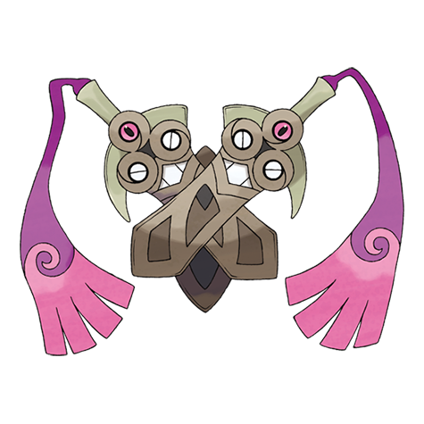
Pokémon design often uses color as a visual shorthand for a creature’s temperament and role in battles. Doublade, a dual Steel/Ghost Pokémon, embodies this idea with a deliberately cool, calculated palette. The blades gleam with metallic blue-silver tones, while the surrounding aura—hinted at by subtle shading and edge glow—leans into a ghostly, otherworldly vibe. This combination communicates not just a weapon, but a sentinel: precise, unyielding, and slightly enigmatic. ⚡🗡️✨
Looking at the base stats helps connect color to function. Doublade carries a robust Attack of 110 and a standout Defense of 150, paired with relatively modest HP (59) and speed (35). In essence, Doublade is designed to be sturdy and punishing up close, rather than flashy or fast. The steel component reinforces a sense of engineered durability—the kind of design that looks born from cold metalwork—while the ghost element hints at an unseen, almost spectral resilience that survives beyond the obvious. The color language mirrors this dual purpose: the steel-blue sheen signals reliability and precision, while ghostly accents suggest something beyond the visible, ready to surprise opponents. 🔷🧊
What the palette conveys in practice
- Steel symbolism: The metallic tones evoke durability, structure, and discipline. In gameplay terms, Doublade’s high Defense (150) and solid Attack (110) align with a persona built to soak damage and deliver strong physical hits. The color palette reinforces the sense that Doublade is not a fragile or flashy attacker, but a well-balanced wall that can press the pin once it engages. 🪨
- Ghost symbolism: Ghostly hints—cool glow, translucent aura, or subtle purple-blue tints—signal something eerie and intangible. This aligns with its Ghost typing and the feeling that Doublade operates with a quiet, almost spectral certainty, striking when you least expect it. The contrast between hard steel and soft, spectral cues creates a memorable silhouette that reads well in the heat of battle. 👻
- Contrast and readability: The mix of bright blade highlights against darker hilts improves readability in the heat of combat, helping players quickly parse Doublade’s positioning and threat level. This design choice supports the player’s eye-tracking during fast exchanges. ✨
Color is not decoration; it’s a language. Doublade’s steel-ghost palette speaks of controlled power with a hint of mystery—precision grounded in the unseen. If you imagine it as a sentinel of an ancient armory, the colors reinforce its role: a calm, unwavering guardian that cuts through both physical and ethereal challenges.
Strategic takeaways from color and composition
Doublade’s design language suggests a few practical training and battle tips for players. The steel-ghost pairing implies a straightforward, punishing presence on the field, with a strong emphasis on staying power and physical damage. Here are some concrete, game-relevant ideas that align with the visual story:
- Bulky, mid-to-late-game approach: With high Defense and solid Attack, Doublade shines as a sturdy foe that can wear down opponents over time. Its color story reinforces a patient, methodical battle tempo—think “set up a wall and then strike with precision.” 🔩
- Watch the weaknesses reflected in the palette: Ghost types are immune to Normal and Fighting, and while Steel provides broad resistances, certain threats—like Dark moves that target Ghost—can pressure Doublade. Use teammates to cover those gaps, and lean into the visual cue of a steady, unflinching guardian. ⚔️
- Team storytelling through color: Pair Doublade with partners that complement its sturdy, extraction-focused role. Colors can guide intuition: bright, warm tones on teammates can signal offense, while cooler hues on Doublade echo resilience and endurance. This creates a balanced color narrative in your lineups. 🧊
Context of color in the broader design language
Doublade’s palette is a thoughtful example of how designers weave type identity into color. The Steel component anchors the creature in a world of craftsmanship—edges are clean, surfaces reflect light, and the silhouette reads as a weapon perfected for controlled, deliberate use. The Ghost component injects a reminder that not everything about Doublade is visible at first glance; there’s a lingering, otherworldly dimension to its presence. When combined, these signals invite players to respect Doublade as a dual-natured threat: formidable in the moment, and potentially unpredictable because some aspects of its power feel beyond the ordinary. 🌊
Final reflections
Color is a powerful shorthand in Pokémon design, and Doublade demonstrates how steel-blue polish and ghostly glow can convey a multifaceted combat identity without a single explicit statement. It’s a reminder that great design can front-load strategy—players pick up on the implications of color cues and then translate them into in-battle decisions. Doublade’s sturdy profile, reinforced by its steel-ghost aesthetic, makes it a memorable presence whether you’re building a story-driven team or chasing that perfect, enduring wall with surprising offense. 🛡️⚡