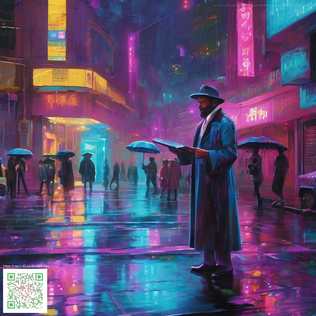
Designing cohesive aesthetic wallpaper packs for mobile devices
In a world where our phones are as personal as our fingerprints, the wallpaper you choose acts as a daily mood board. Creating cohesive wallpaper packs means more than pairing a few pretty gradients. It means curating a steady visual narrative that feels intentional across homescreens, lock screens, and multi-device setups. The goal is to deliver variety without chaos: distinct textures and motifs that share a common rhythm, color language, and balance so users can mix and match with confidence.
Establish a signature look that travels well
Start with a clear design anchor—this could be a core color palette, a recurring geometric motif, or a gentle texture. A cohesive pack uses a handful of consistent elements, not a random assortment of imagery. When you define a signature look, you’re giving users a sense of continuity as they swipe between screens. For mobile devices, simplicity often yields impact: clean lines, breathable spacing, and subtle depth keep home screens legible while still feeling premium. Think about how the same palette can appear in gradients, soft textures, and minimal patterns without becoming repetitive.
“Consistency in color and rhythm across wallpapers helps users feel at home with their screens, rather than overwhelmed.”
— Design Editor, Digital Vault
From palette to pack: a practical workflow
- Define the core palette. Choose 3–5 harmonious colors. Start with a dominant hue, then add 1–2 accents and a neutral grounding color to ensure versatility across light and dark modes.
- Develop a variation set. Create a series of backgrounds that share the palette—gradients, soft textures, and a few geometric patterns—to give users a sense of progression without sacrificing unity.
- Incorporate subtle overlays. Gentle grain, noise, or bloom can unify different designs and add depth without compromising readability of app icons and widgets.
- Test at key resolutions. Preview wallpapers at common mobile sizes and consider both notch/sensor areas and safe zones to keep important elements visible.
- Curate for light and dark modes. Ensure legibility and contrast so the pack feels equally polished on iOS and Android devices across themes.
Technical tips for a/mobile-friendly aesthetic
Mobile screens demand careful attention to composition. Favor vertical or square compositions that maximize usable space and avoid content that feels cramped. Use scalable vector patterns where possible and export high-resolution raster assets that hold up on larger devices while remaining lightweight for quick loading. A well-balanced wallpaper pack should feel tactile—like a curated art exhibit—yet practical enough for everyday use.
“A wallpaper pack isn’t just decoration; it’s a daily interface that influences focus, mood, and how users interact with their device.”
To illustrate the union of style and practicality, consider pairing your wallpaper packs with a physically reliable workspace accessory—for example, a high-quality mouse pad. If you’re exploring gear that complements a focused setup, the Gaming Mouse Pad 9x7 Custom Neoprene with Stitched Edges offers durable support and a sleek aesthetic that can mirror the tone of your themes. Learn more about the product.
As you package your wallpapers, document the design decisions behind each asset. A simple brief for each image—theme, color values, recommended device sizes, and a short usage note—helps maintain consistency when teams collaborate or when you expand the pack in the future. Clear documentation also makes it easier to adapt the same aesthetic to other formats, such as lock screen animations or animated wallpapers, should you choose to extend beyond static imagery.
Sharing and discovery: how to present your packs
When presenting wallpaper packs, storytelling matters. Use a short, compelling narrative that explains the mood, the intended devices, and the design ethics behind the palette. Include a few “before and after” examples showing how a home screen can evolve from a neutral setup to a cohesive aesthetic. Offer bundles—one core pack plus 2–3 complementary variations—to encourage users to download multiple assets at once rather than cherry-picking individual images.
Similar content
The broader collection from this topic can be explored here: https://100-vault.zero-static.xyz/1f6d61be.html