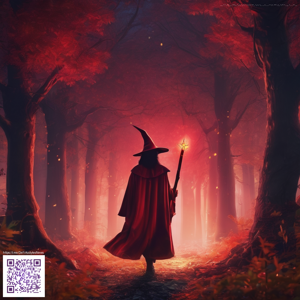
Crafting Vintage-Style Overlays: A Practical Guide
Vintage overlays have a quiet power. Instead of shouting at the viewer, they layer mood, history, and atmosphere onto modern imagery. The goal isn’t to antique every color or force a film look, but to invite storytelling through texture, grain, and controlled imperfections. In this guide, we’ll explore practical techniques to help you create overlays that feel intentional, cohesive, and unmistakably yours.
What makes a vintage overlay work
- Texture and grain: Subtle film grain or scanned paper texture adds depth without overpowering the subject. A gentle grain helps images read as tactile, not digital snapshots.
- Light leaks and vignetting: Soft leaks and a restrained vignette can frame a scene and evoke a nostalgic moment without distracting from the focal point.
- Color taming: Desaturation with selective warmth or cool shifts creates a period-appropriate mood while preserving skin tone and subject clarity.
- Scratches and dust: Tiny flecks and specks feel authentic when they’re sparse and communicate decades of exposure without stealing attention.
- Edge softness: Feathered edges help overlays blend with the image so the effect feels like a natural part of the capture, not a sticker.
Practical workflow for photographers
Start with a clean base image, then stack overlay layers in your preferred editing software. Use blending modes such as Screen, Soft Light, or Overlay to let the texture breathe. A common approach is to apply a grain layer at a low opacity—roughly 5–15%—and then add a subtle light-leak layer at 10–20% opacity. The key is restraint; vintage overlays should enhance tonality and storytelling, not overpower the subject.
“The magic isn’t in a heavy-handed texture, but in how it elevates mood and narrative.”
Experiment with opacity and masking. If you love a textured edge around the image, create a vignette mask and feather the edges so the subject remains the focal point. For landscapes, a touch more color shift toward amber can echo classic film stocks, while portraits may benefit from a cooler, desaturated inner tone to preserve facial features.
Color palettes that feel timeless
While there’s no one-size-fits-all palette, these timeless directions often work well:
- Warm-toned vintage: amber highlights, muted greens, creamy white balance.
- Cool-era homage: desaturated blues, soft magentas, gentle teal shadows.
- Monochrome with texture: grayscale with subtle film grain and a light burn edge.
When choosing overlays, consider how they interact with your subject. A cool light source in a portrait might benefit from a warm grain accent to convey mood, while a landscape can gain depth from a light-leak that nudges sky highlights toward creamy tones. If you’re curious about different applications, you can explore more perspectives on this topic by visiting the related page: https://rusty-articles.zero-static.xyz/6a918fbf.html.
To keep your editing workflow comfortable during long sessions, a reliable desk setup can make a difference. For example, this Neon Gaming Mouse Pad Non-Slip 9.5x8in Anti-Fray helps maintain precise cursor control and reduces desk movement while you dial contrast and texture. It’s a practical ally in the creative process, especially when you’re juggling multiple layers and color passes. You can learn more about this product here: https://shopify.digital-vault.xyz/products/neon-gaming-mouse-pad-non-slip-9-5x8in-anti-fray.
Ultimately, vintage overlays are about intention. They tell a story, shape atmosphere, and guide the viewer’s eye. With practice, you’ll learn to recognize when a texture adds depth and when it distracts from the moment you captured. The most successful overlays feel like a natural extension of your photography rather than a gimmick you add after the fact.
If you’d like to see how others are applying overlays across genres—portraits, architecture, or product photography—keep experimenting and refining your approach. Small, thoughtful adjustments can elevate a shot from polished to evocative.