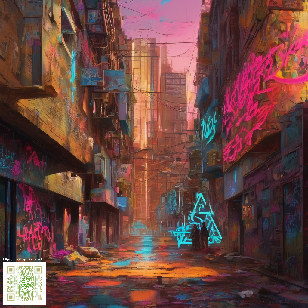
Designing Paper with Depth for Motion Posters
Motion posters exist at the intersection of print and motion, where a single still image hints at movement through clever layering, texture, and light. Creating depth in paper is not merely about stacking elements; it’s about orchestrating how the viewer’s eye travels across the surface. When you design with depth in mind, you invite the audience to lean in, tilt their head, and explore every fold, cut, and shade as if the poster itself were in motion.
Why depth matters in motion-focused print
Depth gives a poster narrative an immediacy that flat designs struggle to achieve. By introducing multiple planes—foreground elements that pop, mid-ground details that recede, and subtle shadows or translucencies—you create a sense of three-dimensionality. This technique is especially powerful for posters that promote experiential campaigns, product launches, or events where the storytelling relies on perceived motion rather than actual animation.
Depth in paper is a tactile invite—readers don’t just see the idea, they feel the layers work together to tell it.
To translate motion into static form, think in layers and light. A crisp foreground element can guide the viewer’s gaze, while delicate mid-ground impressions suggest movement. The carefully selected paper stocks, folds, and finishes can simulate speed, bounce, or gravity without a single moving component. As you plan, keep in mind production realities—weight, durability, and finish options—all of which shape how depth translates from concept to print.
Techniques to achieve depth on the page
- Layered stock and offset panels: Build a multi-tiered structure by mounting cutouts on foam or foam-board spacers. This creates visible separation between planes, which reads as motion when viewed from different angles.
- Die-cut silhouettes and negative space: Strategic cuts reveal underlying layers or background textures, producing a sense of movement as light plays through the openings.
- Textured finishes and subtle contrasts: Combine matte with spot-gloss, or use a tactile stock to make certain elements recede while others advance.
- Translucent overlays: Sheer papers or vellum can float above solid layers, suggesting velocity or shimmer as light travels through.
- Accordion folds and pop-outs: Dynamic folds encourage a viewer to engage physically, bending the poster into a momentary 3D scene.
- Color depth without clutter: Use a restrained palette with one accent hue to push a foreground element forward while keeping the rest calm.
In practice, you can experiment with small maquettes to test how depth behaves under different lighting and viewing angles. A hands-on approach often reveals how a tiny adjustment—like a slightly taller spacer or a thinner translucent layer—can dramatically alter the perceived motion. For designers exploring hardware-inspired concepts, a quick analogy can be found in the physical packaging of tech items: even a compact product benefits from layered storytelling to communicate features at a glance.
As you refine your process, you might explore references such as the product page for a compact device like the 90-Second UV Phone Sanitizer with Wireless Charging Pad. It demonstrates how depth cues in packaging and presentation help convey function in a concise, tactile way. For readers seeking a broader discussion about depth in design, a related write-up is accessible at https://defiacolytes.zero-static.xyz/39c00934.html.
Practical workflow for depth-focused posters
- Define the story beat and identify 2–3 anchor elements that should appear in the foreground.
- Choose papers with distinct weights and textures for each layer to maximize contrast.
- Sketch the layering plan, then build a small mock-up to test alignment and readability from various distances.
- Experiment with translucency, fold types, and finish to optimize how light interacts with each plane.
- Prototype a finished panel, photograph it under different lighting, and adjust depth cues accordingly.
Depth is not an afterthought; it’s a core design decision. When you approach posters with this mindset, you’ll find your work communicates more clearly and engages viewers more deeply, even before any motion is introduced in a digital sense.