Image courtesy of Scryfall.com
Design Adaptation in Action: Wasp Lancer Across Paper and MTG Arena
When you pull a Wasp Lancer from a Shadowmoor booster or draft it online, you’re witnessing more than a creature with wings. You’re watching a case study in how magic design travels across formats—how a card’s mana costs, body, and vibe translate from the tactile world of paper into the pixelated cadence of MTG Arena. 🧙♂️ The Lancer’s three-faceted mana symbol, built as {U/B}{U/B}{U/B}, isn’t just a quirky hybrid gimmick; it’s a deliberate bridge between formats, color identities, and strategic tempo. This isn’t nostalgia alone; it’s practical design discipline, tuned for both deckbuilding and digital hand-reading. 🔥
A Quick Look at the Card Itself
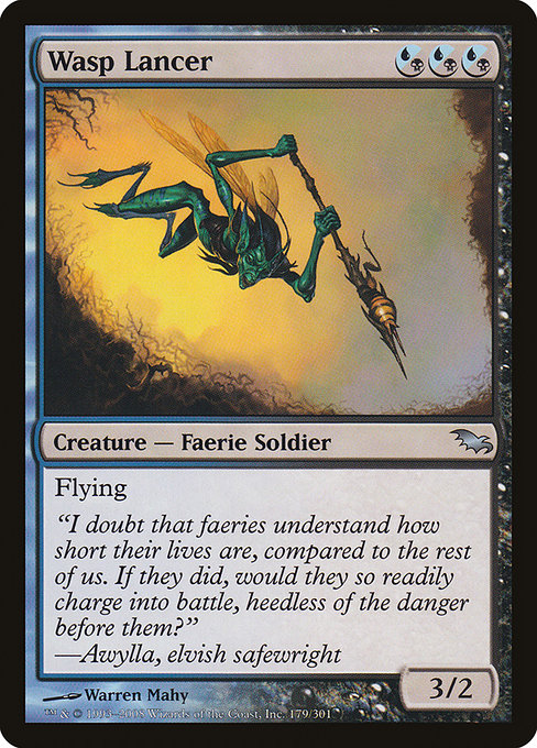
- Name: Wasp Lancer
- Set: Shadowmoor (SHM), a block known for its moody light and hybrid mana themes
- Mana Cost: {U/B}{U/B}{U/B} — three blue/black hybrid symbols
- Type: Creature — Faerie Soldier
- Rarity: Uncommon
- Power/Toughness: 3/2
- Keyword: Flying
- Flavor Text: "I doubt that faeries understand how short their lives are, compared to the rest of us. If they did, would they so readily charge into battle, heedless of the danger before them?" — Awylla, elvish safewright
In paper, Wasp Lancer feels like a tempo flyer that trades a touch of raw brute force for evasive presence in the air. It’s not a dragon, but it climbs above ground-level threats with ease. The card’s hybrid mana makes it accessible in a wider color spectrum—blue for control and manipulation, black for disruption and resilience—offering a subtle nudge to players to think about mana fixing as a strategic resource, not just a constraint. ⚔️
Hybrid Mana: A Cross-Format Balancing Act
The heart of Wasp Lancer’s design lies in its mana cost. Hybrid mana was a deliberate attempt to reduce color-fixing friction while keeping the identity of each color intact. In paper, you gather dual lands, manabases, or mana rocks to reliably cast a three-hybrid spell. In Arena, the same constraint exists, but the UI and automation do the heavy lifting for you—still honoring color identity and the rule that you can pay with either blue or black sources for each {U/B} symbol. The digital representation has to respect both the visual language and the mechanical nuance of hybrid mana, ensuring players don’t misread the cost or misjudge the timing of a fly-by swoop. The result is a seamless cross-format experience where the same decisions—bend toward tempo, or hold for value—feel the same at the table or on the screen. 🧠🎨
Shadowmoor’s design ethos—misty aesthetics, a bustling undercurrent of faerie mischief, and color-blended mana—shines through in Wasp Lancer. The card’s body is lean enough to fit into fast aggressive blue-black strategies, yet its flying speed and 3/2 stat line also tempt midrange board-sweeps or surprise combat tricks. In Arena, you’ll see this as a flexible play pattern: a creature that can threaten early damage while enabling follow-up in subsequent turns via bounce, removal, or pump spells in blue-black schematics. The paper version rewards careful sequencing and deck layering; the digital version rewards precise timing and efficient mana usage. It’s a shared DNA, adapted to two ecosystems that both crave speed, choice, and a touch of elegance. 🧩
Flavor, Art, and the Fantasy we Share
Warren Mahy’s illustration grants Shadowmoor a distinct, moody glow—faeries that feel both dangerous and daring, like tiny cavalry in a dusk-lit field. The Lancer’s name conjures images of pointed wings and precise dives, a beacon of kinetic energy in a world where the battlefield shifts with the wind. The flavor text underscores the tension between faerie lifecycles and mortal time, a playful but sobering reminder that speed and cunning can tilt outcomes in subtle, memorable ways. In both formats, the art and lore reinforce the idea that cunning flight beats brute force when the moment is right. 🎨💎
“I doubt that faeries understand how short their lives are, compared to the rest of us. If they did, would they so readily charge into battle, heedless of the danger before them?”
— Awylla, elvish safewright
Gameplay Value Across Formats
In constructed play, Wasp Lancer provides a versatile drop that can swing tempo in blue-black control shells or fuel evasive air-based pressure in midrange builds. Its 3/2 body trades well against early blockers and can pressure life totals when combined with pump or evasion tricks. In Limited, those hybrid costs feel even more meaningful: you need to color-fix efficiently, leaning into the strengths of your pool. The digital arena, with its head-up display of mana sources and color availability, helps players visualize the path to casting Wasp Lancer sooner rather than later. The design invites you to think in terms of color synergy—how blue’s tempo and black’s disruption can play nicely with a single flying threat that demands attention. 🧙♂️⚔️
Collectibility, Value, and the Shadowmoor Moment
As an uncommon from a beloved era of MTG, Wasp Lancer sits at an interesting intersection of nostalgia and collectibility. The card’s foil version, printed in the Shadowmoor cycle, holds a particular lure for collectors who love the hybrid-mana era and Warren Mahy’s distinctive artwork. Its price point remains accessible for many players, yet the opportunities to feature it in a modern-legal deck or a casual Commander table whisper of “remember when” moments that fans savor. For collectors, this card represents a snapshot of late-2000s design experimentation—the kind of thoughtful, hybrid-forward approach that shaped how designers and players think about color identity and mana efficiency. 🔮🔥
Design Notes: What This Means for Cross-Format Play
Wasp Lancer stands as a thoughtful example of how a single card concept travels between paper and digital. The hybrid mana strategy invites players to evaluate mana approaches differently in each format, but the core decisions—attack when you can, protect your goals, respect your opponent’s threats—remain consistent. For designers, it’s a reminder that cross-format parity isn’t about cookie-cutter rules; it’s about preserving intent, clarity, and excitement. Arena’s UI helps communicate costs without erasing the tactile thrill of assembling a mana base in paper, while paper preserves the tactile drama of choosing when to deploy a 3/2 flyer amid the chaos of blockers and tricks. 🧙♂️🎲
As you plan your next drafting night or your next Arena ladder push, consider how a single card embodies the bridge between two beloved MTG worlds. Wasp Lancer asks you to balance three color identities, to time your plays with the wind, and to savor the moment when a tiny faerie with iron will skims just above the fray. And if you’re paneling strategy with real-world gear, don’t forget to check out the cross-format-friendly gear that keeps your play surface steady and your focus sharp—a nod to both the table and the screen. The product below isn’t just a mouse pad; it’s a reminder that great games deserve great spaces to play. 🧙♂️💎🎨