Image courtesy of Scryfall.com
Typography and Layout: Decoding Golden Argosy’s Visual Language
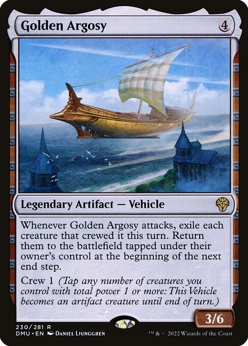
If you’ve ever paused mid-game to truly study a card’s typography, you know MTG design isn’t just about pretty pictures; it’s a careful choreography of type, spacing, and frame that tells a story even before you read a single line of rules text. Golden Argosy, a legendary artifact vehicle from Dominaria United, provides a compact Masterclass in how a few careful typographic choices can reinforce identity, mechanic, and mood. The colorless, all-foil-acknowledged aura of an Artifact—Vehicle card relies on a clean, confident type system to communicate everything from mana cost to a crewed-exile loop on attack. 🧙🔥💎⚔️
Overall frame and identity
The card sits inside a modern 2015-era frame that Wizards uses for many artifacts, with a black border and a crisp, legible type stack. The name, Golden Argosy, sits in a bold, high-contrast banner at the top, signaling its legendary status with a subtle flourish that borders on ceremonial. The absence of color in the mana costs is visually prominent—a stark reminder that not every card needs a hue to carry significance. The vehicle’s silhouette and “Legendary” frame treatment help the eye recognize it as a standout card—the kind you draft early or pull in a sealed pool and set aside with reverence. The font choices stay faithful to MTG’s long-running typographic grammar: a sturdy sans-serif for the name, a compact, readable body font for the rules text, and a smaller, restrained font for set and rarity indicators. The result is a card that communicates both function and personality in a glance. 🎨
Name, mana cost, and identity: what the eye picks up first
Golden Argosy’s mana cost is simply {4}, a straightforward figure that sits above the type line. That cost, paired with a 3/6 power/toughness line, makes it a noteworthy but not overwhelming investment in a single card—an impression reinforced by the rarity tag being rare. The name typography is intentionally compact, but with enough weight to endure the long stretch of a card row in a deck box or on a digital interface. The absence of color in the mana symbols is a design decision that reinforces the artifact identity: colorless means you’re thinking in terms of artifact synergies and the crew mechanic rather than colored mana curves. This simplicity in the top banner contrasts with the complexity of the rules text below, guiding players to internalize the card’s identity before parsing its mechanics. 🧭
Type line, power, and toughness: layout for clarity
The type line—“Legendary Artifact — Vehicle”—uses a compact, single-line format that immediately informs you of rarity and category. The dash separating Artifact and Vehicle is a tidy visual cue that helps separate subtypes without clutter. The power and toughness—“3 / 6”—are presented in a familiar corner, aligned to communicate combat value at a glance. For a card that hinges on a clever attack-triggered effect, this numerical backbone is essential: it signals whether you’re likely to leverage the vehicle in combat or keep it as a craftily positioned threat. The layout keeps room for the long rules text without crowding, ensuring that the critical line breaks don’t obscure the card’s meaning. A few extra pixels of whitespace would be wasted anyway when your brain reads “Crew 1” and the accompanying explanation in the same breath. ⚔️
Oracle text, spacing, and the rhythm of rules
The oracle text reads as two sentences, punctuated and broken for readability. The first sentence—“Whenever Golden Argosy attacks, exile each creature that crewed it this turn.”—acts as the punchline, delivering a high-impact effect that rewards careful crew deployment and timing. The second sentence—“Return them to the battlefield tapped under their owner’s control at the beginning of the next end step.”—gives the sense of a temporary, dramatic exodus. The line breaks enframe the action, enabling quick scanning in the heat of play. The parenthetical reminder for Crew—“Tap any number of creatures you control with total power 1 or more: This Vehicle becomes an artifact creature until end of turn.”—appears as a compact aside, but it remains legible and unintrusive, preserving the primary action while still educating you on the mechanic. The typography here isn’t just about readability; it’s about pacing your brain to anticipate the next phase of the turn. 🎲
“Typography is the quiet engine of a card’s story—every line break is a beat, every symbol a cue.”
Mechanics and typography in harmony: Crew and exile
The keyword Crew is a small but mighty anchor for the card’s layout. The ability text places the notion of turning non-creature materials into a temporary creature on the same screen where you learn the attack-triggered exile loop. This creates a cohesive mental model: you lift a crew cost, you attack, you exile, you return—each step visually chained by the typography’s rhythm. The exclusion of color in the card’s identity shifts emphasis to the mechanical storytelling—what matters isn’t “which color you’re playing” but “how will you orchestrate your artifacts and creatures to maximize attack windows and reusability.” The elegant consequence is a layout that feels like a well-run machine, even before you resolve the first combat phase. 🧙🔥💎
Art, flavor, and the cadence of design
Daniel Ljunggren’s art—captured on the Dominaria United frame—leans into gilded, treasure-holding vibes that echo the card’s name. The typography supports that mood, allowing the text to feel like a ledger entry in a treasure ship’s log rather than a dry rules summary. The gold motif you glimpse in the art is mirrored, subtly, in spacing decisions that emphasize the “legendary” aura and the vehicle’s importance within the battlefield’s economy. It’s not just about what the card does; it’s how the visual language makes you feel like you’re guiding a fleet laden with memories and gold. 🎨🧭
Practical playtips and collector’s whisper
- Leverage Golden Argosy as a finisher when you’ve stacked a crewed vehicle with efficient evasive or fermentation-like threats. Exiling and reentering creatures can swing the tempo, especially in casual formats where long games reward clever tempo plays.
- In Commander, consider synergy with token and clone effects that your deck already runs—arguably the most fun comes from a well-timed attack to yoke multiple creatures into exile and then watch them reappear tapped at end step, potentially resetting combat math for your next swing.
- Collectibility is a whisper: the card is rare, with a modest market footprint, but the foil variants and the art’s prestige keep it in conversation among Artifact-focused decks and collectors alike. The magic of a well-designed card is often in its ability to become a staple in multiple formats, even if it doesn’t steal the show every single game. 📈
For readers who enjoy curating a desk ecosystem that blends MTG passion with practical gear aesthetics, a tasteful cross-promotion can feel organic. If you’re shopping for a sleek, responsive mouse pad to accompany late-night gameplay, you can check out a high-quality neoprene option with stitched edges—a perfect desk-side partner to long sessions of deckbuilding and card art appreciation. The product page offers details you’ll care about if you’re optimizing space and comfort during those multi-hour drafting marathons. Pro tip: your workspace deserves a little legendary polish, too. 🧙♂️🎲