Image courtesy of Scryfall.com
Design Constraints in Visual Language: A Peek at Drowner of Hope and the Un-Set Ethos
MTG has always walked a tightrope between readable rules text and evocative artwork. When Wizards experiments with the playful, “Un”-set aesthetic—Unhinged, Unstable, and friends—the constraint becomes even more pronounced: how do you push humor and novelty without muddying gameplay or confusing casual players? The concept of Un-Set visuals—puns, meta-jokes, and deliberately comic fare—establishes a design playground where art must convey a wink before it conveys a mechanic. That same design discipline echoeses through every corner of the game, including cards like Drowner of Hope when we imagine how it might translate into Un-Set sensibilities. 🧙🔥
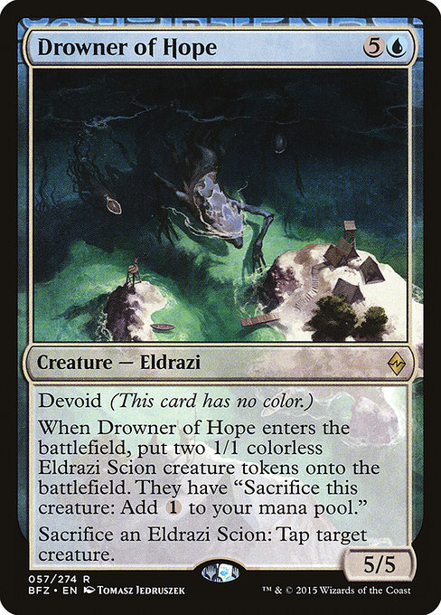
Battle for Zendikar gave us a very different flavor profile—from the humbling, earth-piercing menace of the Eldrazi to a colorless identity that defies traditional color logic. Drowner of Hope carries the Devoid watermark, a deliberate indicator that this 6-mana leviathan is “colorless by design.” In Un-Set circles, you’d expect visuals to foreground humor or subversion. In a standard-set creature, however, the constraints are subtler: the art must read as powerful, align with the Eldrazi threat, and still communicate Devoid’s colorless nature without relying on color hints. The result is a design tightrope: a fearsome silhouette, a watery, otherworldly backdrop, and just enough colorless aura to signal the mechanic without clobbering the eye with color cues. ⚔️
What the card tells us about colorless storytelling
Drowner of Hope is an Eldrazi creature with no color of its own (Devoid). Its mana cost—{5}{U}—situates it on a knife-edge: it’s a big, late-game threat that wants to be blue-aligned in spirit but must remain colorless in identity. The Devoid keyword lets the art and flavor lean into cosmic horror rather than “blue spellwork” signals. Visually, that means the artist has a freer hand to foreground texture, scale, and menace rather than rely on a traditional blue palette. The result is a creature that feels both alien and immediate, with a presence that whispers of rifts in reality rather than the orderly cool of a fetchland ocean. And then the mechanical table-turner—the two 1/1 Eldrazi Scion tokens that enter the battlefield with Drowner—turns the design into a stage for strategic textures: ramping through colorless mana, token synergy, and a tax on the opponent’s board state. The tokens’ sacrifice-to-add-C ability is a clean, mechanical loop that reads as “industrial magic” rather than “cute cartoon.” In Un-Set terms, you’d chuckle at the idea of colorless mana tokens that also perform a tiny tap-dance, but the underlying design constraint remains: clarity first, flavor second, with a wink somewhere in the margins. 🎨
“Designers walk a careful line between spectacle and clarity; the Un-Set vibe invites mischief but never at the expense of understanding the card’s core function.”
That balance is precisely what makes Drowner of Hope a useful lens for exploring Un-Set visuals. The card is visually imposing, with a towering Eldrazi silhouette that carries a wave-washed color scheme and a sense of ancient, unknowable power. Yet it also neighbor-talks with its tokens—the Eldrazi Scion—whose existence is a design joke that sticks to mechanical truth: sacrifice one to generate colorless mana. In an Un-Set context, you could imagine the same creature reinterpreted as a playful gag, perhaps with a token that literally says “Cries out for tea” or a flavor text pun that preserves the deception of Devoid while leaning into humor. The constraints—clear identity, readable mechanics, and a distinctive look—are the same constraints that guide the humor in Un-Set visuals, just applied to a much more serious battlefield. 🧩
Design constraints in practice: how the visuals support the game
- Colorless identity without color bias: Devoid allows the artwork to signal “colorless” without relying on a color-coded frame. The visual language shifts toward texture, scale, and ominous, water-warped light to communicate the void and the immense presence of the creature. This restraint helps artists craft fearsome imagery while staying rules-accurate. 💎
- Token economy that reinforces onboarding and depth: The two Eldrazi Scion tokens entering alongside Drowner are a visual and mechanical cue that the card is about tempo and resource acceleration. In Un-Set terms, those tokens might be used for comedic mischief, but here they anchor the gameplay loop—create bodies, tap for colorless mana, sacrifice to tap a rival creature. The constraint is to make token art cohesive with the main creature’s menace, not a pasted-on joke. 🎲
- Flavor that respects lore while inviting playability: The Eldrazi family is cosmic horror—vast, ancient, and indifferent. The art direction respects that lore, delivering a visually legible, intimidating presence that doesn’t overshadow the card’s text. For Un-Set visuals, flavor-tue humor would still need the same readability to avoid misinterpretation during a match. 🧙♀️
- Accessible art that scales across formats: From paper to MTGO, the art must remain legible as a 5/5 behemoth with a token wave. This constraint is even more important when you consider Un-Set visuals, where readability must survive punchlines and visual gags. The balance keeps the card iconic, independent of the setting. ⚔️
Beyond the battlefield: how design informs collectors and culture
Cards like Drowner of Hope live at the intersection of strategy and art. The foil and nonfoil finishes, the bold illustration, and the Devoid treatment all contribute to a distinct collectible footprint. For Un-Set enthusiasts, the design conversation sometimes centers on how far an image can bend before it breaks the spell of the card. The constraints from both worlds—Un-Set and Battle for Zendikar—jointly illustrate a core truth: great visuals in MTG are not about showing off flashy tricks; they’re about serving the story, supporting gameplay, and inviting players to imagine new possibilities without sacrificing clarity. 🧙♂️💎
And if you’re tuning your desk for long evenings of drafting and deckbuilding, a something-for-everyone cross-promo moment can be a small delight. If a quick gadget break is in order, consider a practical sidecar purchase like a UV phone sanitizer with wireless charging—the kind of modern-day tool that feels almost magical in its own right. It’s the kind of product that sits nicely on a game night table, a subtle nod to the blend of lore and utility that MTG fans adore. If you’re curious, you can explore options at this link: the 90-Second UV Phone Sanitizer Wireless Charging Pad. 🧙🔥
Whether you’re chasing rare borders, chasing flavor, or just chasing that perfect token synergy, the story of Drowner of Hope reminds us that great design is about constraints well wielded: a colorless identity that feels inevitable, tokens that feel like a natural side quest, and visuals that tell a tale long before the first line of rules text is read. The Un-Set mindset may tease with irreverence, but at the table, it’s the discipline of the design that makes the magic sing. 🎲⚡