Image courtesy of Scryfall.com
Un-set Visuals in Trick Shot: Design Boundaries Reimagined
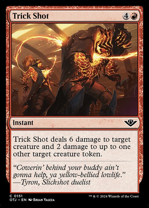
Magic: The Gathering has long thrived on the tension between crisp, rule-accurate illustration and the playful chaos of parody sets. When we talk about design constraints for Un-set visuals—especially in a hypothetical take on a card like Trick Shot from the Outlaws of Thunder Junction expansion—we’re really exploring how humor, clarity, and collector appeal intersect with strict mechanical communication. Trick Shot, a red instant with mana cost 4R and a text line that reads “Trick Shot deals 6 damage to target creature and 2 damage to up to one other target creature token.” serves as a perfect case study: it is punchy, it interacts with both creatures and tokens, and its aggressive flavor can be amplified or tempered by the visual language we choose to pair with it. 🧙🔥
What Un-set Visuals Bring to MTG, and How That Shapes Trick Shot
- humor as a design vector: Un-sets lean into playful exaggeration. A Trick Shot illustration could embrace slapstick motion, exaggerated weapon props, or comic misdirection—without muddying the card’s official text. The challenge is to signal silliness while keeping the mechanics crystal clear, especially the two separate damage targets and the token interaction.
- visual readability: A red spell like Trick Shot must communicate its damage output and targets at a glance. In Un-set visuals, you lean into dynamic composition and high-contrast color blocks so players aren’t left guessing what the damage numbers mean or which creature is the primary target versus the token target.
- token depiction and scale: Since one of the damages can land on a creature token, the art should convey the existence of tokens without requiring separate iconography. A well-designed frame or foreground action can imply “token presence” through subtle indicators or reactive props in the scene.
- flavor and narrative alignment: The flavor text and character poses in Un-set visuals often wink at the audience. pairing Tyron’s swagger in the flavor text with a visual gag—something that feels earned, not gratuitous—helps the card land as both playful and memorable.
- printability and foil handling: Un-set designs still need to read well on both standard and foil stock. High-contrast colors, legible mana cost area, and bold action lines become crucial when translating the design from screen to table.
Design Constraints for a Trick Shot Artwork in an Un-set Style
If you’re guiding illustrators and layout designers, these constraints become practical guardrails:
- Directness of the action: The trick shot concept should be immediately recognizable—the sequence of aiming, release, and impact should feel kinetic on the card front. Use motion lines, a visible trajectory, or a boisterous, oversized impact effect to convey the spell’s 6-damage punch to a rigid, simple beast and a token target.
- Clear token cueing: Since the secondary target can be a token, ensure tokens appear as distinct silhouettes or small, cartoony figures that are easy to identify at common card sizes. This avoids “token confusion” during play and keeps the humor accessible to newer players.
- typography harmony: The mana cost {4}{R} and the text box should contrast with the art so that text remains scannable. Un-set visuals often experiment with typography; the design should not obscure crucial keywords or the exact damage values.
- color language: Red visuals benefit from bold, warm hues and energetic accents. But a hint of comedic mischief—smoke rings, exaggerated splashes, or a playful creature reacting comically—should be used sparingly to avoid undermining the spell’s seriousness when it resolves in play.
- flavor integration: The art should echo the card’s flavor line, “Cowerin' behind your buddy ain’t gonna help, ya yellow-bellied lowlife.” Visual humor should underscore bravado and showmanship, not mean-spirited cruelty.
- legality and clarity of effect: Even in playful contexts, the visual cannot reinterpret the card text. The color identity (R), the cost, and the target requirements must remain unmistakable to players relying on the card for strategic decisions.
Flavor, Humor, and the Snapshot of Tyron
“Cowerin' behind your buddy ain't gonna help, ya yellow-bellied lowlife.”
The flavor line anchors Trick Shot in a world where swagger and showmanship clash with the chaos of the duel. In a design scenario that embraces Un-set sensibilities, the image might bounce between slapstick mischief and a wink to the audience, using visual gags that reward close inspection. The artistry from Brian Valeza—an integral voice in OTJ—already evokes dynamic storytelling. A nod to the humor in the art can coexist with a clean read of the card’s mechanical text, ensuring that players—both seasoned and new—feel the thrill of a well-timed shot without losing track of the spell’s effect. 🎨⚔️
Gameplay Moments Reflected in Visual Design
Trick Shot hits for 6 damage on a primary target and 2 on a secondary target creature token. That split makes timing and target selection critical in combat-heavy decks. In an Un-set visual approach, you can emphasize the dramatic turn where a creature falls under the first blast, while a second, cheaper token flinches under the follow-up blow. The contrast in scale between creature and token can be amplified in the art to highlight the mechanical distinction, without overshadowing the action that makes Trick Shot a satisfying play. The combination of high-impact numbers and a token-friendly secondary target invites clever board states where Red’s aggressive tempo becomes a storytelling moment—an arena where the players’ decisions feel as cinematic as the illustration suggests. 🧙🔥
Collectibility, Accessibility, and Community Pulse
OTJ’s Trick Shot sits as a common print with foil and non-foil finishes, a reminder that even widely accessible cards can carry a lot of personality when paired with distinctive visuals. Scryfall data shows a modest price footprint in the modern market (roughly a few cents to a few dimes depending on condition and whether it’s foil), underscoring its role as a fun, approachable pick for casual decks and pop-culture-themed builds. The design conversation around Un-set visuals doesn’t only live in high-end collector circles; it thrives in community showcases, fan-made art, and conversations about how humor translates into board-game equity. The card’s identity—red, aggressive, and token-aware—lends itself to playful extensions and cross-promotional experiences, like the featured product link below, which adds a tactile, real-world hobby component to the MTG experience. 💎🎲
Practical Tips for Designers and Players
- For designers, lean into a few gag-forward elements that don’t obscure the card’s mechanics. A strong silhouette and a readable action focal point are king.
- For players, look for timing windows where Trick Shot can punish a fragile board state. This is where your token management and creature removal plans come into play.
- For collectors, celebrate the card’s complete package—the red payoff, the token interaction, and the art that can land with both humor and impact on the table.
- For crossover promotions, small touches—like a promotional product link—can or cannot disrupt play; keep them subtle and clearly labeled for best reception.