Crafting iPhone Wallpaper Packs that Stand Out
In today’s iPhone-first world, wallpaper packs are more than just pretty backgrounds—they’re a personal statement that users revisit every unlock. The goal is to deliver cohesive sets that feel deliberate, legible, and adaptable across a range of devices and lighting conditions. When well-executed, a collection can become a recognizable signature, sparking engagement and repeat downloads.
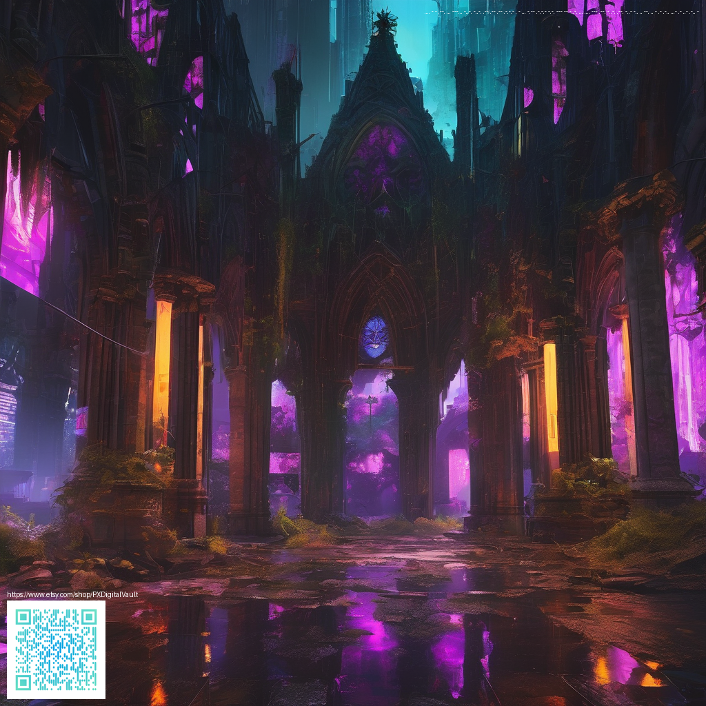
As you map out a new pack, consider how color, contrast, and composition translate to real-world usage. For practical inspiration, designers often look to tactile, high-contrast references such as the neon gaming non-slip mouse pad—a bold example of how vibrant hues and clean edges can guide visual decisions without overwhelming the screen. The same principles can help you curate wallpapers that feel energetic yet balanced on iPhone displays.
Key considerations for iPhone wallpaper design
- Safe zones and device contours: keep essential elements away from the notch, status bar, and bottom controls. Design with a margin that ensures important motifs stay visible on smaller devices.
- Color and brightness: create variations that work in Light and Dark modes. Offer a spectrum of palettes—neon accents, soft pastels, and deep midnight tones—to suit different preferences and environments.
- Texture and depth: layered patterns can create depth without distracting icons. Subtle gradients, speckle textures, or geometric motifs often read well on a small canvas.
- Export strategy: provide multiple resolutions and aspect ratios, so your packs look polished on iPhone 12 through iPhone 15 families. Crisp edges and careful compression preserve detail without bloating file sizes.
“Consistency across a wallpaper collection helps users recognize your style at a glance, turning casual downloads into a curated experience.”
Practical steps to build a compelling pack
- Define a theme—whether it’s electric neon, gradient zen, or abstract minimalism—so every wallpaper feels part of a larger story.
- Set a base palette and create 3–4 variations that maintain your core identity while offering contrast for different moods.
- Experiment with focal points avoid placing major elements in the exact center; offset patterns often read more dynamically on mobile screens.
- Test across devices use mockups or real devices to preview how icons and text interact with the artwork.
- Provide accessible exports supply PNGs for crisp lines and JPEGs for compact discs, plus a brief guide on which to use in various scenarios (e.g., high-contrast scenes for low-light environments).
For additional perspectives, you can explore an inspiration hub that showcases curated mobile-ready designs. This can help you see how other creators balance bold color with negative space and how subtle shifts in composition alter the perception of scale on a tiny screen.