Image courtesy of Scryfall.com
Un-set Visuals and the Whimsy of White Aura Design
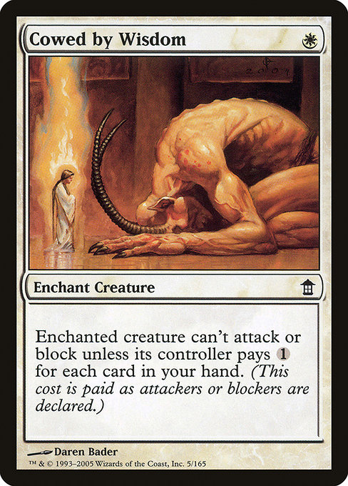
Designing cards for the MTG multiverse often means walking a tightrope between playful experimentation and rock-solid gameplay semantics. When we tilt toward Un-set visuals, that balance gets a little spinny—like a spark spell fizzing just a bit too bright. The goal is to invite a grin without obscuring what the card actually does on the battlefield. Today we use a specific example from the broader catalog—Cowed by Wisdom, a white aura enchantment from Saviors of Kamigawa—to explore how designers translate humor, typography, and imagery into a readable, collectible experience. 🧙🔥💎
Case study: Cowed by Wisdom
Card basics: Name Cowed by Wisdom; Set Saviors of Kamigawa (SOK); Mana cost {W}; Type Enchantment — Aura; Rarity Common; Artist Daren Bader; Oracle text Enchant creature. Enchanted creature can't attack or block unless its controller pays {1} for each card in your hand.
Enchant creature. Enchanted creature can't attack or block unless its controller pays {1} for each card in your hand.
From a design perspective, that text is a tidy micro-lesson in constraint. One white mana buys you a persistent shield, but the enchantment’s power curve rises directly with the complexity of your own hand. The more cards you hold, the more incentive there is to pay the price to attack or block. It’s a playful tension between hand size, tempo, and decision-making—perfect fuel for Un-set style visuals that wink at the rules without breaking them. ⚔️
Rarity and print history: Common, foil and nonfoil options appeared in print. The card hails from 2005 Kamigawa, where the art direction leaned toward crisp lines and legible text. The border and frame choices reflect a traditional aesthetic that prioritizes clarity even when designers push the envelope with humor. This is a crucial constraint when you’re asking illustrators and layout teams to inject whimsy without undermining readability. 🎨
Design constraints that Un-Set visuals must wrestle with
- Readability first, humor second. Un-set visuals lean into jokes, but the text must stay legible across lighting, angles, and quick tabletop glances. A bold treatment of keywords like Enchant and the line describing attack/block limitations should remain decipherable even with playful art in the background. 🧭
- Color identity and border language. White mana conjures a sense of clarity, protection, and restraint. In Un-set visuals, designers often lean into that identity, letting the aura’s frame reflect a bright, clean aesthetic while avoiding garish contrasts that muddy the design language. 💎
- Flavor alignment without overreach. The joke should feel earned, not forced. The flavor lines and visuals ought to hint at the humorous premise—being “cowed by wisdom”—without turning into a pure gag that erases the card’s strategic footprint. 🎲
- Iconography that travels across formats. An Un-set-inspired design needs to commute well from kitchen-table play to broader formats. For Cowed by Wisdom, any visual gag must respect the hand-size mechanic and remain instantly readable in quick play. ⚔️
- Art direction that plays with references. The artist’s hand, whether it’s Daren Bader’s crisp linework or a playful reinterpretation, sets the tonal compass. In Un-set-forward visuals, designers blend nods to MTG tropes with cartoonish exaggeration—while still honoring the card’s mechanical core. 🧙♂️
In this context, the “Un-set” design philosophy invites players to appreciate the joke while recognizing the rules that govern play. The visual language must support both the humor of the moment and the seriousness of the battlefield in a way that enhances, rather than distracts from, decision-making. The result is a dynamic, collectible experience where flavor and function coexist—every image and symbol telling a small story about play, risk, and payoff. 🎨🎲
Practical takeaways for designers
- Lead with the mechanic. If a card’s power scales with something like hand size, visuals should hint at those constraints without cluttering the frame. A subtle hand motif or a clean counter graphic can convey the idea at a glance. 💡
- Let the frame do the heavy lifting. The Un-set concept thrives on whimsy, but the card frame must still anchor the essential identity—mana cost, type line, and enchantment keywords should be readily legible. 🖼️
- Test the joke in play. Humor should enhance comprehension, not obscure it. The visual gag ought to reward rule-savvy players with a wink, not induce confusion at critical moments. 🧪
- Balance formats and collectability. Cowed by Wisdom sits comfortably within Modern-legal, Legacy, and Commander play, offering a charming brag for fans of Kamigawa’s lore. Its EDHREC rank sits at 21,135, a reminder that wit can outshine raw power in a casual, puzzle-loving corner of the multiverse. ⚔️
For fans who adore the intersection of art, humor, and strategy, this exploration shows how a simple white aura can spark a surprisingly rich discussion about design constraints. The set, the rarity, and the exact wording—all anchor the conversation as you imagine how Un-set visuals might look if given the same playful license. It’s the kind of reflection that makes even a simple enchantment feel like a doorway to a broader MTG conversation—where nostalgia, clever visuals, and smart mechanics converge with a wink. 🧙♀️💎
If the idea of bringing Un-set whimsy into real-world products appeals to you, consider how design language travels beyond the card frame. It translates beautifully to merchandise and branding that celebrate MTG’s artistry—like bold, neon accents on everyday items that echo the card’s crisp lines and playful spirit. After all, magic isn’t just what happens on the battlefield; it’s what happens when we borrow a bit of that wonder for our daily gear. 🎨🎲