Image courtesy of Scryfall.com
Frame-by-Frame: How MTG’s Card Borders Mirror Its History
Magic: The Gathering has always operated on a delicate balance between mechanics, lore, and the tactile joy of a well-designed card. The artifact from Visions, released in 1997, sits at a fascinating crossroads: it’s a rare piece that not only plays with colorless mana in a very literal way but also embodies a frame language from an era when the game was still experimenting with how a card should “feel” in your hand. The frame around this card is a snapshot of a period when Wizards of the Coast was refining readability, artwork presentation, and the way you perceived a card at a glance. 🧙♂️🔥💎
What the card does and why the frame matters
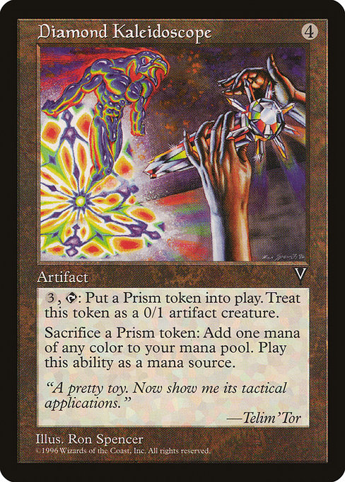
This artifact is a compact package: a 4-mana investment for a card that pays you back in two distinct ways. First, its tap ability—{3}, tap—to create a 0/1 colorless Prism artifact creature token—gives you a persistent, if modest, board presence. Second, and perhaps more cheekily, you can sacrifice a Prism token to add one mana of any color to your mana pool. That single clause opens up a surprising amount of color flexibility for a colorless engine, letting you chain a sequence of plays that can surprise the unprepared opponent. The card’s mana cost and its text live in a frame that emphasizes function as much as style; the 1997 frame paired with heavy-art presentation makes the token-generation and mana-synthesis feel like a mechanical toy—beautiful to look at, satisfying to execute. 🎲⚔️
The Visions set brought with it a wave of artifacts and colorless options that demonstrated how colorless tools could bend the color wheel without abandoning color synergy completely. The Prism token, in particular, is a neat nod to the way MTG has always loved color as a spectrum rather than a fixed fence. The card’s rarity—rare—signals that it was designed as a strategic centerpiece for careful decks rather than a mass-market inclusion. The text reads like a whisper from a different era: efficient, purposeful, and a little mischievous. The ability to generate a token week after week, then trade that token for a rainbow of colors, invites a kind of token-centric ramp that’s part puzzle, part parade float. 🧙♂️🎨
The mechanics in context: color, tokens, and mana parity
What makes this card look deceptively simple is how its components interact with the broader MTG ecosystem. First, the Prism token is 0/1 and colorless, a humble creature but a perfect canvas for a token-focused strategy. Second, the sacrifice clause—sacrifice a Prism token to add one mana of any color—delivers a bridging function: you can convert your colorless token economy into explosive multi-color plays when the moment calls for it. In decks that crave color flexibility or that leverage color-intensive spells, this artifact becomes a quiet engine, enabling spells that otherwise wouldn’t fit a colorless or a mono-color plan. The frame from Visions reinforces this blend of practicality and wonder; the token becomes a tangible, visible payoff that’s easy to track during a game, much as early Frame 1997 cards were designed to be legible at a glance even in the heat of a crowded battlefield. 🔥💎
Frame evolution in practice: how design iterations shift play
Across MTG’s history, frame changes have often reflected broader shifts in print philosophy: readability, art balance, and the relationship between the text box and the art. In the late 1990s, you’ll notice a frame that leans into compact text areas, with a bold emphasis on the card’s typographic clarity. Designers were experimenting with how to weight the mana cost, the card name, and the type line, balancing them so players could parse a card’s intent in a single breath. The artifact in Visions is a prime example: its text box sits comfortably with the artwork, giving the token’s colorless nature a chance to “glimmer” as a design concept rather than simply being a mechanical footnote. That era’s frames are a reminder that MTG’s surface is as much about anticipation and mood as it is about the rules. 🎲🎨
“A pretty toy. Now show me its tactical applications.” —Telim'Tor
The flavor text underscores how collectible and tactical the card feels—a reminder that the aesthetic choices of that era were often paired with a wry, pragmatic sense of play. The flavor line juxtaposes curiosity with use, a sentiment modern players still recognize when they pull a card from a binder and map its potential onto a fresh deck idea. The card’s art by Ron Spencer further anchors this sense of kaleidoscopic possibility—a design choice that rhymes with the name itself, even if we’re not reprinting it in today’s standard formats. The frame, token design, and colorless theme come together to celebrate a moment in MTG’s graphic evolution when novelty and practicality weren’t at odds but rather complemented each other. 🧙♂️⚔️
Deckbuilding implications: weaving Prism tokens into a plan
- Token tempo: The Prism token remains a small but persistent presence, letting you build a micro-board while you stash a pool of color options for the endgame or a decisive two- or three-spell turn.
- Color-fixing on the fly: Sacrificing Prism tokens to add any color mana can help you align your mana base in a pinch—handy for multicolor spells or planeswalkers that demand diverse colors.
- Artifact synergy: In formats where artifacts shine, an engine like this can pair with other colorless accelerants, turning a modest mana base into a springboard for bigger plays.
- Vintage and Commander resonance: Though not a Modern-legal staple, the card’s Vintage and Commander presence speaks to a broader appreciation for the artifact’s design principles in multi-player formats where color flexibility and long-term synergies thrive. The card’s old-school charm is a perfect match for “classically modern” lists that honor the roots of MTG’s frame language. 🧭🎲
Collectibility and value: a frame-era keepsake
As a Visions rare with a black frame and 1997 frame treatment, this artifact sits in a niche that’s beloved by collectors who savor the tactile history of MTG. It’s a non-foil, non-premium print, but its collectible aura isn’t just about scarcity—it’s about the moment in time it captures: a bridge between the game’s initial experiments with token ecosystems and the more expansive, color-rich strategies players deploy today. Market values for cards of this vintage and rarity can be modest by today’s standards, but the allure lies in its representational power: a tangible reminder of the early days when token strategies and colorless engines were exploring their identities in bright, bold frames. The card’s collector profile—visited by vintage enthusiasts and players who love the idea of “colorless creativity”—continues to grow as MTG history becomes a more widely celebrated facet of the hobby. 🧙♂️💎
For fans who are curious about where to find this kind of print or how it sits among other Visions-era artifacts, the set’s collector data points—multiverse IDs, print runs, and related pages—offer a roadmap. If you’re thinking about cross-promotion or simply celebrating the cross-pollination of old-school design and modern accessories, you can even pair the nostalgia with a modern-day gadget—like a slim, glossy phone case for iPhone 16—giving you a tactile link between past and present in your daily carry. We’re living in a moment where the aesthetic of a 1997 frame can vibe with a 2025 lifestyle accessory, and that’s the kind of cultural synchronicity MTG fans adore. 🧙♂️🔥💎