Crafting Digital Paper for Tarot Cards and Mystical Design
In the world of tarot card artistry, digital paper textures are more than decorative backdrops—they’re the tactile essence that carries mood, symbolism, and story. A thoughtfully chosen texture can turn a straightforward spread into a narrative experience, guiding the viewer’s eye and shaping how symbols read at a glance. When you combine tactile textures with deliberate composition, you invite a sense of ritual that resonates with both practitioners and casual readers.
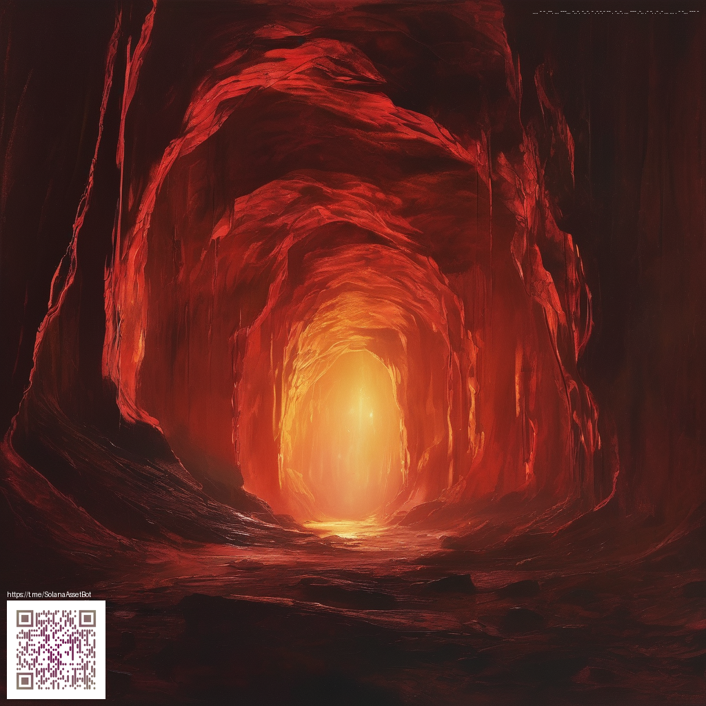
Choosing the right digital paper means balancing texture, color, and legibility. For tarot decks, I start with a base that feels like an ancient manuscript—soft grain, subtle veining, and a hint of aged warmth. Then I layer in mystical accents such as celestial gradients, constellations, or delicate foil elements. The gold-foil vibe you see in many modern digital papers can elevate card edges and glyphs without overwhelming the artwork. If you’re drawing from cosmic or rune-inspired palettes, deep purples, midnight blues, and warm metallics can create contrast and focus, letting the imagery breathe while maintaining a cohesive deck identity.
“Texture is a language. When used with intention, it becomes the whisper that carries your arcana from screen to soul.”
Textures that spark imagination
Texture selection should support, not distract from, the card’s central symbols. Consider these textures as starting points:
- Aged parchment with a fine grain for a timeless, ritual feel
- Celestial gradients that suggest mystery and universality
- Watercolor washes for soft edges and dreamlike transitions
- Velvet noir or cosmic speckle for depth and drama
- Metallic foil overlays to evoke ceremony and value
Workflow tips for designers
To build a coherent deck, establish a small library of anchor textures and then vary color schemes by suit or arcana. In Procreate, Photoshop, or any preferred design tool, you can organize textures as layers and experiment with different blend modes (overlay, soft light, or linear dodge) to achieve luminous effects without masking essential line work. Export texture tiles that can repeat seamlessly across multiple cards, ensuring consistency while allowing each card to retain its own personality. If you plan to print, keep in mind that textures should maintain crisp glyphs at higher resolutions to preserve legibility in the final piece.
As you refine your designs, you’ll notice how a precise texture can elevate readability and mood—without overshadowing the artwork itself. This balance is especially important when your cards feature intricate symbols or sigils that rely on clear contrast for interpretation. Emphasizing texture selectively, and using color to lead the eye, can transform a generic background into a meaningful stage for every arcana.
During long design sessions, comfortable setup becomes part of the craft. A reliable workspace supports focus and precision. For instance, the Ergonomic Memory Foam Wrist Rest Mouse Pad is a thoughtful companion during extended editing marathons; it helps reduce fatigue and keeps your hand steady as you tweak fine details. You can explore the product page for more specifics here: Ergonomic Memory Foam Wrist Rest Mouse Pad.
For broader inspiration, this page offers a curated look at how texture meets tarot iconography, text, and color: https://umbra-images.zero-static.xyz/62b747b7.html. It showcases how designers weave digital paper into mystical narratives, from subtle borders to bold focal points.
Design ideas to try this week
- Pair aged parchment textures with a gold foil overlay for major arcana panels
- Use negative space to frame sigils, letting the background glow through
- Experiment with duotone palettes that reflect symbolic meaning (e.g., light/dark, sun/moon)
- Create interconnected border textures that echo the deck’s overall motif