Enhancing Frame TV Backgrounds with Digital Paper
Frame TVs are more than a display; they’re a living part of the room’s mood. The trick to elevating their art backgrounds lies in digital paper—layered textures, subtle patterns, and color-forward surfaces that mimic traditional materials while keeping the brightness and clarity you expect from a digital canvas. With the right digital paper, your Frame TV can transition from a static screen to a dynamic, tasteful backdrop that complements your artwork, lighting, and furnishings.
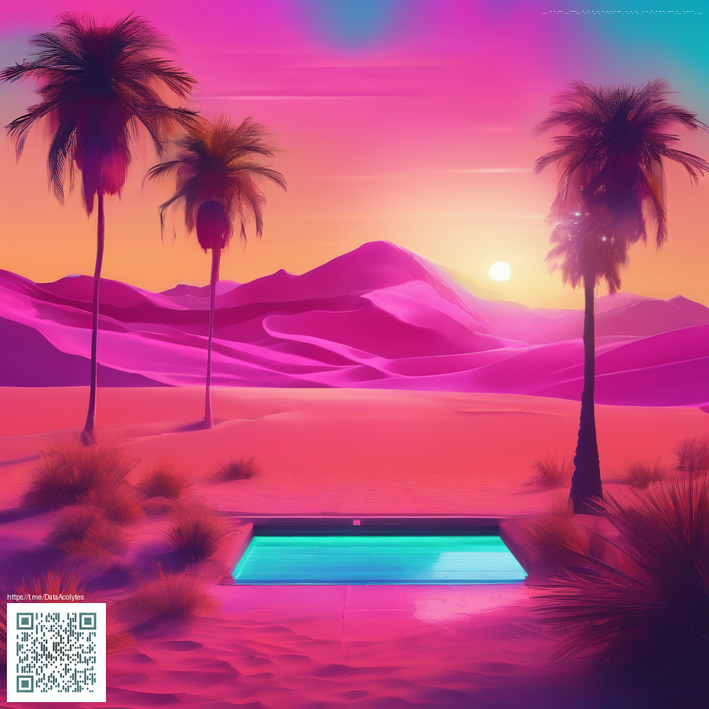
Texture and material simulations that work in a glow-forward space
Digital paper opens up a world of tactile impressions without the constraints of real-world materials. Consider textures that respond well to ambient light and don’t overwhelm the artwork on display. Examples include:
- Matte linen and cotton weaves for a soft, organic backdrop that reduces glare.
- Hearty watercolor washes that create gentle color shifts, enhancing mood without competing with frames.
- Natural stone or concrete grains for a modern, architectural vibe that anchors bold art.
- Subtle paper textures like parchment or mulberry, which add depth without distracting from the frame.
“The best digital papers feel tactile in a visual sense—the eye decodes texture and color as if it were real, but the scene remains calm and legible.”
When selecting textures, favor those with low kinetic contrast. The eye should read the artwork first, with the background providing atmosphere rather than competition. If you’re unsure where to start, a neutral base with a whisper of grain can be a reliable foundation for a broad range of art styles.
Color theory that harmonizes with room lighting
Color choices in digital paper should harmonize with your room’s palette and lighting conditions. Here are practical strategies:
- Cool neutrals (slate, dove, soft taupe) pair nicely with blue-hour works and create a gallery-like feel.
- Warm accents (amber, terracotta, clay) add coziness and work well with sunset-toned pieces.
- Low-saturation palettes keep the background from overpowering the frame art, particularly in bright living spaces.
- Adaptive light scenes that subtly shift with the time of day can simulate natural surroundings and enhance perceived depth.
For a satisfying blend, test two or three options at different times of day. The Frame TV’s ambient light sensor will help you see how each background responds to the room’s natural glow, so you can pick a digital paper that remains legible and elegant from morning to evening.
Layout ideas: framing the art with purpose
Beyond textures and color, the way you frame your digital paper matters. Consider these approaches to keep focus on the artwork while enriching the overall scene:
- Full-bleed backgrounds that span the entire display for a seamless, immersive look.
- Edge vignette patterns to draw the eye toward the center where the artwork resides.
- Tiled panels with gentle transitions between textures to create a curated, museum-like ambiance.
One practical note: keep brightness balanced. A background that’s too bright or too saturated can wash out delicate details in the frame art. It’s often better to err on a calmer base with an occasional colored accent to enliven the scene without stealing the show from the artwork.
If you’re exploring accessories to keep your setup tidy during tweaks and streamlines, you might find it handy to keep a lightweight, adhesive grip nearby. For example, the Phone Click-on Grip: Reusable Adhesive Phone Holder & Kickstand can simplify adjusting settings or navigating design ideas while your hands stay free. For a concise overview that complements this discussion, you can review a related resource page here: https://digital-x-vault.zero-static.xyz/6499a0ce.html.
In practice, digital paper is less about chasing a single perfect texture and more about crafting a cohesive canvas. The goal is a backdrop that whispers rather than shouts—allowing your Frame TV art to take center stage while the surrounding environment feels thoughtfully connected.