Image courtesy of Scryfall.com
Far // Away: Adapting Split Card Design for Physical and Digital MTG
Magic: The Gathering has always thrived on the tension between tactile, card-slotted play and the fluid, screen-driven pace of digital environments. When you hand a player a Dimir fuse card like Far // Away, you’re handing them a compact study in adaptability: two halves sharing a common frame, two distinct effects, and a single decision tree that can bend to tempo, disruption, or outright overreach. Published in Dragon's Maze as an uncommon card, Far // Away is more than a curiosity of layout—it's a microcosm of how design translates across physical cards and digital interfaces 🧙🔥💎.
What Far // Away actually does, on both sides
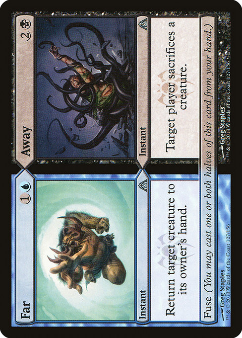
This split instant card bears two faces, each with its own purpose and cost, yet a fused identity that invites tricky plays. The first half, Far, costs {1}{U} and reads: “Return target creature to its owner's hand.” The second half, Away, costs {2}{B} and reads: “Target player sacrifices a creature of their choice.” Thanks to the Fuse keyword, you may cast one or both halves from your hand, offering flexible answers to the board state. In terms of color identity, Far is blue, Away is black, and together they live under the Dimir watermark, signaling a blend of mind games, tempo, and calculated risk 🎲⚔️.
From a design perspective, the dual-functionality of Far // Away is a rare breed of efficiency. A single card can be played as a removal-for-any-target tempo play, or as a more punitive disruption—especially against creature-heavy strategies—by forcing a sacrifice. The card’s text is short but potent: it rewards sequencing, anticipation, and the cunning Dimir mindset. The art by Greg Staples—shared across both faces—cements the impression of a single, shadowy plan unfolding across two horizons 🖌️🎨.
Physical vs. digital: how the layout influences play
In a physical collection, Far // Away presents a straightforward, single-card experience with two discrete halves. The partial overlaps and shared gateway text require players to hold two realities in mind: casting Far or Away, or both, depending on mana availability and board needs. The visual pacing—two halves, shared watermark, two distinct text blocks—asks you to parse options quickly while maintaining a sense of mystery that Dimir designs thrive on 🧠💎.
Digital MTG platforms, by contrast, can exploit space and sequencing to emphasize Fuse. You can present the option to cast one half, both halves, or choose multiple target interactions with visual cues that adapt as mana is tapped. The digital medium also promises easier value-driven decisions: filtering by card type, reading ephemeral hints, and replicating the card’s nuanced timing with tooltips. Designers can, in effect, simulate a more deliberate “two-for-one” experience without sacrificing clarity, while preserving the original’s coordinated flavor—the blue-black mirror that Dimir fans adore 🎮🧙♂️.
Color, control, and the strategy chisel
- Tempo and tempo denial: With Far // Away, you can bounce a creature to its owner’s hand to buy time, or remove a threat through forced sacrifice. The fuse option means you’re never locked into one line of play—you can tailor your tempo to the matchup.
- Resource management: The two halves demand careful mana budgeting. Casting Far for {1}{U} and returning a creature might stall a faster aggro deck, while choosing Away for {2}{B} can wreck an opponent’s board presence in a slower grind.
- Dimir flavor in two moves: The Dimir watermark signals a philosophy of information denial and calculated risk. Far // Away embodies that through split-second decisions—control what your opponent can do, and dictate the path of the game in two, carefully weighed steps 🧪🔮.
Design adaptation: readability, typography, and card framing
One of the ongoing challenges with split cards—physical or digital—is ensuring each half remains legible, especially when mounted on a single frame. Dragon's Maze uses a modest art footprint and a clear typographic hierarchy to keep the two halves legible at a glance. In a digital rendition, you might see adaptive text boxes that emphasize the individual lines when Fuse is in play, or highlight the cost difference so players can quickly estimate total mana. The goal is preserving the card’s intent across formats: a nimble, situational instant utility that rewards timing and sequencing, not merely brute force 🧙🔥.
Lore, art, and the collector’s pulse
Greg Staples’ artwork anchors Far // Away in the Dimir world of shadowy negotiation and information warfare. The dragon’s maze environment foregrounds a guild that thrives on misdirection and subterfuge—perfectly suited to a card that plays two ways at once. For collectors, the Dragon's Maze set sits in an interesting niche: it’s not the price-friendliest era of MTG, but its designs are beloved by players who enjoy the puzzle-box feel of split cards. The card is listed as uncommon, with foil and nonfoil finishes, and a price footprint that’s modest but real on the secondary market. In digital ecosystems, this kind of card often sees renewed interest through casual play and specific archetypes that flirt with control and disruption 💎⚔️.
“In a world of wild permanents and flashy combos, the elegance of a well-timed fuse spell is a reminder that sometimes two precise moves are better than one big strike.”
Beyond the card’s intrinsic magic, Far // Away offers a lens into how Wizards of the Coast has approached split cards across formats. The design challenge—keeping two halves that feel distinct yet thematically bound—echoes in digital adaptations where interface choices can either reveal or obscure options. The result is a card that rewards both meticulous planning and a little bit of luck, a quintessential Dimir moment in a blue-black dance 🕵️♂️🎲.
Why this matters for you as a player and a collector
Whether you’re drafting through Dragon's Maze at your kitchen table or piloting Dimir strategies online, Far // Away remains a standout study in adaptability. The fuse mechanic nudges you toward hybrid playstyles, encouraging decks that can pivot on a dime. For collectors, the card’s dual-face identity, coupled with Greg Staples’ evocative artwork, makes it a memorable piece—an illustration of how a single design can bend across physical and digital interpretations while staying true to its guild’s ethos. And if you’re hunting for a tactile project that blends art with strategy, you could even draw creative inspiration from this dual-natured archetype for custom accessories—like a mouse pad that mocks the same two-sided approach you’d find in a Dimir deck 🧙♀️💻.
As you explore cross-format design, consider the ongoing cross-promotion opportunities that live outside the game—like dedicated accessories that celebrate MTG’s wide universe. If you’re in the market for a chic, functional desk companion, check out the Custom Mouse Pad collection and see how form meets function in a way that nods to the same careful, two-way thinking that Far // Away embodies.