Image courtesy of Scryfall.com
Fortuitous Find Artwork: Analyzing Perspective and Depth
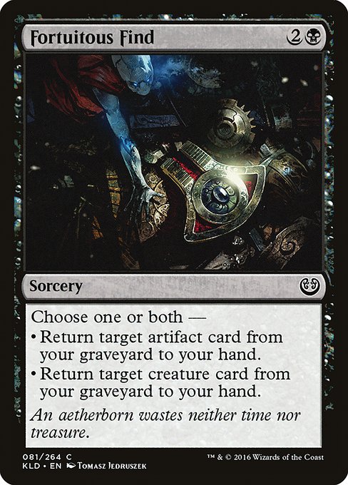
In the bustling world of Kaladesh, where brass gears whirr and aether crackles like static in a storm, the visual language of card art tells as much story as the spell text itself. Fortuitous Find, a common golgari?—no, a black mana sorcery from Kaladesh, invites us to look beyond the surface of its mechanics and into the layered craft of perspective and depth that Tomasz Jedruszek wove into the piece. The artwork does more than decorate a card; it guides your eye, suggests a narrative, and echoes the card’s flavor about seizing opportunity with quiet, merciless efficiency. 🧙♂️🔥💎
Understanding the Frame: Perspective as a Narrative Tool
Compositionally, the Kaladesh frame often uses bold diagonals, reflective surfaces, and a play between light and shadow to create a sense of depth that feels cinematic. In Fortuitous Find, the artist leans into perspective lines that pull the viewer into a foreground moment and push the background into a distant workshop of possibilities. The result is a tangible sense of space: a dense foreground where action begins, a mid-ground where the core idea takes shape, and a distant blur that hints at a larger machine world. This layered structure mirrors how the card’s effect operates—pulling resources from a graveyard into your hand, one carefully chosen target at a time. The eye travels along a deliberate path, moving from the most immediate focus to the wider machinery of Kaladesh that powers such discoveries. 🧭
- Foreground focal point: A device or action cue that signals “discovery” and foreshadows retrieval.
- Mid-ground artifacts: Elements that suggest the presence of artifacts and their relation to the graveyard mechanic.
- Background environment: Workshop clutter, warm glow, and aether shimmer that deepen the scene without stealing focus.
Color, Light, and Depth Cues
Jedruszek’s palette for Kaladesh often leans into amber, copper, and brass tones, punctuated by darker shadows that give gravity to the scene. The interplay of light and dark isn’t merely aesthetic; it creates atmospheric perspective—the distant parts of the workshop appear cooler and more desaturated, which enhances depth and makes the central action pop. In this piece, you can sense the tactile quality of metal and glass—the way light glosses off a polished surface, how a hidden gadget catches a gleam, and how subtle color shifts guide the viewer’s gaze toward the core idea of “finding” something valuable from a past realm. This use of light helps translate abstract mechanics into a concrete, almost tactile, moment of discovery. 🎨
Beyond mood, the color work reinforces the card’s black-mana identity. Dark hues often imply sacrifice, risk, and the graveyard’s quiet gravity—the precise vibes you want when you’re deciding which card from the graveyard to return. The visual tension between the darker foregrounds and the brighter focal points mirrors the strategic tension of Fortuitous Find: pay mana to retrieve either an artifact or a creature, or both, and bend the late game in your favor. The art’s depth cues keep that tension legible even on a hurried tabletop skim. ⚔️
Storytelling Through Art: Flavor Meets Function
Kaladesh is a world where invention is law and ingenuity is currency. The flavor text of Fortuitous Find—“An aetherborn wastes neither time nor treasure.”—echoes the efficiency depicted in the artwork: the moment you uncover something valuable, you act with purpose, minimal waste, and precise timing. The image’s depth invites you to imagine what lies beyond the frame: a workshop teeming with recovered relics, a mind weighing options in the graveyard’s quiet corridor, and a plan taking shape under the glow of aetherlight. The art doesn’t spell out the exact mechanics, but its energy aligns with the card’s dual-target potential, reminding players that in the Kaladesh cosmos, careful retrieval can change the board state as deftly as a finely tuned gadget changes a project. 🧙♂️
“The wisest find is often the one you didn’t expect—until you reach out and pull it into the now.”
Design, Lore, and Collectibility
Tomasz Jedruszek's work for Kaladesh remains a standout example of how micro-details can speak to macro-myths. Fortuitous Find, a common rarity, sits within the broader Kaladesh set’s celebration of invention and resourcefulness. The image supports a spell whose power scales with your graveyard strategy—returning an artifact and/or a creature can unlock a late-game tempo swing, especially in decks that weave together artifact synergy with resilient beaters. From a collector’s lens, the card’s foil and nonfoil finishes offer a modest ramp in value for foil fans, while the nonfoil version keeps it accessible for budget-friendly builds. It’s a reminder that even common cards can carry premium aesthetic value when paired with the right piece of art. 💎
Gameplay and Visuals: A Symbiotic Relationship
On the battlefield, Fortuitous Find asks for deliberate timing: pick which graveyard target—artifact, creature, or both—to restore to your hand, and plan your next move around that gained tempo. The artwork’s depth helps players read the moment as more than a mere refresh of resources; it’s a beat in a larger rhythm—one where every choice ripples through the board. The spatial cues present in the painting—where light concentrates around the “find,” while the periphery remains layered and complex—mirror the cognitive process of planning several turns ahead. In this way, the art teaches a subtle lesson: depth isn’t just about layers of color, but layers of strategic possibility. 🧩
Where to See and Collect
As a Kaladesh-era piece, Fortuitous Find sits among a celebration of mechanical artistry and narrative depth. The card’s rarity and set context make for approachable collecting, while its practical foil value adds an optional spark for those who love tactile display pieces in their binder. Whether you’re building a casual commander table or building toward a vintage-influenced graveyard shell, this card’s art is a compelling reminder of how a single image can communicate a card’s promise long before you even read the text. For modern players, it’s a gentle nudge toward appreciating the craft behind the card as much as the mechanics it enables. 🧙♂️🔥
If you’re curious about pairing this visual treat with a practical upgrade, consider protecting your collection with a sturdy, slim case that keeps your cards safe during long nights of pondering throwback strategies. For a touch of everyday ease, this product—designed to shield your devices with elegance—fits the vibe of Kaladesh’s precision engineering, echoing the meticulous care with which you approach your deck building. Smart gear for smart play, wherever your journeys take you. ⚔️