Image courtesy of Scryfall.com
Framing and Perspective Choices in Shield of the Righteous
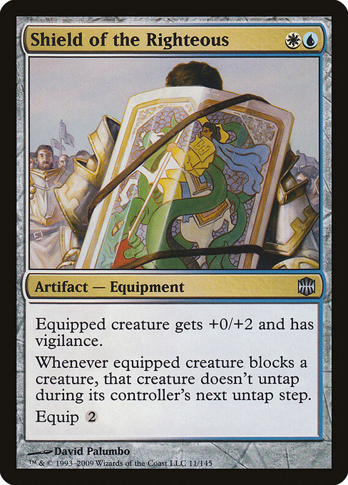
Magic: The Gathering is as much about how a card looks as how it acts. The moment you glimpse Shield of the Righteous, you’re invited into a careful dance of framing, color, and intention. Crafted during the Alara Reborn era, the piece rests on a 2003-style frame with a black border that foregrounds clarity and contrast. The artwork by David Palumbo leans into a focused, almost cinematic perspective: a gleaming shield perched at the edge of the frame, catching light the way a guardian’s gaze catches a threatening shadow. It’s as if the viewer is both spectator and witness to a poised moment—the moment before defense becomes a strategic move in combat. 🧙🔥
The choice of perspective matters because it communicates the card’s role in a game that rewards timing and posture as much as raw power. Here, the shield dominates the foreground, but not in a way that eclipses the user’s strategic agency. The camera angle suggests vigilance, a readiness to interpose protection while remaining mindful of the tempo of the battlefield. The result is a composition that feels tactile: you can almost hear the rattle of metal and the whisper of a well-timed block. This is the artistry of framing, where color, line, and light fuse to make the card’s mechanics feel inevitable. 💎
Visual framing as a primer for gameplay
Shield of the Righteous is an Artifact — Equipment with a compact but potent kit of effects: the equipped creature gets +0/+2 and gains vigilance; when the equipped creature blocks, that creature doesn’t untap during its controller’s next untap step. The visual emphasis on a sturdy, well-engraved shield mirrors this mechanical promise: a defensive stance that is proactive, not passive. The art’s balance—tangible armor in a color palette that nods to its color identity—helps players internalize the card’s role before they even read the text. The dual color identity listed as U and W hints at a deck’s temperament: precision, tempo, and defense, rather than overwhelming brute force. In practice, Palumbo’s shield feels like a quiet but relentless bulwark on the board. ⚔️
Color identity, frame, and the mood of a blue-white artifact
Alara Reborn is famous for weaving color into the very fabric of its mechanics and visuals. Shield of the Righteous sits at the intersection of blue and white, a rarity in artifacts that often lean toward the pure metallic palette. The white aspect signals protection, order, and resilience, while the blue breathes calculation, timing, and control. The weaponry of safety—vigilance and a blocking bonus—reads through the frame as a disciplined approach to combat: you don’t just stop creatures; you ensure they won’t slip back into the fray the moment you lift your shield. This is the design language of a card whose identity arcs toward defense with a touch of cerebral maneuvering. 🎨
- Equipped creature gets +0/+2 and vigilance: a reliable bolster that compounds with any creature that can block well. Palumbo’s shield is the visual cue for “don’t blink—the threat remains guarded.”
- Whenever equipped creature blocks a creature, that creature doesn’t untap: a mischievous twist that punishes aggressive lines. The art’s calm is contrasted by the idea that a block here has lasting, strategic consequences.
- Equip cost is 2 mana: a measured investment that rewards thoughtful timing, not brute force. In the frame, that investment seems small yet consequential, like a carefully chosen posture in a long duel. 🧭
From a collector’s and designer’s lens
As an uncommon from Alara Reborn, Shield of the Righteous sits in a sweet spot for collectors and players who crave a nuanced defensive tool. The card’s single-art presentation by Palumbo, the 2003-style frame, and abstract balance of color identity contribute to its distinct feel on the table. The print run spans nonfoil and foil options, with current price trends that hover around modest values in the market—perfect for players who enjoy building around layered defense without breaking the bank. The artwork’s fidelity and the card’s utility combine to make it a favorite for players who value tempo control in Modern and Legacy circles, while remaining a delightful curiosity for Commander builds that lean into protection and synergy. The online data hints at its real-world economics: a foil copy fetches a small premium, underscoring its collectible charm without becoming prohibitive for casual afficionados. 💎
For builders, the UW flavor invites pliable deck construction: counterspell suites and blink motifs mesh with the vigilance-driven blocking dynamic. Imagine pairing Shield of the Righteous with creatures that benefit from frequent blocking or that rely on attack-to-defend interactions. The piece’s frame and color psychology encourage you to plan around the moment you invest the equip cost and push your defense into a defensible fortress. It’s a card that rewards patience, weaving a narrative of armor and timing that’s as much about the mind as the hand. 🎲
There’s a quiet drama to Palumbo’s shield—a shield that’s ready to absorb the next swing, while the eyes behind the visor read the tempo of the game. The frame says “defend with intention”; the text says “control the pace.”
On a design level, Shield of the Righteous exemplifies how an artifact can carry the color identity of its wielder as much as its own metallic aura. The combination of +0/+2 and vigilance is thematically tied to the idea of endurance—staying present, absorbing pressure, and ensuring you stay a step ahead when the defense finally transitions to offense. The blocking penalty—creature doesn’t untap—turns a simple shield into a strategic trap, a reminder that not all power is in attacking; some of the strongest plays are the ones that keep your opponent from getting the turn back. 🧙🔥
For fans who like to pair lore, art, and play, Shield of the Righteous stands as a compact testament to the era: an artifact from a time when color wheels, frame aesthetics, and perched guardianship collided to create memorable moments at the table. If you’re curious to explore similar artworks or to deck-build with a purposeful mixed-color shield in mind, you might also enjoy a tactile companion for your desk—an easy-to-clean Non-Slip Gaming Mouse Pad (9.5x8.3mm rubber back) that keeps your battlefield focused and your hands comfy during those long drafting sessions. It’s a subtle nod to how presentation—on the card and at the desk—helps elevate the overall MTG experience. 🧙🔥
For more perspective on the card’s place in your collection, you can explore pricing and availability on popular marketplaces, or read up on other artifacts that pair well with blue-white control strategies. And if you’re looking to upgrade your play space while you plan your next big Commander game, consider the product linked below—an ode to the ritual of preparation and the joy of a well-aimed block. ⚔️