Image courtesy of Scryfall.com
From Borders to Boldness: A Walk Through MTG Card Frames
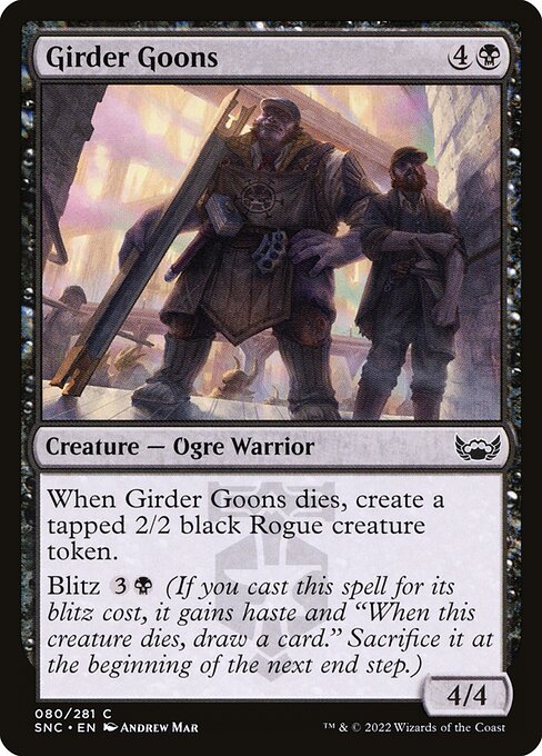
Card frames are more than decorative borders; they’re a visual shorthand for an era, a design philosophy, and a game's evolving balance between readability and flavor. When you glance at a card like Girder Goons, you’re not just seeing a creature with a mana cost and power/toughness—you’re witnessing a deliberate design language that has shifted across decades. The black Ogre Warrior from Streets of New Capenna sits on a frame that embodies the modern, 2015-era approach to clarity, contrast, and curated information. 🧙♂️🔥 The way the mana cost sits in the upper right, the way the name and type line breathe, and the placement of keywords all tell a story about how Magic has grown up while keeping its core identity intact. ⚔️
Let’s start with the card at hand: Girder Goons is a 4/4 for 4 colorless and a black mana (designated as {4}{B}) from the Riveteers-aligned streets of New Capenna. A common creature, it carries the emblematic Riveteers watermark and uses the 2015 frame that most players recognize today. Its ability as a Blitz creature adds a tempo twist: when you cast it for its blitz cost, it gains haste and presents a built‑in risk‑reward dance—“When this creature dies, draw a card”—and a future obligation to sacrifice it at the end step. And if it dies, you get a tapped 2/2 black Rogue token. That layered mechanic set—Blitz plus a death trigger—illustrates how the frame accommodates multi-part abilities without sacrificing legibility. 🔥🎲
“Frames are the stage on which mechanics perform; the better the stage, the clearer the performance.”
Early years: a frame that prioritized information density
Back in the late 1990s and early 2000s, frames tended toward a denser, busier aesthetic. The focus was on cramming old-school abilities and keywords into a compact silhouette, which sometimes made reading multi-part text a challenge on crowded cards. Borders were sturdy, mana costs were compactly enclosed, and the art often competed with text for attention. For many longtime players, those frames evoke the tactile experience of opening a booster and sorting through piles of mana costs and flavor text. 🧙♂️
The 2000s refresh: readability over embellishment
As card complexity grew, designers pushed for improved readability. Subtle shifts—slightly larger names, more generous spacing above the text box, and standardized font choices—helped players parse the card’s abilities at a glance. The 2009–2014 window introduced a more consistent alignment of the mana symbol, the card name, and the type line. This era laid the groundwork for the modern frame, balancing the need to show off art with the necessity of clear mechanics. Girder Goons benefited from that stability: its blitz, death trigger, and token clause sit in a frame that makes each piece of text feel intentionally anchored rather than squashed into a corner. ⚔️💎
The 2015 update: a modern frame with a flavor-forward edge
The 2015 frame is what you’ll see on Girder Goons: a clean, high-contrast layout that preserves legibility as a card’s text grows. This frame reimagined the balance between art and information—wider text boxes, more readable mana costs, and sharper iconography. The result is a canvas that feels both contemporary and timeless, which is perfect for a card that blends a straightforward stat line (4/4 for 4) with a multi-note ability like Blitz and a death-based token engine. The Riveteers watermark on Girder Goons is more than flavor; it’s a badge that communicates the card’s allegiance and the storytelling cadence of the set. And while the art and border have a noir vibe, the readability isn’t compromised—the frame keeps the mechanics front and center, even in chaotic board states. 🧙♂️🎨
When frames influence flow: how design affects gameplay perception
Frame choices affect more than aesthetics; they influence how players perceive tempo and risk. For a card like Girder Goons, the Blitz cost hints at an aggressive tempo push, while the death trigger pointing to a Rogue token introduces a safety net that players weigh against the potential end-step sacrifice. This dual-layer design is a perfect case study in how a frame can accommodate layered text and still feel intuitive: you see the blitz reminder immediately, you spot the token clause at the bottom, and you understand the color identity and rarity without pulling out a card encyclopedia. The 2015 frame’s emphasis on clean typography and efficient layout makes these strategic signals pop, especially in quick multiplayer games where every second counts. 🧙♂️🎲
Collector value, foil fantasies, and frame-driven collectibility
Beyond gameplay, frames influence the collectibility story. Girder Goons is a common foil, with a low market price that still invites casual collectors to chase shiny copies. The card’s border color, watermark, and set symbol—all framed by the 2015 aesthetic—add to its charm for modern enthusiasts who appreciate how far frame design has come. Foils, reprints, and border variants often ride or ride the waves of frame-era nostalgia, and the Riveteers’ distinctive vibe gives these cards a tangible “new Capenna” aura on the table. The evolution of frames thus intersects with market dynamics, art appreciation, and the tactile delight of opening a fresh pack. 💎🧩
As we trace the arc from the earliest frames to today’s modern silhouettes, it becomes clear that MTG frame design is a living chronicle of the game’s growth—balancing readability, stylistic identity, and the evolving language of magic. Girder Goons stands as a compact exemplar: a solid creature with a robust set of abilities, delivered in a frame that respects both tradition and innovation. And on the table, it still locks horns with your opponent through tempo tricks and token strategies—a little piece of the past with a very present punch. 🧙♂️🔥
Interested in a tiny real-world companion for your MTG journey? Check out the Neon Slim Phone Case for iPhone 16—the chic, glossy polycarbonate design makes a bold statement whether you’re at the game store, the kitchen table, or the convention floor. Neon Slim Phone Case for iPhone 16 🧙♂️🎨
More from our network
- https://crypto-acolytes.xyz/blog/post/ethereum-vs-avalanche-which-layer-1-shines-bright-in-2025/
- https://crypto-acolytes.xyz/blog/post/bitcoin-layer-2-ecosystems-lightning-sidechains-and-beyond/
- https://crypto-acolytes.xyz/blog/post/next-gen-graphics-elevate-realism-in-survival-games/
- https://blog.digital-vault.xyz/blog/post/solar-analogs-in-focus-against-a-luminous-hot-giant/
- https://blog.digital-vault.xyz/blog/post/best-ikra-shidiqi-the-usurper-commander-combos/