Image courtesy of Scryfall.com
How templating shapes player understanding of Cinder Pyromancer
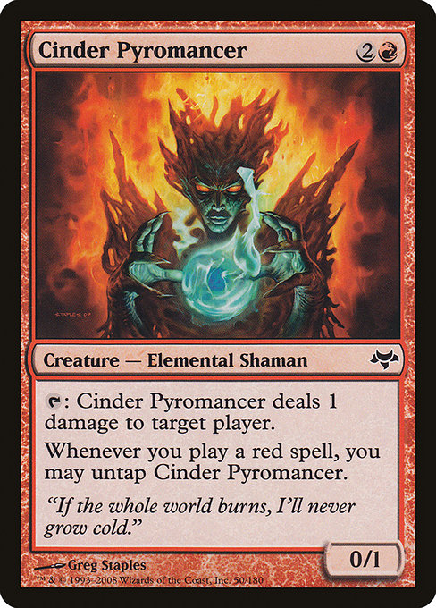
If you’ve built a cube or drafted a bunch of EDH games, you know that a card’s power is only half the battle. The other half lives in how that power is presented on the page—the templating, punctuation, and line breaks that guide your eye from cost to effect to the moment you actually click with the rules. Cinder Pyromancer, a red-gray snapshot from Eventide, is a neat case study in how a few typographic choices can tilt the moment you start playing the card. The way its two abilities are laid out, the activation cost, and even the flavor text work together to shape expectation and strategy before a single spark hits the table 🧙🔥.
Why templating matters isn't just about aesthetics. It affects readability under pressure, how players infer timing, and even how new players parse the card during their first few games. A clean template helps a player recognize, at a glance, that this is a red creature with a tapped damage ability and an untap trigger tied to red spells. The result is faster decisions, fewer rule checks, and more room for creative mischief when you build around those cues. Cinder Pyromancer, with its 2-colorless and one red mana investment, emphasizes tempo and opportunity—templating nudges you toward thinking about quick, aggressive turns rather than slow, grindy board states ⚔️🎲.
Reading the mana cost and color identity
From the top, the mana cost is 2 generic and 1 red mana {2}{R}. In a single glance you deduce three things: the spell’s color identity is red, it isn’t a fast mana engine, and you’re playing a three-mana body with potential for immediate action. The color cue is reinforced by the card’s colors and its rarity (common, in Eventide’s case). This templating aligns with how most red staples read: a cost that invites quick play, a body that’s not meant to soak up the battlefield but to spark aggression or ping away at a planeswalker. For newer players, that alignment between cost and expected effect is a comforting map—templating has done some of the heavy lifting by showing you the likely lane of play before you commit mana to it 🧙🔥.
The activated ability and the timing cue
“T: This creature deals 1 damage to target player or planeswalker.”
Right away you notice that the first line uses the classic T activation shorthand; this is the templating that players recognize as “tap to deal damage.” The effect is simple and direct, which helps players onboard the core tactic of red aggro: poke and pressure. The line break before the next ability—Whenever you cast a red spell, you may untap this creature—is deliberate. It’s a cue that this creature can potentially attack, be tapped to deal 1 damage, and then come back to threaten again the moment you cast another red spell. The may clause introduces a choice, which is where templating quietly shapes risk assessment: do you untap for a second swing now, or save the untap for a bigger burn later? The phrasing nudges you to weigh tempo against reach, a classic red decision tree 💎⚡.
Line breaks, punctuation, and what players infer
Notice how the two distinct lines segregate two modes of use: a straightforward activation and a conditional untap. That structure makes it easier for the brain to categorize the card’s possibilities. If the text were jammed into one block, a new player might read the second ability as a conspiratorial afterthought rather than a dynamic engine to recur damage. The current templating, by contrast, treats the two halves as separate but connected verbs: damage now versus untap to strike again later. It’s a small grammar trick with outsized influence on how players prioritize board development in the heat of conflict 🔥🎨.
Flavor text, art, and thematic cues
The flavor line—If the whole world burns, I’ll never grow cold.—reads like a promise from a pyromancer who loves the blaze as much as the blaze loves them. The art by Greg Staples depicts a feisty, emboldened figure surrounded by heat, which reinforces the templating’s call to action: red magic is efficient, relentless, and personal. When you pair that flavor with the mechanics, templating becomes a bridge between mood and play. You don’t just know what this card does; you feel the heat of its potential and the stubborn tenacity of its untap engine while you chase the next red spell to fuel a mini-storm 📜🧙🔥.
Eventide’s design philosophy and templating norms
Eventide (EVE) sits in a nuanced era of MTG where templating often balanced complexity with readability. Cinder Pyromancer, as a common red creature, uses clean and consistent language that new players can latch onto quickly, while still offering meaningful decisions for seasoned players. The two-core ideas—the direct damage ability and the untap trigger—are templated in a way that encourages aggression but rewards careful sequencing. It’s a reminder that design isn’t just about what a card can do, but how its text invites you to think about the rhythm of a turn and the tempo of your game 🧩🎲.
Practical takeaways for players and designers
- Clarity over flourish: The split sentence structure makes it easy to parse each capability on its own, speeding the planning stage for your next move.
- Consistent keywords: The familiar T activation and Whenever you cast a red spell trigger mirror other red pays-offs, reducing friction for players who know the language of MTG templating.
- Strategic orientation: The untap clause invites tempo considerations with successive red spells, shaping deck-building choices that maximize repeated pressure rather than a single burst.
- Flavor pairing: Flavor and mechanics reinforce one another, helping players remember the card’s identity beyond just its numbers.
For fans who love staying organized during long nights of play, a sturdy desk setup never hurts. If you’re dialing in game-night efficiency, you might appreciate a practical desk companion—the Phone Stand for Smartphones — Sleek Desk Travel Accessory—so you can keep notes, life-motivation quotes, or deck lists close at hand without muting your vibe. Check it out here and imagine the same confidence you bring to your playmats, replicated in your workstation: Phone Stand for Smartphones — Sleek Desk Travel Accessory 🎨⚔️.
Designers and players alike benefit from studying templating as a living language of the game. The way Cinder Pyromancer presents its two pivotal actions—one immediate, one conditional—offers a compact blueprint of how to craft cards that feel intuitive yet inviting for strategic depth. It’s a reminder that every punctuation mark, each line break, and the choice of when to tuck a rule into a sub-clause can tilt how a new player learns a system that has centuries of memory behind it. And in the hands of a veteran, those same choices become a catalyst for creative, explosive turns that light up the table with color and sound 🎲💎.