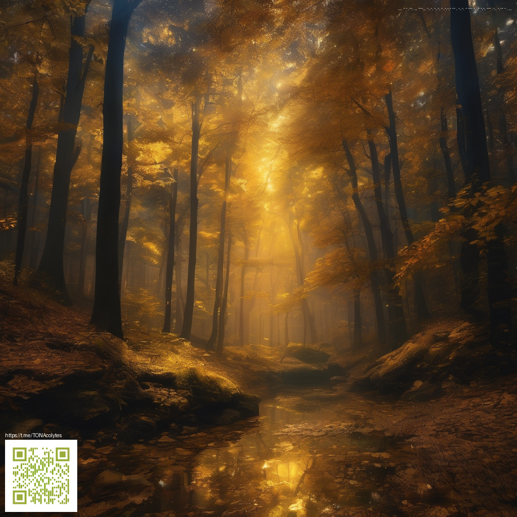
Depth and transparency in digital paper art
In the realm of digital paper art, depth isn’t just about color richness—it’s about how transparent layers interact to reveal or conceal information as you build your composition. Each layer acts like a sheet of delicate parchment: you can see hints of what lies beneath, while still enjoying the discrete presence of the top layer. Mastering this balance turns flat shapes into scenes with atmosphere, texture, and a sense of space that invites the eye to wander across the page.
Digital tools make layering incredibly precise. You control opacity, blend modes, and stacking order with a few keystrokes, enabling nuanced interactions between elements. As you refine these translucent relationships, your artwork gains depth without sacrificing crisp edges or intentional color harmony. A practical workspace helps keep this delicate balancing act smooth; for example, the Custom Neoprene Mouse Pad can improve comfort and control during long layering sessions.
Core concepts behind depth with transparency
- Opacity as a bridge: Lowering a layer’s opacity reveals underlying forms, creating a sense of distance or atmosphere without erasing color relationships.
- Blending modes as behavior signals: Modes like Multiply, Screen, Overlay, and Soft Light alter how colors mix, often simulating the way ink or paint interacts on physical paper.
- Edge quality and feathering: Soft edges at the boundaries of translucent layers help them blend with the layers beneath, avoiding harsh separations that break the illusion of depth.
- Color as depth cue: Warmer tones tend to advance while cooler tones recede; combining translucent layers with thoughtful color choices enhances the perception of space.
- Light and shadow framing: Subtle shadows and ambient occlusion-like shading anchored to an implied light source anchor elements in three-dimensional space.
Transparent layers are the quiet architects of depth—small shifts in opacity and blend can transform a flat panel into a story with atmosphere.
Practical techniques you can try today
Begin with a soft, base layer that establishes your color direction. Then build translucent overlays that hint at secondary shapes or textures. Don’t hesitate to experiment with clipping masks and layer groups so you can control where each translucent tone appears without reworking the entire composition.
- Layer order matters: Stack related translucent elements so the most distant shapes sit lower in the stack, then gradually introduce foreground details.
- Mask for precise reveals: A soft mask lets you reveal glimpses of underlying forms while keeping the edges gentle and natural.
- Texture and grain: Subtle textures on translucent layers add tactile depth, echoing the feel of handmade paper.
- Color harmony: Use a limited palette with a few tinted overlays to maintain cohesion as depth increases.
- Light-aware adjustments: Treat highlights and shadows as separate translucent passes to preserve realism as shapes overlap.
Workspace matters and a few quick tips
A stable desk, a comfortable input surface, and a reliable mouse pad or tablet stand can make the difference when you’re painting dozens of translucent passes. In many workflows, a Custom Neoprene Mouse Pad helps keep your tools at your fingertips while you fine-tune layer balance and edge softness. Remember to save incremental versions so you can compare approaches side by side and revert if a particular layering pass doesn’t land as hoped.
As you practice, you’ll notice a pattern: depth emerges when translucent layers are allowed to interact in a way that respects light, space, and texture. The goal isn’t to hide information beneath a veil, but to reveal just enough of what lies beneath to guide the viewer’s gaze. With patient adjustments to opacity, a judicious selection of blend modes, and a few well-placed textures, digital paper art can achieve that luminous, layered feel that feels both tactile and expansive.
Similar Content
Explore more on this topic at diamond-images.zero-static.xyz/e00ccccc.html.