Image courtesy of Scryfall.com
How Vanishing Verse Shapes MTG Fan Card Design
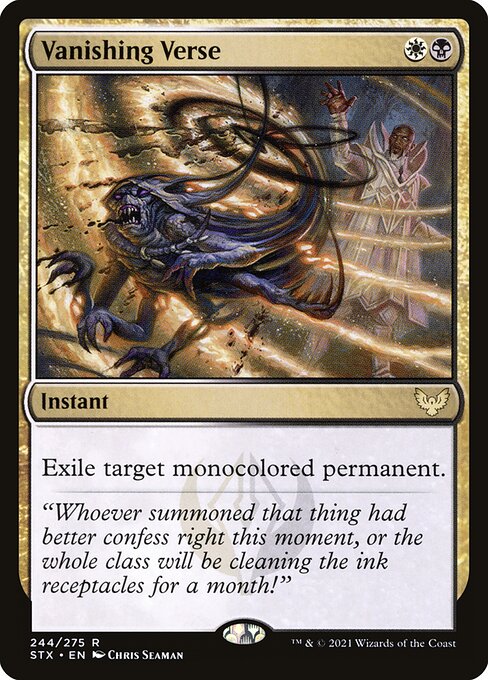
When you study the arc of fan-made cards, one constant question surfaces: how do designers translate a card’s core feel into playable, collectible, and visually cohesive fan concepts? Vanishing Verse from Strixhaven: School of Mages is a fantastic case study. A lean, elegant instant with a sharp purpose—Exile target monocolored permanent—it embodies a design philosophy that fans often emulate: clarity, color identity storytelling, and mechanical signaling that you can actually feel in a game of Magic. 🧙🔥💎
Strixhaven’s silverquill watermark isn’t just a cosmetic flourish; it sets a tonal stage for how card identity communicates lore and function. Vanishing Verse sits squarely at the intersection of two colors, White and Black, and its mana cost of {W}{B} mirrors that duality: protection and removal, light and shadow, justice and consequence. This is the kind of duality designers lean on when they craft fan cards that want to shout “this is a scholarly spell with real consequences.” The instant-speed exile effect gives players a decisive, strategic tool that feels thematically appropriate for a school of magic built on rhetoric, debate, and discipline. ⚔️🎨
Design Principles that fans latch onto
- Color identity as a narrative lens: The W/B identity of Vanishing Verse makes it a natural partner for fan concepts that explore balance, rules-lawyering, and the gray areas of magical ethics. Fans often echo this in fan cards that foreground exile, bounce, or other forms of control, using keywords or color archetypes that feel rooted in the Strixhaven ethos. 🧭
- Simplicity with a clear KPI: The card asks for a single, unambiguous action—exile a monocolored permanent. In fan design, this translates to clear victory conditions or effects that can fit neatly into a deck’s strategy without overloading the imagination with multiple lines of text. The best fan designs model that same crispness. ✍️
- Interleaving flavor with mechanics: Vanishing Verse’s flavor text and art evoke a disciplined, sometimes sly environment where scholars weigh consequences. Fan cards often mimic that tone—polite, precise, with a hint of mischief—so the reader feels the world behind the mechanics, not just the numbers on the page. 🎭
One core takeaway for designers—whether you’re drafting a fan card or thinking through a commander interaction—is the way Vanishing Verse communicates “counterplay possible, but not infinite.” It’s a finite tool in a world of chaos. When fans draft their own cards, they frequently model that same sense of scope: a well-defined effect that doesn’t step on every other card’s toes. The lesson here is not to copy the effect, but to copy the discipline in choosing a single, impactful interaction that remains elegant at the table. 🧙♂️💬
“Whoever summoned that thing had better confess right this moment, or the whole class will be cleaning the ink receptacles for a month!”
In a way, Vanishing Verse helps fans think about design tradeoffs in microcosm. Its rarity (rare) signals a certain weight on the battlefield, while the silverquill watermark nudges designers to imagine school-themed, lore-forward motifs for future fan sets. When you pair this with the card’s lore-friendly art by Chris Seaman, you see how a single card can anchor a whole subset of fan creativity—art direction inspired by the school’s houses, the tension between order and subversion, and the ritual of scholarly duels. The card’s availability in both foil and nonfoil emphasizes accessibility, a reminder that great design should be collectible without alienating players who don’t chase every shiny version. 🎨🧩
Why this card resonates in fan projects
From a collector’s corner to a casual kitchen-table match, Vanishing Verse demonstrates how a compact set of constraints can spark broad, creative exploration. Fans frequently riff on the concept of “monocolored permanence” and widen it to include artifacts, creatures, and even opponent permanents in future designs. The color-bending tension—exiling a monocolor permanent, regardless of who controls it—becomes a conversation starter about control, policy, and the ethics of power within a fantasy academy. And because the card exists in a modern set with beautiful art and a strong narrative, it becomes an aspirational target for fan artists who want to capture the lane of Strixhaven without copying the exact image. 🧙♀️🧪
For playtesters and deck-builders, the practical takeaway is straightforward: a targeted exile that clears a single category of threats—monocolored permanents—can define a control deck’s pacing. Designers thinking about fan cards often model this by proposing team-friendly or commander-friendly variants that keep the same spirit while scaling for multiplayer formats or unusual color identities. The emphasis on clarity of purpose helps fans draft without fear of “rule bloat,” a frequent pitfall when simulated cards try to pack too many ideas into one line of text. ⚔️💎
Practical guidance for aspiring fan designers
- Anchor with a theme—tie mechanics to a narrative or school-dward motif so the card feels like part of a greater world. 🧭
- Embrace a clean line of play—aim for a single, decisive effect rather than cluttering text with multiple conditions. 🧱
- Respect color boundaries—use color identity to inform both flavor and function, ensuring your card fits the color wheel’s expectations. 🎯
- Balance rarity and power—even fan cards should respect game balance so they feel viable and fun at the table. 🪶
If you’re collecting or crafting, you’ll notice how Vanishing Verse’s design dialog—between color identity, school flavor, and a streamlined exile effect—offers a blueprint for how fans can contribute meaningfully to MTG’s evolving multiverse. The card’s presence in Strixhaven’s tapestry gives veteran players and newcomers alike a tactile sense of how simple, well-aimed design choices can reverberate through fan communities, spur creative variants, and even influence future official card aesthetics. 🧙♂️💫
For fans who want to extend that communal vibe into everyday play, a practical desk-side accessory can help: a non-slip mouse pad offers steady focus during long drafting sessions, casual commander nights, or heated sideboard debates about card text—like the kind Vanishing Verse invites us to scrutinize and discuss. If you’re shopping for a desk upgrade, consider a dependable pad that keeps pace with your tabletop storytelling. Because the mythic and the mundane ride the same table—and sometimes you need both to win the argument and the game. 🎲🧙🔥
Ready to support your next MTG session with a practical gear upgrade? Explore a high-quality non-slip gaming mouse pad and add a sturdy, polyester-surface companion to your play area. It’s the quiet partner in the loud world of spellcasting, trade-offs, and dramatic reveals.