Image courtesy of Scryfall.com
Typography and Layout in a Red Instant: A Design Deep Dive into Invigorated Rampage
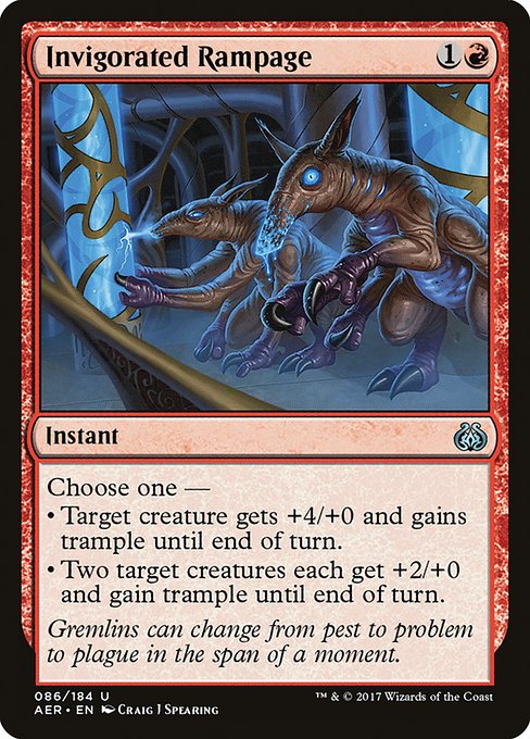
If you’ve ever leafed through an Aether Revolt booster and paused to admire the text treatment on a simple but punchy red instant, you’re not alone. Invigorated Rampage is a compact study in how typography, color, and card anatomy work in harmony to deliver a moment of action that feels as cinematic as it reads. At first glance, you spot the mana cost {1}{R} in the top-right, a clear signal that fiery tempo and direct impact are the name of the game. The card’s layout—normal, with a black border and a 2015 frame—stays faithful to the modern template, yet every line of text is a designer’s puzzle piece that nudges you toward the decision you’ll make in combat. 🧙♂️🔥
Invigorated Rampage is an Instant from the uncommon slot in Aether Revolt, a set that leans into artifact-themed chaos and bold spell design. Its rarity informs not just collectible value but typographic weight: the card must convey urgency without crowding its own typography. The oracle text presents two distinct choices, both centered on one primary concept: bolstering a creature force with trample. The first option—“Target creature gets +4/+0 and gains trample until end of turn”—reads like a sudden blast of confidence, while the alternative—“Two target creatures each get +2/+0 and gain trample until end of turn”—feels like a cooperative surge, a push that can swing multiple small combats into a winning moment. The way this is broken into lines and bullets on the card surface is a masterclass in semantic rhythm: short phrases, strong verbs, and a trailing sense of momentum that mirrors the spell’s effect. ⚔️
Flavor text aside, the layout itself acts as a quick-read dynamic: the “Choose one —” line sets a decision-making tempo, and the subsequent sub-points visually anchor the player to the consequences of each option. The red color identity reinforces aggression and direct impact—traits you feel as you economically parse the difference between a single power spike and a broader, dual-target surge.
Design Cues: How Red, Rhythm, and Readability Converge
Color, typography, and spacing all do work here. The card’s mana cost sits in a compact cluster, with a human-friendly gap beneath to separate it from the type line. The type line simply states “Instant,” a clean cue that the card’s tempo will be swift and decisive. The text box uses a readable line length and a balanced line-break pattern to avoid illusionary clutter when you scan the two modes. The card’s art—Craig J Spearing’s illustration housed in Aether Revolt’s 2017 frame—engages the eye with motion lines and a burst of red that the typography then echoes in the text’s intensity. The artist’s work, paired with a bold, concise spell description, creates a visceral surge of energy each time you read it. The result is not merely informative; it’s cinematic. 🎨
From a typographic standpoint, designers must juggle the layout’s constraints: a small mana cost in the upper corner, a bold card name, a concise type line, and a structured text block that can hold two distinct outcomes. Invigorated Rampage does this with aplomb. The line breaks are purposeful, with the “Choose one —” selector acting as a micro-CTA that nudges you toward a specific tactical path. The second option’s “Two target creatures” phrasing broadens the spell’s perceived scope, and the spacing around the bullets creates a rhythm that invites careful consideration rather than a rushed read. In print, this is a delicate balance of emphasis and restraint—the hallmark of good card typography. 🧙♂️
- Mana cost and color balance: The red mana symbol sits in a compact stamp, signaling aggression while leaving room for the narrative text to breathe.
- Text box hierarchy: The “Choose one —” line anchors the decision, followed by two clearly delineated options, each with its own power/toughness swing and trampling bite.
- Flavor text and flavor alignment: The flavor line about gremlins subtly complements the card’s aggressive, spur-of-the-moment decision-making. The visual energy of the art and the text’s pace work together to convey a moment of impulsive action. 🔥
- Rarity and balance implications: As an uncommon, Invigorated Rampage is designed to feel pivotal in the right red strategies without flooding or overpowering standard spell density. The typography mirrors that balance—compact, punchy, and highly legible even at a glance. ⚡
- Frame and border choices: The 2015 black border and the standard frame keep the card legible across formats while ensuring that color and spell effects are unmistakable, even in quick play. ⚔️
Collectors and players alike appreciate the way the card’s art and typography align with the mechanistic content. The numerical values—cmc 2.0 and the exact +4/+0 or +2/+0 boosts—are presented with precision, because in competitive settings, clarity is as vital as power. The rarity tag, the set symbol, and even the subtle italicization in certain releases—all contribute to a holistic design language that players recognize instantly when they reach for a red instant in their deck. 💎
Gameplay Silhouette: How Invigorated Rampage Plays in Red Decks
Mechanically, this card shines in tempo-forward builds. In a world of creature fights, a single-target +4/+0 spike can erase a threat and push through precisely what you need to land the final blows. The alternative option—bolstering two creatures—offers a wider window of play against boards with multiple small threats or when you want to set up a lethal alpha strike with trample on multiple units. The decision point invites strategic timing: are you saving the spell for one powerful swing, or are you accelerating two fliers to ensure a multi-pronged assault? The typography guides your eye to these decisions with clear punctuation, so your brain reads the card as fast as your mouse-clicks or your whip-crack draws. 🧙♂️
In a set like Aether Revolt, where artifact synergies and red aggression collide, Invigorated Rampage fits neatly into decks that prize momentary power bursts. You’ll often see it played to finish off a swinging opponent or to accelerate a triumph in a crowded battlefield. The red mana identity makes the spell an obvious pick in those shells, while the layout ensures that players comprehend its two routes at a glance—an important feature in both casual and competitive environments. 🎲
Market Pulse and Cross-Promotional Note
For collectors, the card’s pricing tells a story of accessibility and appeal. Non-foil copies sit around a few tens of cents to a couple of dollars depending on condition and rotation legality, while foil versions command a modest premium—the kind of card that sits nicely in a casual sideboard or a value-focused trade binder. Even at modest prices, Invigorated Rampage remains a neat artifact of red’s impatience and momentum, a reminder that even a two-mana spell can shape a game’s tempo in a heartbeat. If you’re building a themed collection around the Aether Revolt era, the typography and layout details make this card a tasteful inclusion that fans will recognize and study. 💎
Meanwhile, if you’re scouting real-world gear for transporting your MTG life on the go, consider merging your hobby with practical accessories. A good phone grip kickstand can keep distractions at bay during long drafts or late-night leagues—and you can check a curated selection at the product link below. The cross-promotion is gentle, but the synergy is real: a well-tuned table experience pairs nicely with well-designed cards. 🧙♂️⚔️