Image courtesy of Scryfall.com
Evolution of MTG Card Frame Designs
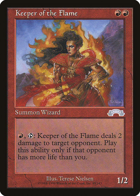
If you’ve ever shuffled a stack of vintage MTG cards and then peeled your eyes toward the edges of the art, you’ve felt the pulse of design change in real time. Frames are more than decorative borders; they’re a visual language that signals what the game values at a given moment—clarity, art, and the flow of combat. The Keeper of the Flame offers a pristine lens into an era when the game was still calibrating its identity, even as it lit the spark for countless iconic moments 🧙♂️🔥. This uncommon red creature from Exodus (1998) sits in a frame that many fans now recognize as the 1997-era style—an evolution that bridged the early, text-dense days with the cleaner, more legible layouts that followed. "
Keeper of the Flame is a compact two-mana investment in red that embodies the era’s belief in a fast, direct line of play. With a mana cost of {R}{R} and a 1/2 body, this Human Wizard is all about turning life totals into aggressive pressure. Its activated ability—{R}, {T}: Choose target opponent who has more life than you do as you activate this ability. This creature deals 2 damage to that player—asks you to make a gut-check call: do you fight fire with fire when you’re behind? The card’s design rewards players who are comfortable trading life and tempo for reach, a quintessential red gamble that still feels fresh in the age of dual lands and powerful"Weenie" obsessive strategies ⚔️🎲. "
The Exodus frame in question is a snapshot of late-’90s MTG, where borders grew bolder and the card window began to balance more generous art with practical readability. The Keeper’s typography sits within the era’s slightly taller text box, and you can see the frame’s emphasis on the mana cost in the upper right corner and the overall silhouette that many collectors affectionately call the “1997 frame.” It’s a style that many players now identify with vintage drafts and early tournament chatter—the kind of design that invites both nostalgia and spirited debate about readability and ornate artwork 🎨💎. "
What the card teaches about frame design in play
From a gameplay perspective, the Exodus-era frame is less forgiving on tiny details than today’s borderless or modern-bordered masterpieces, but it anchors the flavor of the card. The Keeper’s ability requires you to weigh your life total against your opponent’s; the frame around the text helps you focus on the crucial lines: the cost, the tap symbol, and the damage shot that can swing a game’s momentum. The art, courtesy of Terese Nielsen, leans into a fiery aesthetic that resonates with the name—Keeper of the Flame—while the frame keeps that narrative legible across different lighting in a draft booth or a kitchen-table showdown 🧙♂️🔥. "
Historically, card frames have traded off between flavor and function. Early black-bordered frames prioritized dense text and mechanical clarity, while later iterations experimented with art integration, border width, and the legibility of the mana symbols. Exodus’ frame sits at a crossroads: it’s not as streamlined as later 2000s frames, but it’s unmistakably evocative of the era’s bold color contrasts and theGravity of red burn spells. Collectors often encounter Keeper of the Flame in a nonfoil guise, with the Exodus set symbol and a border that communicates its vintage pedigree at a glance ⚔️. "
Frame milestones in the MTG timeline
- Early days: Black-bordered frames with compact text and heavy lore. The art often shared space with blocky mechanical text, making the layout feel tactile and dense 🎲.
- New frame era (late 1990s): The 1997-era frame refined readability, enhanced art presentation, and a more balanced card silhouette. Exodus sits comfortably here, marrying flavor with functional design.
- Modern border reshapes (2000s–today): Subsequent redesigns pushed toward clearer typography, subtle shading, and, eventually, borderless or lightly framed cards in various sets. The goal shifted from “maximum art impact” to “speedy playability,” especially for drafting and commander rundowns 🔥🧙♂️.
Keeper of the Flame rides that transition nicely: you can feel the tail-end of the older, more cramped typography and the mid-trajectory toward the cleaner readability that has defined modern sets. Its 1997 frame is a badge of that transitional beauty—ornate enough to feel special, but still perfectly legible at a glare-heavy table. The card’s red pipeline—two mana, a life-levered burn spell—remains a didactic reminder that design isn’t merely cosmetic; it shapes how you read the board and decide when to pull the trigger 💎⚔️.
Flavor, art, and collector vibe
Terese Nielsen’s illustration for Keeper of the Flame nudges the imagination toward a wizard who keeps an inner furnace lit—an image that the Exodus frame only amplifies. The combination of a fiery red spell, a two-damage burn option, and a life-total calculus makes the card feel like a vintage spark plug in a modern engine. For players who adore the intersection of lore and mechanics, the Keeper serves as a perfect case study in how set identity—Exodus’ era, Nielsen’s distinctive line work, and the 1997 frame—coheres to tell a story on cardboard. Collectors who chase vintage frames often prize the Exodus uncommon highly for its historical resonance and the sheer memory-evoking design language it carries 🧙♂️🔥. "
Even in today’s meta, the card’s flavor and design choices continue to spark conversations about how far red can push a game’s tempo. The card’s invoked flame—ephemeral, dangerous, and thrilling—is mirrored in the way the frame invites you to lean into risk whenever you read the activated ability. It’s a small reminder that MTG’s best cards aren’t just about numbers; they’re about moments you’ll remember around a table—moments where a plan comes together with a single, blazing decision 🎨🎲.
Notes on value and cross-promotion
Keeper of the Flame is an uncommon from Exodus, a reminder of the era when players drafted with fervor and trade moderately priced rares and uncommons with friends after a long night of play. Its price sits in the accessible range, reflecting both its age and its enduring appeal among vintage and legacy players who savor the 1997 frame’s aesthetics. The card’s power and impact in a focused red shell—especially in casual formats—keep it relevant as a collectible that captures a specific design philosophy. If you’re chasing memorabilia that pairs well with faithful display and practical use, you’ll find the right balance in the frame’s history and the card’s fiery temper 🧙♂️🔥. "
For fans who love pairing their decks with stylish, protective display, a neon card holder phone case can be a fun counterpoint to the Keeper’s blazing energy. It’s a playful nod to the way MTG culture invites thoughtful, themed accessories that celebrate both the game and its vibrant art. If you’re curious to explore a fit that’s as fearless as a two-red-mana play, check out a product that keeps your cards and phones safe in equal measure.