Image courtesy of Scryfall.com
Frame evolution in MTG: a journey through eras
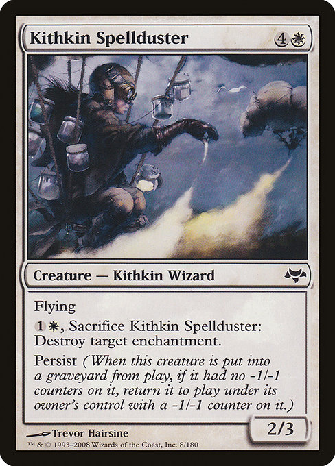
If you’ve ever thumbed through a collection of vintage MTG cards and then picked up a modern booster, you’ve felt how the frame carries a memory as vivid as the artwork. The Kithkin Spellduster, a white creature from Eventide released in 2008, sits at a charming crossroads of design philosophy and mechanical clarity. Its 2003-era frame — the standard for many years — is a perfect example of how frame decisions can quietly sculpt how we read, cast, and collect. The card itself is a neat microcosm: a flying white wizard with a practical ability to destroy enchantments, all while carrying the Persist mechanic that rewards thoughtful play even after a creature dies. 🧙🔥
Eventide’s frame speaks to a design moment when Wizards of the Coast was tightening readability, maximizing the legibility of abilities, and streamlining the layout for both paper and the growing digital space. The 2003 frame is recognizable for its balanced white space, the bold mana-cost line, the centered card-name typography, and a rules text box that feels less cramped than some of its earlier siblings. When Kithkin Spellduster steps into play, you’re not just looking at a creature with flying; you’re looking at a snapshot of a time when the contract between card face and player was being refined for better comprehension during high-tension board states. 🎨
Two features in particular anchor frame evolution for this card: the color-accurate mana cost on the top left and the way the rule text is laid out beneath the image. The mana cost {4}{W} gives you a sense of a midrange white creature with a respectable body (2/3) and a useful spark of control. The Persist keyword—returning to the battlefield with a -1/-1 counter if it dies without one—was a hallmark of the era’s flavor for “sticky” survivability. The frame supports that storytelling by keeping text blocks tidy and ensuring that keywords are legible even when you’re studying a card in a crowded hand or on a cluttered battlefield. ⚔️🧭
What changes in frames actually changed on the battlefield?
To MTG veterans, frame changes are less about cosmetics and more about readability and a modular approach to design. Here are a few touchpoints that frame evolution helped unlock, with Kithkin Spellduster serving as a gentle ambassador for the era:
- Layout discipline: The 2003 frame maintains a clean separation between name, mana cost, type line, and rules text. This makes it easier to parse a card’s core identity at a glance, which is critical when you’re pondering casting timing or sequencing with Persist triggers and enchantment destruction. Beauty in clarity matters when a card’s decisions hinge on precise wording.
- Iconography and readability: The white mana symbol sits proudly alongside the cost, while the rules text remains readable at a width that’s friendly to sleeves and sleeves-to-tabletop play. For a creature that can destroy an enchantment, the clarity of its activated ability is essential — you don’t want to misread a line and sac a crucial blocker by accident.
- Color identity and consistency: Frames started to emphasize consistent color identity cues, helping players quickly identify which colors a card belongs to, even when you’re skimming a trap-filled board. Kithkin Spellduster’s white aura is complemented by the frame’s clean lines, reinforcing its role in white’s toolbox: tempo, protection, and targeted removal of problematic enchantments.
- Foil and print variation: The Eventide frame’s durability translated well into foils and reprint cycles. For a common with a foil option, the frame remains legible and collectible, allowing players to enjoy the foil sheen without compromising readability or the artwork’s impact. The card’s foil availability is a reminder that frame design also drives the tactile experience of collecting. 💎
As the years rolled on, Wizards experimented with further refinements, including subtle shifts in text size, border weight, and the relative height of the card face. The result was a more consistent reading experience across a wide array of card types, panels, and keywords. The Kithkin Spellduster card, with its Flying and Persist, demonstrates how a well-chosen frame can support not just the mechanical text but the dramatic feel of a creature that thrives on persistence and quick, decisive action. 🎲
“The frame is a map of the card’s personality: it can hint at speed, resilience, and the rhythm of a duel.”
From a collector’s perspective, the 2003 frame is beloved for its crisp corners and the sense that every line has a job. The common rarity of Kithkin Spellduster makes it a frequent sight in casual White Weenie decks, but its Persist capability gives it a surprising line of play in stalemates where a timely enchantment destruction swing can tilt the balance. The card also serves as a reminder that frame choices aren’t just about aesthetics; they influence how players read, memorize, and react to a card in real-time combat. ⚔️
Beyond the mechanics, the art direction deserves its own praise. Trevor Hairsine’s illustration for Kithkin Spellduster leans into the luminous, almost ethereal quality that white creatures in this era often carried. The painterly approach pairs with the frame to evoke a moment of arcane focus — a wizard who hunts what binds enchantments in place. It’s easy to overlook how art and frame work together to tell a story at the table, but when you catch a glimpse of the card’s full art or a well-lit foil, you feel the synergy. 🎨
For players who love the broader arc of MTG design, Kithkin Spellduster is a nice case study in how a card’s frame supports its function. It sits in a period when the game was balancing grand, mythic storytelling with the day-to-day practicality of building a deck, slamming down a beat, and peeling away a problematic aura with a precise sacrifice. The white border, the 2003-era geometry, and the crisp typography all work in concert to serve the moment you need to destroy an enchantment while keeping a stubborn attacker on the board. 🧙🔥
Frame evolution in practice: what to look for today
Modern MTG frame design continues to honor legibility while exploring new printing formats, including borderless art and alternate frame treatments for premium products. When you crack open a newer booster and glimpse the same spirit in a refreshed frame, you’re witnessing a living history: how a game designed to be played with pencils, sleeves, and dreams adapts to a digital era and a global community. The lineage—from those early, chunky frames to the sleek modern lines—remains a living archive of a hobby’s growth. And cards like Kithkin Spellduster remind us that sometimes a card’s most enduring legacy is how it looks while it does its job. 🧙🔥💎⚔️
- Key takeaways for frame enthusiasts: readability drives playability; consistent iconography lowers cognitive load; foils preserve the visual story without sacrificing clarity.
- Collectors note: foil versions often ride the wave of nostalgia for the era, while nonfoil prints remain accessible for budget-conscious players who still want a classic look on the battlefield.
- Design takeaway: a well-designed frame makes a good card feel great in your hand—whether you’re brewing in a commander pod or contentedly drafting with friends.
If you’re curious to see more about the tactile world of MTG collectibles, you can explore deals and curiosities that cross into lifestyle gear, like the sleek Blue Abstract Dot Pattern Tough Phone Case linked below. It’s a small wink to how the MTG community loves to carry the magic beyond the game table. And if you’re chasing a concrete collectible experience, consider how the frame of a card influences your fond memories of a duel long past. 🧙🔥