Image courtesy of Scryfall.com
The Evolution of MTG Card Frames: Lava Storm as a Time Capsule
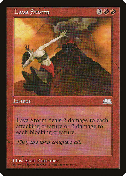
If you’ve ever leafed through a Weatherlight booster and paused to study the borders, you know there’s more to MTG frame design than mere decoration. The frames are a living timeline, a visual diary that tracks how Wizards of the Coast translated mana, myth, and memory into a readable, playable interface. In the mid-1990s, when Lava Storm first drafted its flame into the annals of the Weatherlight set, the card frame was a compact canvas: bold black borders, a sturdy type box, and a strong emphasis on art that felt both heroic and a little rough around the edges. That era—Frame 1997—wasn’t just about aesthetics; it shaped how players scanned a card for mana cost, rules text, and flavor in a single breath. 🧙♂️🔥
Lava Storm itself, an instant from Weatherlight (set code WTH) with a mana cost of {3}{R}{R}, lands squarely in red’s wheelhouse: a straightforward payoff that punishes aggression by blasting every attacker or every blocker. This is a card whose power is measured in consequences—the battlefield becomes a lava field, and the timing of damage is everything. Its rarity is common, but its design speaks to a larger truth: the frame is part of the spell. The heat of Lava Storm doesn’t just come from the mana in its casting cost; it radiates outward through the card’s typography, art box, and border. The artistry by Scott Kirschner, paired with a 1997 frame, makes it a perfect snapshot of early modern MTG’s balancing act between readability and flavor. ⚔️🎨
Why Frame Matters: Readability as a Core Design Principle
Early frames were designed to maximize legibility on a crowded battlefield. The rules text lived in a dense block, while the flavor text waited in the margins, sometimes as a whisper rather than a shout. In Lava Storm’s case, the text is clear: an instant that deals 2 damage to “each attacking creature or Lava Storm deals 2 damage to each blocking creature.” The bifurcated wording, with the choice depending on the creature’s status, is a good example of how a frame carries a heavy burden—conveying precise rules while preserving the drama of the scene. The red color identity is reinforced by the crimson hue of the mana symbols near the top, and the boldness of the frame anchors the card in the red aggressor’s tradition. This is the type of synergy that frame design aims to preserve: color identity, mechanical function, and narrative moment all aligned. 🧙♂️🔥
From Frame 1997 to a More Modern Palette: What Changed?
As the years rolled on, MTG experimented with the balance between art, text, and readability. The 1990s gave way to a design language that gradually opened up space around the art and moved text blocks into more predictable corners. In later frames, you’ll notice subtler outlines, more generous margins for flavor text, and a shift toward a slightly brighter overall feel that keeps the card legible even as the art grows more dramatic. Lava Storm’s 1997-era design sits at the intersection of compact text and bold illustration—easy to spot on a cluttered table, but with a certain rugged charm that modern collectors often treasure. The frame’s black border, the square art box, and the dense rules text are all signals of a time when MTG was still defining how to present a fantasy duel as a clean, navigable game. 💎
As the game expanded, Wizards experimented with frame geometry to accommodate larger creatures, more elaborate artwork, and occasionally larger flavor texts. The result was a gradual shift toward greater white space around the art and a rebalancing of where information lands on the card. Lava Storm, with its two-line title area and its two-line rules block, demonstrates the older template’s preference for a denser information footprint—the kind of footprint that could feel nostalgic to players who started collecting during the Weatherlight era. The evolution wasn’t about sacrificing flavor for function; it was about refining function to keep pace with the growing complexity of the game. 🪄⚔️
Gameplay, Lore, and Aesthetics: A Triad That Frames the Card
Beyond the mechanical text, Lava Storm also carries flavor text: “They say lava conquers all.” That line sits in a long tradition of MTG flavor that uses elemental forces to reflect a card’s disposition in the world. The Weatherlight era framed magic through a Renaissance of fantasy storytelling, and Lava Storm’s frame helps sell that narrative: a fierce, volcanic spell that punishes both attackers and blockers alike. In a modern context, the card’s aesthetics still resonate, especially among players who appreciate vintage frames for their tactile heft and period-specific silhouette. The frames tell a story about how players interacted with the game—physically shuffling pages, turning a card over, and reading the crisp, compact rules text that defined a generation of duels. 🧲🎲
Collectibility and Cultural Footnotes
Weatherlight-era commons like Lava Storm are affordable curiosities today, with price points around a few cents to a few dimes depending on condition and language. Yet their value is not solely monetary. They’re earned through nostalgia, and their frame design is a badge of memory—an artifact that signals a specific era of play and art. The card’s non-foil finish and black border are telltale signs of the era, and the art by Scott Kirschner carries a fidelity to the period’s fantasy aesthetics. For collectors and players who love the tactile feel of a 1997 frame, Lava Storm remains a touchstone in the ongoing conversation about how design, color, and mechanics interact on an MTG card. The frame isn’t just a border; it’s a document of how far the game has come while reminding us of the thrill of lava-hot plays that can swing a game in a heartbeat. 💎🔥
Looking Ahead: The Future of Frame Design
As digital interfaces become more prominent and reprint campaigns push for consistent readability across formats, the MTG frame continues to evolve in subtle but meaningful ways. We’ve seen experiments with borderless art, alternate frame treatments for special sets, and a renewed emphasis on legibility in a world of increasingly complex effects. Lava Storm’s enduring charm lies in its ability to be both a memory and a data point—proof that the frame is a language as important as the spell itself. For players, this means continued exploration of how a frame can support fast, accurate decision-making while still offering a dash of personality. The next leap could feature adaptive typography that scales with display size or dynamic color cues that help players identify red spells at a glance—without sacrificing the classic, tactile joy of a card from Weatherlight. 🧙♂️🎨
- Frame 1997 era: robust borders, compact art, dense text blocks.
- Later frames: more white space around art, refined typography, improved readability.
- Special releases: borderless or alternate frame variants that celebrate lore and art.
They say lava conquers all, and in the flame-warped world of Lava Storm, that truth is echoed on the card’s border as much as in its spell text. 🔥
If you’re feeling inspired to dive deeper into the world of MTG frames, I’d wager a friendly nudge toward some hands-on curiosity. Look at Weatherlight-era cards and compare them with modern sets—the way light falls on a dragon’s scale in one print and the crisp, airy margins in another. You’ll hear the echoes of a hobby that has grown up with its players, always refining, always storytelling, forever playing with fire. And who knows—the next frame redesign might just make your favorite lava spell feel new again. 🎲🧙♂️