Image courtesy of Scryfall.com
Visual Composition and Gothic Direction in Lich’s Tomb
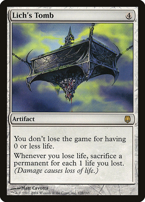
Every MTG card is a doorway into a world, but some doors swing open with a peculiar gravity—the kind that pulls you into a candlelit crypt where every stone has a story. Lich’s Tomb, a rare artifact from Darksteel, is one such doorway. Its card art, crafted by Matt Cavotta, isn’t just a pretty image; it’s a study in how visual composition and gothic direction can encode gameplay philosophy and flavor into a single frame. 🧙🔥💎
Architectural Frame and Diagonal Tension
The composition places the viewer within a tomb’s narrow corridor, where receding arches and bone-white masonry create a sense of distance and inevitability. Diagonal lines—ledger stones tilting away, the slant of a coffin lid, the skeletal silhouette in the gloom—guide the eye toward a central, ominous focal point. This is Gothic storytelling in two dimensions: the architecture does the lamenting, while the lich within hints at the price of curiosity. The effect isn’t merely scary; it’s narratively efficient, signaling that the moment you step into this tomb, life and its margins become a perpetual negotiation. ⚔️
Lighting, Color, and Materiality
In Darksteel’s era, the palette leans toward the industrial and the ethereal in equal measure. The artwork balances cool, steel-like grays with warmer candlelight glows, creating a chiaroscuro that makes the tomb feel tangible yet haunted. The light seems to spill from unseen sources, winding around crumbling stone and a perched, skeletal figure—an intentional contrast that echoes the card’s rules: even in a colorless world, life and loss cast long shadows. This kind of lighting doesn’t just illuminate form; it conveys the latent rules of the card’s life mechanic—loss, sacrifice, and the eerie persistence of the undead. 🎨
Character and Atmosphere: The Lich Within the Tomb
The central figure is quintessentially cadaverous: a lich presiding over a crypt with regal stillness. The pose isn’t over-the-top heroics; it’s a quiet, inexorable command. The atmosphere—cool stone, amber glow, and the weight of centuries—translates the card’s flavor into an impression: death is not a spectacle here, it’s an economic reality, a ledger you carry as you navigate the game’s life total mechanics. The art direction makes the tomb feel personal, as if the lich keeps a private archive of every life lost and every permanent sacrificed in its name. 🧙🔥
Colorless Aesthetic, Gothic Mood
Lich’s Tomb sits in the colorless domain, a rarity that feels paradoxically rich in gothic mood. The lack of color isn’t a limitation; it’s an editorial choice that emphasizes form, texture, and silhouette. In a world where most vampires and necromancers crave chromatic signaling, this artifact leans into monochrome permanence—the stone, metal, and bone forms speaking louder than palettes ever could. The result is a visual language that’s unmistakably Darksteel: clean lines, precise edges, and a sense of inevitability that mirrors the card’s mechanical clause about life loss and sacrifice. This is the aesthetic equivalent of a grave marker with a perfectly etched inscription: minimal, monumental, and memorable. 🧱⚰️
Symbolism, Mechanics, and Visual Metaphor
The art direction doesn’t stop at mood; it aligns with the card’s core mechanics. You don’t lose the game for having 0 or less life—a concept that could feel abstract in a vacuum, but is rendered tangible by the tomb’s graphic logic. Each time life is lost, the tomb’s gravitas calls for sacrifice: “Whenever you lose life, sacrifice a permanent for each 1 life you lost.” The imagery—an artifact anchored in a necropolis, a hall of quiet demands—serves as a visual mnemonic for the card’s risk-reward dynamic. It’s a design win when the art helps players anticipate strategic decisions: do you push for lifetotal swing at the cost of permanents, or play a careful game that keeps your resources intact? The visual language reinforces that calculation with a sense of looming consequence. 🧩
Artist’s Hand: Matt Cavotta’s Signature Style
Matt Cavotta’s work on Lich’s Tomb harmonizes with the broader early-2000s MTG aesthetic: crisp linework, restrained color use, and a love for architectural narration. Cavotta’s tomb feels tactile—stone textures, metallic glints, and skeletal forms that read clearly from a card’s compact canvas. It’s a reminder that great card art isn’t just about pretty scenes; it’s about shaping a card’s identity through composition, texture, and atmosphere. Fans often cite Cavotta’s ability to blend fantasy romance with grim realism, a balance that makes Lich’s Tomb feel venerable and inevitable in every sense. 🎨
Gameplay Relevance and Collectibility
Beyond aesthetics, Lich’s Tomb interacts with the deeper mechanics of lifeloss and permanents. In constructed play, this artifact can be a tempo-conscious choice for decks that lean into disruptive life totals, where each life swing must be weighed against the need to maintain a board presence. It’s not a flashy combo piece, but its elegance lies in the way it shapes decisions—triggering sacrifices as life declines—turning the tomb into a strategic throttle on the pace of the game. Collector-wise, its rarity and age—DST’s Darksteel era—make it a desirable piece for players who cherish both the lore of necromancy and the artifact’s archetypal design. The card’s price reflects not just its playability but its enduring appeal as a visual artifact of a distinctive era. 💎
Collectible Value and Cultural Resonance
Darksteel marked a milestone for artifacts, and Lich’s Tomb remains a touchstone for fans who savor the gothic branch of the MTG multiverse. The combination of a timeless subject (the undead archivist) and a stark, modern execution represents a bridge between fantasy heritage and game-ready design. As players and collectors seek to curate shelves that tell a story, this piece offers a compact narrative of life, loss, and the quiet dread of a tomb that never rests. For those who love the vibe of necromantic lore, this card art is a standout, a canvas that invites not just admiration but interpretation. 🧙♀️🗝️
In Closing: A Visual Textbook for Gothic Card Art
If you’re assembling a mood board for MTG art direction, Lich’s Tomb sits near the top as a masterclass in how to fuse form and function. The tomb’s architecture, the moody lighting, and the lich’s restrained majesty all serve a singular purpose: to foreground the emotional logic of the card’s rules. It’s a reminder that the best magic cards are not only about what they do, but how they look when they do it—that perfect synthesis of narrative and mechanics that keeps players coming back for another look, another turn. 🧙♂️⚔️
For fans who want to cradle this art in a practical, everyday accessory, there’s a companion product that pairs well with the vibe: a phone grip kickstand holder designed to keep your device steady during lore-filled reflections or quick deck-building sprints. It’s a playful nod to the craft of tabletop culture, bridging the tactile world with the digital rituals of modern play. Check it out and bring a little of the tomb’s gravity into your daily carry.
Image courtesy of Scryfall.com
Interested in more MTG-themed gear that complements your collection? The following link opens a world of accessories that celebrate the art, the lore, and the play style you love: