Image courtesy of Scryfall.com
Lightning Reaver Typography: A Deep Dive into MTG Card Layout
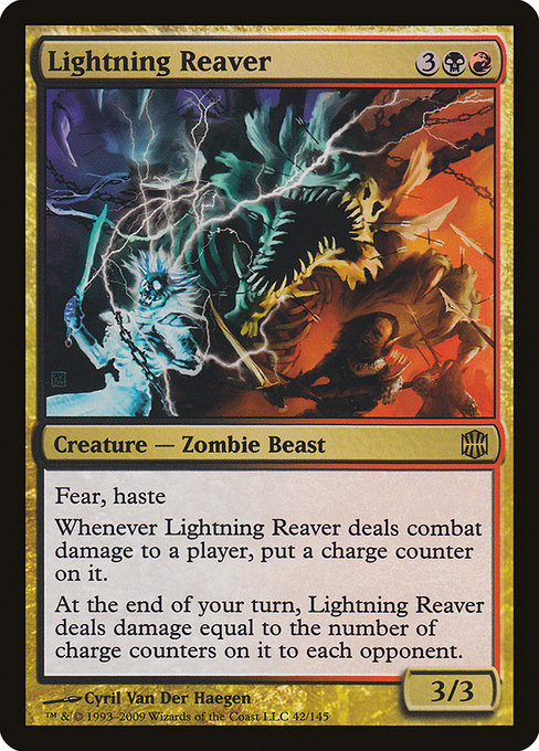
Card design in Magic: The Gathering isn’t just about what’s on the battlefield—it’s a visual language that communicates power, risk, and strategy at a glance 🧙♂️💎. Lightning Reaver, a rare Zombie Beast from Alara Reborn, is a striking exemplar of how typography and layout work together to tell a story of aggression and chaos. With a mana cost of 3BR and a robust 3/3 body, this creature demands attention in both gameplay and presentation. The moment you read its bold Haste and Fear keywords, you’re reminded that color identity isn’t just a mechanic; it’s a design choice that informs how you read the card as a whole ⚔️🎨.
Two-toned identity: mana cost, color, and typographic emphasis
The mana cost for Lightning Reaver sits prominently in the upper right of the card, a familiar anchor in MTG’s typographic choreography. The combination of {3}{B}{R} signals a hybrid identity—black and red—whose visual rhythm influences decisions long before the first attack timer ticks. The black mana symbol’s angular silhouette contrasts with the scarlet glow of red, creating a tension that mirrors the card’s dual nature: ferocity and fear. This is not merely ornamentation; it’s how the eye parses cost, speed, and potential damage in a single breath 🧙♂️🔥.
- Name and type line: Lightning Reaver, a Creature — Zombie Beast. The line rests on a compact baseline that keeps the card readable in crowded zones of the battlefield and in the clutter of casual playgroups.
- Mana cost typography: colored mana symbols are given weight in the card’s top-right corner, ensuring that players instantly perceive the switch from early-game acceleration to mid- to late-game power spikes.
- Rules text hierarchy: the bold, legible rules block communicates a three-part loop: Haste, Fear, and a recurring end-step damage payoff tied to charge counters. The design aligns with the card’s tempo—a nimble, evasive behemoth that punishes slow play and rewards aggressive momentum.
Mechanics as typography: reading the rules text
The actual rules text on Lightning Reaver reads: “Haste; fear (This creature can't be blocked except by artifact creatures and/or black creatures.) Whenever this creature deals combat damage to a player, put a charge counter on it. At the beginning of your end step, this creature deals damage equal to the number of charge counters on it to each opponent.” The wording itself is compact, but the layout adds legibility. The two keyword lines sit at the start of the block, signaling immediate action—the headset-ready beep before a play, if you will. Then the counter mechanic flows into an end-step payoff, a classic design twist that folds text into a strategic arc. The cadence of the font, the spacing, and the line breaks all cooperate to help you quickly assess risk when you’re deciding whether to swing with a 3/3 Zombie Beast that trembles with counter-charged potential 🧪⚡.
Layout, rarity, and the Alara Reborn frame
Alara Reborn (ARB) shipped in a stylish frame that emphasized contrast and bold color blocks. Lightning Reaver’s rarity is marked as rare, which in practical terms means the card often sits at a nice spot in the collector’s queue: not the most scarce, but with enough flair to stand out in a binder or a deck. The black border, classic frame, and high-contrast art direction from Cyril Van Der Haegen contribute to a look that’s simultaneously vintage and punchy. The “nonfoil” and “foil” finishes offer tactile and visual variation—from textured foil glints to a cleaner look in nonfoil—each affecting how the art and typography breathe on a printed surface 💎🎲.
“Haste” gives Lightning Reaver the instant tempo to press early pressure, while “Fear” ensures that your opponent feels the weight of your color philosophy—the fear of being unable to block a black-red threat unless they’ve got the right artifacts or black creatures in play. The card’s type line, its ornate name typography, and the careful alignment of the rules text all work in concert to make the card feel fast, dangerous, and deliciously dicey 🧙♂️⚔️.”
Strategy through the lens of typography
From a gameplay perspective, Lightning Reaver rewards offensive, tempo-centric play. The haste clause removes the chill-out phase and puts immediate pressure on the opponent. The fear trait limits blocking options, which is particularly punishing for decks that rely on wide boards or multi-colored blockers. The drip-feed of charge counters—earned as the Reaver deals combat damage—culminates in a punishing end step: damage equal to counters to each opponent. The typography reinforces this arc by placing the scoreline of power and risk in a compact block that’s easy to scan mid-combat. The visual cue of the keyword lines plus the counter-tracking prompt a mental checklist: can you push through enough damage before the end step, and how many counter steps remain before you erupt? The answer often depends on your mana and board state more than any single spell in hand 🧙🏻♂️🔥.
Design, color identity, and collector insight
Lightning Reaver is a vivid case study in how a design team uses color identity to shape expectations. The dual color identity—black and red—maps to aggressive, chaotic themes in both lore and layout. The card’s lore-friendly vibe as a “Zombie Beast” is reinforced visually by an art direction that leans into the feral, untamed energy of Alara Reborn’s shards. For collectors, the rarity and print run specifics (ARB, 2009) mean that foil copies present opportunities for premium display, while nonfoil versions remain accessible to broader players. The power-to-value ratio is respectable, with price points that reflect both nostalgia and playability in eternal formats and modern environments alike 💎🧭.
Cross-promotional note: gear for the modern MTG enthusiast
Beyond the battlefield, MTG fans often seek ways to carry cards and memories with style. The product linked at the provided shop URL offers a Phone Case with Card Holder—an elegant fusion of protection and portability for those who carry a little magic with them every day. It’s a subtle nod to the card-nerd lifestyle: a practical accessory that respects the game’s aesthetic while offering everyday utility. If you’re testing a red-black deck at a local store, this kind of cross-promotional gear keeps the hobby front and center, reminding us that MTG is as much about culture as it is about combat 🧙♂️🎨.
More from our network
- https://crypto-acolytes.xyz/blog/post/final-fantasy-xv-vs-xvi-a-side-by-side-showdown/
- https://crypto-acolytes.xyz/blog/post/how-block-propagation-works-in-solana/
- https://blog.digital-vault.xyz/blog/post/parallax-unveils-a-distant-luminous-blue-giant/
- https://blog.digital-vault.xyz/blog/post/how-to-introduce-new-features-without-alienating-users/
- https://blog.digital-vault.xyz/blog/post/vial-of-poison-unveiling-borderless-and-showcase-variants/
Phone Case with Card Holder – Impact Resistant Polycarbonate MagSafe