Image courtesy of Scryfall.com
Typography as storytelling: Lotleth Troll and the rhythm of a card frame
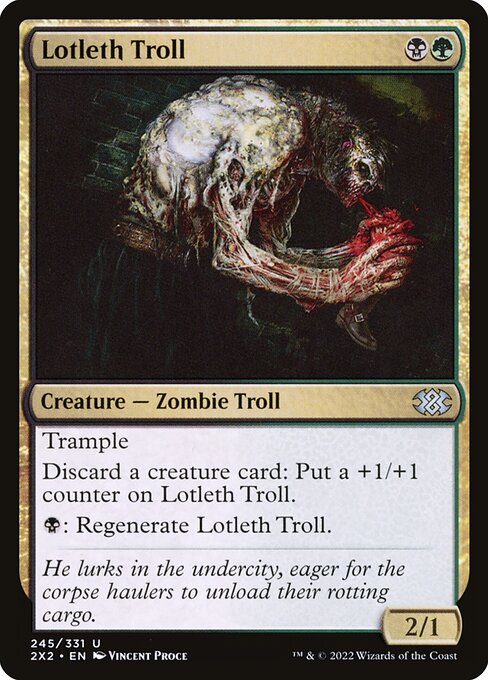
If you’ve ever taken a moment to study a Magic: The Gathering card beyond the spell text, you’ll notice how typography quietly tells a story all its own. Lotleth Troll, a card from Double Masters 2022, is a fine example of how a two-color creature card uses type, spacing, and emphasis to guide your eye—from the bold name across the top to the compact rules text block that carries the creature’s signature gimmicks. The layout isn’t just pretty; it’s practical: it communicates what the card does, in what colors, and under what conditions, all before you ever fully register the artwork’s mood. 🧙♂️🔥💎⚔️
The top of the frame: mana cost, name, and identity in harmony
Lotleth Troll carries a lean {B}{G} mana cost in the upper right, a small but crucial anchor for players. The two colors—black and green—are echoed in the card’s border hints, type line, and flavor, creating an immediate color identity cue that helps you sort it in a busy cube or a commander table. The creature’s name sits in bold type across the top, a classic MTG stand-in for identity and status. In the midst of a two-color spread, the name’s typography asserts presence without shouting, balancing hierarchy with readability. The font choices on modern frames build a sense of rugged fantasy—the kind you feel when you pick up a card that’s both grimy and glorious. 🧙♂️🎨
The body: type line, rules text, and the tactile feel of rules
The type line—“Creature — Zombie Troll”—is a compact capsule that anchors the card’s identity within the broader MTG taxonomy. The dash between creature types is not merely punctuation; it’s a well-timed pause that echoes the card’s mechanical tension. Lotleth Troll’s rules text sits in a legible block beneath the type line, starting with Trample and then the two-stage ability: an optional discard to empower the Troll, and a black mana activation to regenerate. The typography here favors clarity: the card uses evenly spaced lines, with emphasis on keywords like Trample and Regenerate so you can skim for the core mechanics at a glance. This is where the art direction meets gameplay: the layout ensures the reader absorbs both the sprint of combat and the subtle economy of discarding for counters. The result is a flow that feels tactile—as if you could almost reach out and feel the +1/+1 counters accumulate. ⚔️🧙♂️
Flavor text and the mood: lore lining up with letters
Flavor text is the whisper that softens the harsh edges of mechanics, and Lotleth Troll’s line—“He lurks in the undercity, eager for the corpse haulers to unload their rotting cargo.”—reads like a dungeon table entry. Typography here is intentionally understated, set in a smaller type with italicized cadence that distinguishes it from the rules text. The flavor line provides narrative weight, enriching the troll’s grimy, scavenger persona without interrupting the gameplay rhythm. When you pair the word choices with the type scale, you get a sense of the card’s atmosphere: a creature that thrives in the margins where disruption and opportunism meet. This is where design meets lore, and the typography helps carry that bridge with elegance. 🧩💎
Power, toughness, and the art of visual balance
Lotleth Troll’s p/t line—2/1—sits where you’d expect in the lower-right quadrant, a standard compression point that allows the eye to rest after the long rules text. The balance of space around the die-cut numbers, the name plate, and the art frame is a careful choreography. Even with a two-color identity, the card’s balance remains readable and legible at common play distances. Its lay-out is a good reminder that a strong card design doesn’t shout; it guides your reading with measured whitespace, consistent line heights, and a predictable left-to-right scan that mirrors how we think about action in a game. The subtlety here matters in deck building: you want to “see” the card’s capabilities at a glance, and Lotleth Troll delivers that with quiet confidence. 🧙♂️💥
Set, rarity, and the broader design language of Double Masters 2022
Double Masters 2022, captured under the 2x2 Masters banner, is a celebration of reprints and high-contrast foils. Lotleth Troll is marked as uncommon, a label that sits alongside the card’s foil/foil-etch interplay in the physical product line. The rarity informs how the typography and frame are treated in production: uncommon cards often use high-contrast typography and crisp line work to stand out in a stack of rares and mythics—the goal being legibility in all light conditions, from the crowded board to the dim gaming table. The art by Vincent Proce adds a tactile texture that the type system supports, letting the letters feel as gritty as the scene depicted. That synergy between art, text, and color makes the card feel like a compact module of a larger narrative. 🎨🧙♂️
Typography is the hidden scaffold of MTG design—the way a card breathes, even when the rules text is busy. When you see Lotleth Troll, you’re really seeing a careful grid where color, type, and iconography align to make decisions feel intuitive at speed.
Practical takeaways for players and designers
- Hierarchy matters: Name, mana cost, and type line establish the card’s identity before you read the rules. This quick recognition is crucial in multiplayer chaos where every second counts. 🧙♂️
- Color signaling: The B/G identity is reinforced by typography and layout choices that preserve readability across both colors, ensuring you can separate card roles in your mind at a glance. 🔥
- Flavor and function: A readable flavor line deepens immersion without compromising the clarity of mechanics. The balance between lore and rules text is key to lasting memory. ⚔️
- Print considerations: Rarity can influence production choices such as border treatments and foil, affecting how legible the text remains in different lighting. 🎲
For fans who love the tactile, tactile-visual arc of MTG, Lotleth Troll offers a compact case study in how typography, spacing, and iconography work together to tell a story on the tabletop. If you’re building a deck where green and black collide—perhaps leaning into discard synergy and resilient threats—the card’s design language makes the strategy feel clear and immediate. And if you’re curious to explore more products that celebrate the craft of gaming peripherals—and to keep your workstation as sharp as your Sabertooth Troll—I’ve found a product that fits the vibe: a practical, ergonomic memory foam wrist rest mouse pad (foot-shaped) to help you keep your focus when drafting late into the night.
Whether you’re dissecting a frame for a school project, or just admiring the way Lotleth Troll’s layout guides your decisions in real time, the combination of form and function in MTG typography remains one of the game’s most underrated pleasures. 🧙♂️🎲