Image courtesy of Scryfall.com
Martyrdom Card Art: Artist Commentary and Production Techniques
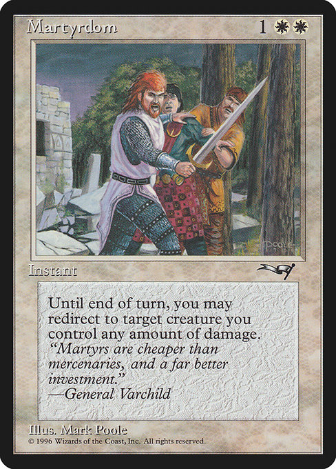
There’s something quietly electric about a Mark Poole piece from the mid-1990s: the clean lines, the restrained color palette, and the way a single moment of resolve can feel like a doorway into a larger story. Martyrdom, a white instant from Alliances, is a perfect specimen of Poole’s craft in a time when Magic was expanding its visual vocabulary as rapidly as its rules were expanding its reach. This article isn’t just about what the card does on the battlefield; it’s about how the art and production techniques of that era cultivate a sense of reverence, risk, and ritualistic heroism that fans still feel when they sleeve up a white-themed strategy. 🧙♂️🔥💎
From concept to canvas: Poole’s approach in the Alliances era
In the All set of 1996, Mark Poole’s illustrations often balanced idealized heroism with a practical, almost architectural clarity. Martyrdom showcases that balance through composition and lighting that guide your eye to the crucial moment: the instant where mercy and strategy intersect. The card features a white mana cost of {1}{W}{W}, signaling not only a cost in mana but a commitment to a defensive, pay-it-forward mindset. The artwork typically leans into a clear silhouette, with soft edge transitions and meticulously rendered highlights that feel almost like a stained-glass moment frozen in time. This was a period when many artists relied on traditional media—pencils, inks, gouache, and then a careful layering of airbrushed tones—to achieve a sense of depth that scans badly in early printing. Poole, however, had a knack for translating that depth into a readable silhouette, even on the small battlefield canvases of a common rare card. 🎨⚔️
“Martyrs are cheaper than mercenaries, and a far better investment.” — General Varchild
The flavor text, though simple, sits in dialogue with the card’s mechanics. It frames martyrdom not as fanatical sacrifice but as a deliberate economic choice—invest in your soldiers, and you minimize collateral damage by redirecting it. That idea threads through the art as well: the figure(s) depicted exude calm resolve, a readiness to absorb the impact of a hostile blow and usher it toward a more virtuous target. The production team behind Alliances aimed to give white a sense of sanctuary and stern duty, which Poole communicates with precise line work and restrained color splashes that read well even in the nonfoil print era. 🧙♂️💎
Production techniques of the era: what you notice in the image
- Line work and composition: Poole’s characters and settings are often delineated with crisp lines, allowing the viewer to read the scene quickly in a crowded draft of rules and card text. Martyrdom’s figure(s) are placed to maximize readability of the action as the “0” ability looms—a smart editorial decision that mirrors how players parse the card text in-game.
- Color and light: Expect a restrained palette—soft whites, cream undertones, and carefully tempered shadows. This wasn’t about flashy chroma; it was about mood and clarity, so that the moment of divine protection could feel both sacred and practical.
- Medium and transition: The mid-90s often used traditional media with digital touches for printing. The soft gradients and controlled highlights suggest gouache or acrylics layered with delicate airbrushing, then scanned for the all-important printing plate. The end result is a card that still reads crisply at common card sizes, with enough tonal nuance to reward close inspection. 🎲
- Iconography and symbolism: The angelic or martial figure, the shield-like aura, and the sense of protection all contribute to a narrative layer that complements the replacement effect’s mechanical flavor. These are not two separate experiences; they’re designed to reinforce one another in a single glance. 🔥
The design tether: how the card plays into your strategy
Martyrdom’s oracle text creates a tiny, tactical shield for a single creature you control: Until end of turn, target creature you control gains "{0}: The next 1 damage that would be dealt to target creature, planeswalker, or player this turn is dealt to this creature instead." Only you may activate this ability. This is a classic example of a replacement + conditional trigger that leans into tempo and board state. In practice, you’re not just protecting a creature—you’re buying time for a key attacker or a planeswalker you must safeguard from a decisive swing. It’s the kind of card that sings in attack-draw-metagame cycles where players need to navigate mass removal and targeted burn, especially because the “the next 1 damage” clause is precise and easily misread in the heat of a match. The white mana investment to cast two white mana is modest for the payoff: a turn-long shield that can turn a marginal board state into a winning one with the right timing. 🛡️⚔️
Historically, this card crept into old-school strategies that valued life-gain, creature protection, and careful sequencing. In a modern sense, Martyrdom reminds players that white has a long tradition of “protect-at-all-costs” responses, even when the effect is small by today’s standards. And while it’s not a staple in every deck, it remains a beautiful demonstration of how a single line of text can shape decision points—forcing your opponent to consider not just what they’ll kill, but where they’ll direct their damage to maximize effect. 💎🎨
Lore, market, and collector curiosity
As a common from Alliances, Martyrdom sits at an approachable price point in the vintage market, with current listing around a few tenths of a dollar for nonfoil copies. The card’s charm isn’t in the sheer power spike; it’s in the narrative of alliance-building and the ritualized play pattern that Poole’s art invites you to inhabit. The flavor and the era conjure memories of pre-2000s tournaments, when casual players traded cards on grassy fields and in corner stores, debating the ethics of “protection” and the economics of “sacrificing” for the greater good. The All set itself is a landmark in expanding the multiverse’s early story arcs, and Martyrdom remains a friendly, accessible entry point for collectors exploring the white instant spectrum. 🧙♂️🔥🎲
Additional angles: collecting, display, and cross-promotion
For fans who want to celebrate this art beyond the sleeve, modern display options let the piece shine on a desk or in a display binder. The print’s era-appropriate border and typographic treatment offer a nostalgic vibe for retro MTG collectors while its clean composition works well in contemporary presentation formats. And if you’re a multitasker who loves a little practical gadget with your MTG nostalgia, there’s a playful crossover you can check out at a certain shop: a Phone Click-On Grip Back Holder Kickstand that nods to the tactile joy of handling cards and accessories in one compact package. It’s a small, modern tangent that doesn’t overshadow the card itself but sits nicely alongside a collector’s setup. 🔥🎨🧙♂️
Whether you’re revisiting Alliances with a fresh eye or introducing new players to the elegance of classic white instant design, Martyrdom stands as a compact study in how art, mechanics, and flavor can align to create a moment of strategic beauty. The piece reminds us that sometimes the best defense is a well-timed act of defense—and that the artists who captured those moments in ink and paint continue to influence how we see the game today. ⚔️💎