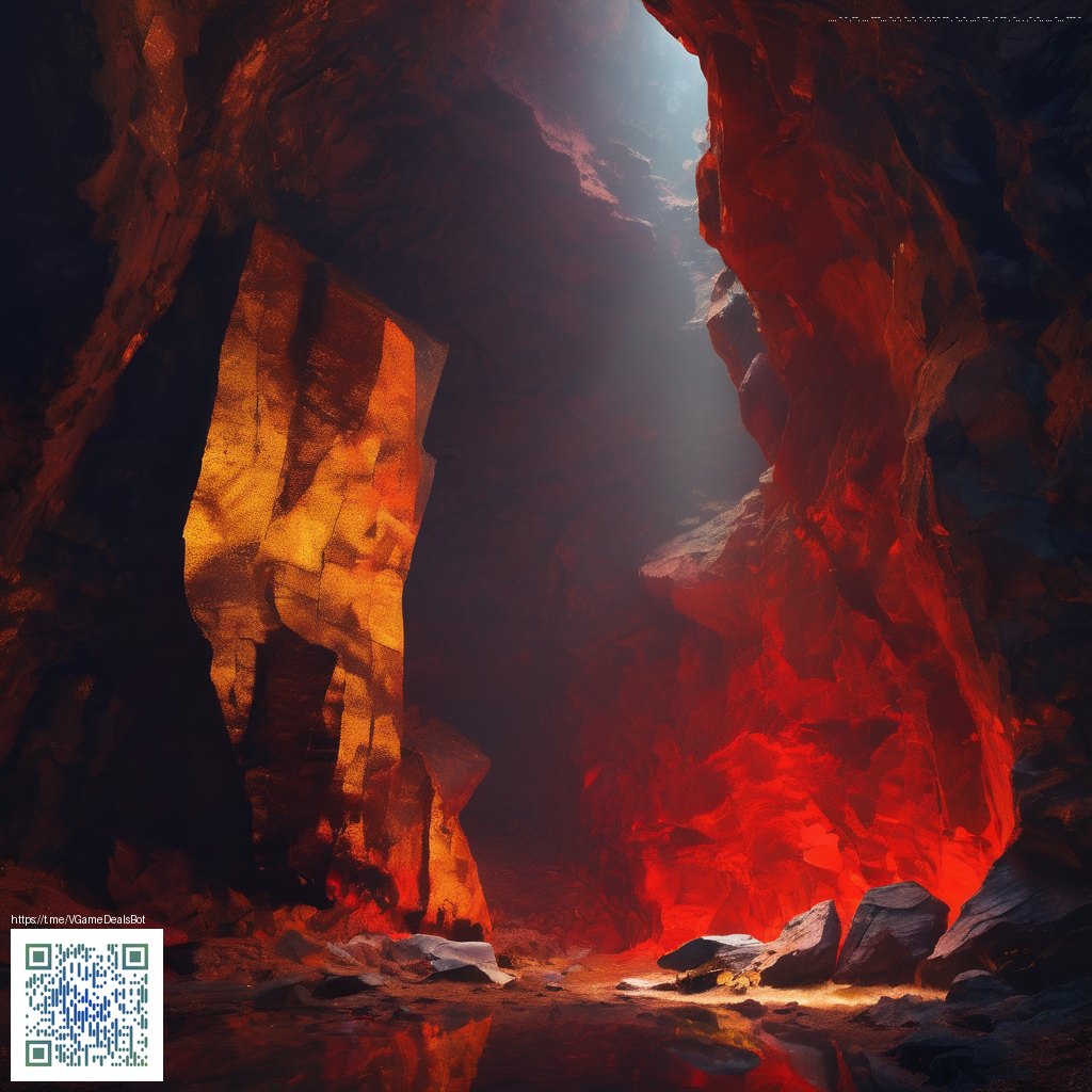
Dark Mode Textures: Crafting Depth for Modern Websites
Dark mode is more than a color swap; it’s a canvas where texture becomes a guide for readability, focus, and personality. In contemporary web design, textures help surfaces feel tactile and real, even within the flat planes of digital interfaces. When used judiciously, a well-chosen texture can elevate contrasts, soften harsh edges, and give users a sense of depth without sacrificing clarity. This approach is especially important as screens get brighter and users demand interfaces that feel premium yet approachable.
Why textures matter in dark mode
In dark mode, the absence of bright backgrounds makes every edge and corner more noticeable. Subtle textures act like a memory cue—your eye recognizes a panel or card not by bold borders alone, but by the nuanced play of light and grain. Think of textures as the soft, ambient echo of real-world materials: paper, fabric, or brushed metal. They reduce visual fatigue by preventing flat, endless expanses and they help separate content zones without shouting for attention.
Texture is the quiet architect of depth in dark mode. It guides eye movement, reinforces hierarchy, and keeps interfaces legible under varied lighting conditions.
Texture strategies you can apply today
To design textures that feel deliberate rather than decorative, consider a layered approach that stays subtle at normal reading distances and becomes perceptible as users interact with the UI:
- Subtle grain or “noise” overlays on panels to avoid flatness without reducing contrast.
- Soft gradients with directional lighting to simulate depth around cards and modals.
- Micro-patterns like linen or geometric textures applied at small scales to give surfaces a tactile identity.
- Shadow layering using multiple, lightweight shadows to suggest elevation and motion affordances.
- Dynamic texture shifts that respond to user focus or hover, offering tactile feedback without abrupt color changes.
For designers seeking tangible cues, real-world references can be surprisingly instructive. In practice, many teams look to hardware accessories for texture inspiration. The Gaming Rectangular Mouse Pad Ultra-Thin 1.58mm Rubber Base product page showcases a surface that interacts with light and touch in a controlled, premium way. Such references help translate physical texture into digital patterns that stay readable across devices.
Implementing textures with CSS and assets
Texture design can be implemented with a mix of CSS techniques and lightweight assets. A common workflow looks like this:
- Start with a base color palette that respects accessibility: high enough contrast against text but still balanced in low-light contexts.
- Layer backgrounds using linear-gradient or radial-gradient to simulate directional light and subtle shadows.
- Apply noise or grain textures as
background-imageon surfaces that need depth, keeping opacity low (usually 3–8%). - Use pseudo-elements (::before, ::after) to add overlays that can be animated on hover or active states without changing the core content.
- Keep performance in mind: textures should be lightweight and scalable, with vector textures preferred for crisp rendering on high-density displays.
When working with textures, test on multiple devices and brightness settings. A texture that reads well on a laptop may appear too strong on a phone with a brighter display. This is where the real value of thoughtful texture design shines—consistency across contexts without sacrificing the UI’s essence.
For teams exploring this topic further, many articles and case studies offer deeper dives into practical patterns and accessibility considerations. If you’re curious about broader discussions on dark mode textures and related design patterns, you can visit https://defiacolytes.zero-static.xyz/766a9437.html for additional perspectives and examples.
Accessibility and performance considerations
Texture decisions should always serve readability. Ensure that text over textured panels maintains sufficient contrast, and avoid textures that reduce legibility for users with visual impairments. Prefer subtle textures that enhance perception of hierarchy rather than patterns that compete with typography. On performance, opt for vector textures or compressed raster textures with proper caching to reduce load times and preserve smooth scrolling.
In daily practice, texture design is a dialogue between aesthetics and usability. It’s about giving surfaces a sense of tactfulness and sophistication while keeping the interface fast, accessible, and delightful to use. The goal isn’t to overwhelm users with decoration but to provide a calm, tactile language that makes modern websites feel inviting and purposeful.