Image courtesy of Scryfall.com
Traditional vs Digital MTG Artwork: A Case Study with Metal Fatigue
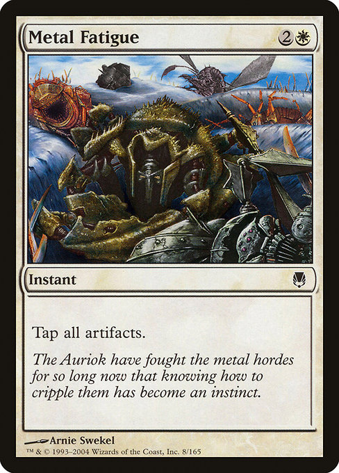
In the sprawling tapestry of Magic: The Gathering, the artwork in every card does more than decorate a rule snippet—it invites you into a mood, a world, and a moment of decision. Metal Fatigue, a white instant from the Darksteel era, is a perfect lens for examining how traditional and digital illustration approaches shape our perception of a spell that taps into the metal heartbeat of the game. The image, painted by Arnie Swekel, captures a tactile, painterly energy that feels earned through brushstrokes and time. It’s a reminder that some cards carry the texture of a craft as tangible as their mana cost 🧙♂️🔥💎.
Arnie Swekel’s traditional technique brings a certain gravity: you can sense the weight of armor, the glint of steel, and the disciplined calm of the Auriok flanking a circle of gleaming artifacts. The Darksteel set—an expansion whose name itself leans into the metal motif—presents art that leans into the physical world: iron, rivets, and the inevitability of machines in a world where even magic is forged. Compare that to today’s digital-forward imagery, where crisp lines and luminous color can dazzle with immediacy. Traditional pieces offer a warmth and depth born of pigment and glaze; digital pieces deliver a punchy clarity that can feel almost architectural. Both routes tell the same story, but with different senses of weight and atmosphere 🧙♂️⚔️🎨.
“The line between tradition and pixels isn’t a battlefield; it’s a bridge that lets Metal Fatigue stand tall in two distinct ways.”
Gameplay-wise, Metal Fatigue presents a clean, tactical moment: for the cost of two generic mana and a white splash, you tap all artifacts. That’s a white tempo tool that can shut down a storied artifact-based defense or an aggressive metal engine built around mana rocks and equipment. The card’s flavor text—“The Auriok have fought the metal hordes for so long now that knowing how to cripple them has become an instinct.”—ges to life when you imagine the moment of impact: a calm, cleric-like intervention that freezes the very tools your opponent leans on. It’s a perfect marriage of idea and image: a white instant that feels like a disciplined strike, a moment where artistry mirrors the clinical clarity of the spell itself 🧙♂️🎲.
From a collector’s perspective, Metal Fatigue sits in the common rarity category, but its foil version carries a touch more rarity and a little more flash on the battlefield. The price indicators from Scryfall suggest a modest foothold in nonfoil and foil variants, with foil occasionally catching the eye of a set-spotlight collector who enjoys the tactile glow of a finished piece. This is the kind of card where the illustration—whether traditional brushwork or modern digital polish—helps filter into a memory: you recall not just the effect, but the moment you first saw the image and felt the decision in your fingertips 🧙♂️🔥💎.
When we talk about the evolution of MTG art, the contrast between Swekel’s traditional approach and contemporary digital art becomes more than a nostalgia trip. Digital techniques have made color fidelity and fine detail more accessible, enabling artists to experiment with lighting, texture, and micro-details at scale. Traditional painters like Swekel, however, often convey a more sculptural sense of form—where light is poured through pigment and the surface itself becomes a story. The result is a duality that MTG fans recognize: two generations of imagery, one shared love for the moment a card flips from face-down to face-up and the world around it shifts in a heartbeat 🧙♂️⚔️🎨.
As you mull over the emotional punch of the art, you can also ponder how a spell’s artwork affects strategy. A white instant that taps all artifacts can be a reset button in a metal-heavy board, a moment to tilt a game toward your tempo. The symbolism of metal, clocks, and machinery resonates with players who enjoy tech-colored builds and artifact synergies, while the card’s simple, direct line keeps it accessible to casual players who appreciate clean, purposeful art that communicates as quickly as the spell resolves. It’s the beauty of MTG at the intersection of design, lore, and play—where every brushstroke and pixel can become a tactical cue 🧙♂️🎲.
For fans curious about the cross-promotional world we live in, consider how tangible accessories and digital marketing collide with card art. The product link at the end of this piece points to a modern, protective accessory that embodies a similar spirit of durability and practicality: a rugged phone case backdrop for everyday adventures—an echo of the steadfast, utilitarian vibe you feel in a white instant that destabilizes your opponent’s toolkit. It’s a small reminder that MTG still thrives in the same ecosystem where collectors, players, and fans mingle across physical and digital frontiers 🔥💎.
Product Spotlight: Rugged Phone Case — Impact Resistant Glossy Polycarbonate
Rugged Phone Case - Impact Resistant Glossy Polycarbonate
More from our network
- https://crypto-acolytes.xyz/blog/post/building-epic-underground-bases-in-minecraft/
- https://blog.digital-vault.xyz/blog/post/how-to-turn-users-into-brand-advocates/
- https://crypto-acolytes.xyz/blog/post/mastering-megabase-builds-in-rust-a-comprehensive-guide/
- https://crypto-acolytes.xyz/blog/post/minecraft-rare-ores-explained-how-to-find-and-use-them/
- https://blog.digital-vault.xyz/blog/post/deadeye-harpooner-gambit-weighing-risk-and-reward-in-mtg/