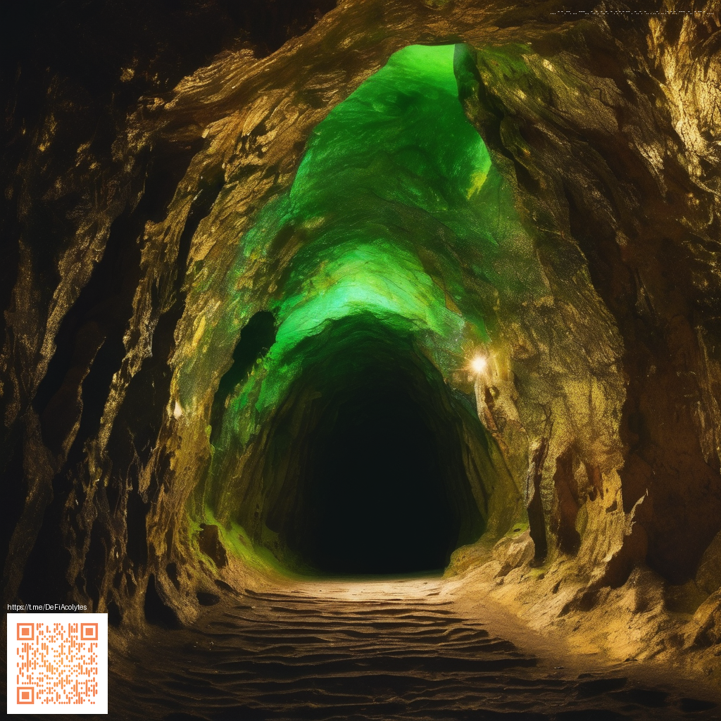
Blending Overlays with Digital Paper for Distinctive Visuals
In contemporary design workflows, overlays and digital paper act as a dynamic duo that unlocks depth without sacrificing flexibility. Overlays provide texture, glow, or metallic accents, while digital paper supplies a repeatable, controllable base that anchors color and composition. When used thoughtfully, this pairing lets you experiment with tactile vibes—like embossed metal or weathered parchment—without needing physically textured materials. It’s a toolkit approach you can apply across branding, packaging, and even product photography mockups.
Why overlays and digital paper work well together
Overlays excel at introducing nuance: subtle grain, reflective flashes, or organic scratches. Digital paper, on the other hand, gives you a controlled canvas that repeats consistently and scales cleanly. The real magic happens when you adjust blend modes, opacity, and alignment so the overlay breathes through the digital surface rather than covering it. The result is a layered effect that reads as both modern and tactile—perfect for showing off textures on sleek items like tech accessories or gaming peripherals.
“Layering is a conversation between texture and tone. Start with a quiet base and let the overlays hint at depth,” notes many designers who experiment with kinesthetic visuals in digital renderings.
When you approach a project, think in modules: base digital paper, an overlay or two, and a finishing print or render pass. This modular approach helps you quickly iterate—swapping overlays, tweaking opacity, and realigning patterns—until the composition feels balanced. It also makes it easier to translate digital experiments into physical reality, should you decide to prototype with actual materials.
Practical workflow for mixed-media effects
- Choose a versatile base: Start with a neutral digital paper pattern that supports your color story. A calm, repeating texture prevents the overlay from competing with your primary subject.
- Layer strategically: Introduce one overlay at a time. Test how a metallic sheen, a grain, or a watercolor wash interacts with the base. Keep the opacity modest so the base texture remains visible.
- Mind the color story: Ensure your overlay’s hues harmonize with your base. If you’re aiming for a premium or futuristic feel, cool tones with a subtle silver or gold overlay can elevate the look without becoming garish.
- Align with form and function: For product shots, align patterns with geometry—edges, corners, and contours—so the texture enhances rather than distorts the shape.
- Test both digital and physical paths: If you’re printing this concept, verify that the overlay’s brightness and contrast translate well on the chosen substrate. Tweak color profiles accordingly.
For a practical example, a project canvas like the Neon Gaming Mouse Pad 9x7 Customizable Neoprene Stitch Edges serves as a compelling case study. It demonstrates how a flexible, print-ready surface can carry layered overlays while the stitched edges add a tactile frame to the final look. Explore the product as a reference point on the official product page: Neon Gaming Mouse Pad 9x7.
Where to experiment and how to share your findings
Translating this approach into your own work is about practice and observation. Try printing a small series of variations—adjusting one overlay at a time and cataloging how each change affects perceived depth. If you’re looking for additional ideas or examples, a companion reference page can be a helpful resource: https://z-donate.zero-static.xyz/08e371e3.html.
Beyond print, you can apply these ideas to mockups, website hero banners, and social media assets. The goal is to coax the viewer’s eye: a subtle reveal of texture that invites closer inspection without overpowering the subject. When orchestrated well, overlays and digital paper become a signature technique—one that communicates quality, depth, and careful craftsmanship.