Image courtesy of Scryfall.com
Typography and Layout Analysis: A Deep Dive into MTG’s Moltensteel Dragon
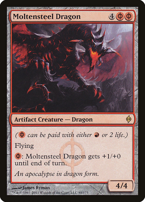
If you’ve ever paused at a card’s edge while shuffling, you know that MTG’s layout is as much a storytelling vehicle as the art and flavor text. Moltensteel Dragon—an Artifact Creature from New Phyrexia—sits at the intersection of aggressive red mana and the chilling Phyrexian aesthetic. Its typography isn’t just about legibility; it’s about signaling power, risk, and the card’s dual identity as both creature and artifact. Let’s unpack the typographic DNA that makes this card feel so native to the black-bordered era and so instantly readable on a crowded battlefield 🧙♂️🔥💎.
Top-edge cues: cost, name, and frame rhythm
Right away, the mana cost—{4}{R/P}{R/P}—dominates the upper-right corner. The hybrid mana symbol {R/P} is a clever reader’s cue: you can pay with red mana or with 2 life. This duality is echoed in the type symbol’s color ecology: a red-leaning mana cost on a frame that carries the black border of a 2003-era design. The visual balance between the big numeral “4” and the two stylized {R/P} icons creates a rhythm that guides the eye from cost to name, then down into the card’s card text. The name itself, Moltensteel Dragon, arcs across the top in a clean, bold type that reads crisply even when faced with a crowded field of numbers and symbols on the table. The interplay between lines and space here isn’t accidental—every millimeter is tuned to legibility in high-pressure moments of play 🔥⚔️.
Type line, power, and the flow of information
Below the name sits the type line: Artifact Creature — Phyrexian Dragon. This is one of those moments where typography does double duty: it communicates both the card’s mechanics (artifact and creature) and its lore-tinged identity (Phyrexian Dragon). The word “Artifact” anchors expectations about overlaying resources, while “Phyrexian Dragon” screams a lineage—fiendish, metallic, relentless. The font weight, letter spacing, and capitalization are calibrated for quick recognition in the heat of a pack-opening or a casual draft. At 4/4 for a 6-mana investment with a potent, recurring ability, the stat line anchors the feel of a dragon that’s equal parts flame and chrome. The typography here isn’t merely decorative; it reinforces the card’s decision points: you’re paying to flood the board, with the risk-reward complexity of R/P as a potent mechanic.
Rules text: clarity under pressure
({R/P} can be paid with either {R} or 2 life.) Flying {R/P}: This creature gets +1/+0 until end of turn.
The rules text block uses line breaks and a compact, readable font to ensure that the hybrid mana cost note is immediately clear. The explicit re-statement of the hybrid mana mechanic—“({R/P} can be paid with either {R} or 2 life.)”—acts as an accessible primer for players who may be encountering Phyrexian mana for the first time. The word “Flying” sits in a small, bolded namespace above the activated ability line, signaling a crucial evasion trait that often matters in combat math. The pumping ability is presented in a succinct, action-oriented clause, so players can parse the tempo swing at a glance: you can boost this dragon’s power—one point at a time—without committing extra mana on the stack if you’re already comfortable paying life. This is a design pattern MTG has used to great effect: make complex mana interactions readable without slowing the game down 🧙♂️🎨.
Flavor, watermark, and the frame’s storytelling palette
The flavor text—An apocalypse in dragon form—wraps the card in a narrative glow. Typography and art work in concert here; the white-space around the flavor text is deliberate, letting the reader breathe as they absorb the lore before the next draw. The New Phyrexia frame is a visual signature of the set: a black border with chrome-like hints on the type line and a distinct watermark that asserts its Phyrexian identity. The word “Phyrexian” in the watermark isn’t just a cosmetic flourish; it’s a typographic cue signaling the corruption and metallic magics that define the set’s ethos. James Ryman’s art—bold, jagged, and flame-slicked—teams with the layout to convey a dragon that’s not merely a creature but a march of industry and apocalypse merged in one terrible silhouette 🔥⚔️.
Color identity, rarity, and the collectible voice of typography
- Color identity and color use: Red mana dominates the cost, even though the card is an Artifact Creature—Phyrexian Dragon. The typography supports this tension by presenting the hybrid symbol with prominence and clarity.
- Rarity and frame: Rare, with a 2003 black border frame and foil/nonfoil finishes. The foil treatment injects a tactile emphasis into the typography’s sharp edges, making the type feel more embossed when you tilt the card in light.
- Set and watermark: New Phyrexia watermark and Phyrexian motifs color the typographic palate with chrome-like accents and a slightly cooler temperature in the text box.
From the card’s price snapshot to its Modern-legal status, Moltensteel Dragon remains a fascinating exemplar of how MTG typography carries not just information but atmosphere. On Scryfall, the numbers—usd around 0.70 for nonfoil and 1.44 for foil—tell a story of a card that’s accessible to collectors while still offering a satisfying play experience in eternal formats like Modern and Commander. The art by James Ryman, the 2003 frame, and the phyrexian watermark all contribute to a cohesive typographic and visual language that makes the card instantly recognizable on sight 🧙♂️💎.
For players who love translating layout into strategy, the card teaches patience and timing: the hybrid mana symbol invites you to weigh life as a resource, while the flying dragon presence creates tempo opportunities that can swing a game if unleashed at the right moment. The crisp typography ensures you can read those opportunities quickly, even as you juggle multiple combat steps and potential pumps at the end of a turn. It’s a reminder that great card design fuses language, imagery, and game rules into a single, legible moment—the kind of moment that keeps your deck-building heart racing 🎲.
Speaking of keeping hearts racing, if you’re curious to see how this design ethos translates into everyday utility, consider checking out gear that complements your MTG obsession. The linked product below isn’t just about style; it’s a nod to the culture of organizing and carrying those precious cards with flair. Whether you’re a casual curator or a tournament grinder, clarity in typography keeps your focus where it belongs: on the play, the plan, and the thrill of the next draw.