Image courtesy of Scryfall.com
Mount Doom: Tracing MTG Card Frame Evolution
If you’ve ever watched the sparks fly when a planeswalker swoops in or a dragon exhales a blaze of mana, you’ve felt how much the look of a card can shape the game’s mood. The Lord of the Rings: Tales of Middle-earth brought a legendary land named Mount Doom into the mix, but what truly underlines its presence is the frame it wears—the modern, 2015-era frame that has become a canvas for both lore and strategy. 🧙🔥 This isn’t just a pretty border; it’s a visual shorthand for how MTG matured as a game, balancing nostalgia with readability, all while inviting new fans into a sprawling multiverse filled with dragons, rings, and—yes—fiery volcanoes that demand careful play. 💎⚔️
A quick tour through MTG’s framing milestones
- Early days (1993–1994): The original black borders that felt like a medieval manuscript. The art was often small, the margins compact, and the text box was a dense block—lending a “dense dungeon” vibe to any dungeon-themed card you drew. 🧭
- Unlimited and the white border era (mid-1990s): Unlimited adopted a white border, which made the art pop and the title breathe a bit more on the page. The readability boom helped farmers and mages alike parse abilities under pressure in a fast-paced game. 🎨
- 4th–5th Edition era (late 1990s–2000s): The frame began to standardize further, with typography and layout tweaks that emphasized clarity over ornament. The game’s visual language shifted toward a clean, readable aesthetic suited for larger tournaments and vibrant art pieces. ⚔️
- The 2015 frame redesign (modern frame): A sweeping update that opened the art area, broadened the lines around the text, and modernized mana symbol presentation. This “new card frame” is the template Mount Doom wears in The Lord of the Rings: Tales of Middle-earth, balancing legibility with a cinematic feel that suits grand, multi-colored effects. It’s the frame many players immediately recognize as MTG’s contemporary look. 🧙🔥
The Lord of the Rings: Tales of Middle-earth and Mount Doom
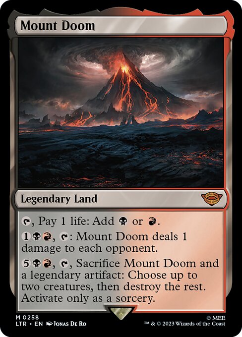
Mount Doom is a Legendary Land with a bold, cinematic presence that suits the cross-pollination of lore and mechanics in LOTR crossover sets. The card’s color identity—black and red (B and R)—is reflected both in its activated mana abilities and its ruthlessly thematic flavor: a land that can light the battlefield on fire, tap away life to forge black and red mana, and, in a late-game swing, sacrifice a legendary artifact to prune the board with surgical destruction. The frame itself—black-bordered, 2015-era, and unmistakably “legendary”—signals to players that this is a centerpiece card, not just a land to splash in for occasional mana. 🔥💎
From a design perspective, Mount Doom embodies how the frame supports complex text while preserving legibility. The card’s three distinct actions—T for mana, {1}{B}{R}, T for a one-damage ping to opponents, and the high-pressure sorcery-cost ability to wipe or sculpt the board—are laid out in a way that a player can scan instantly in the heat of a match. The 0 mana cost plus life payment to generate either black or red mana is a flavorful nod to the land’s lore: sacrifice, risk, and reward all bound up in one volcanic package. 🧙🔥
Frame changes as a design philosophy
Frame evolution isn’t just about cosmetics; it’s a design philosophy that influences how information is perceived during play. The modern frame, as exemplified by Mount Doom, tends to feature:
- Expanded art space: The art occupies more of the card’s surface, inviting players to appreciate the storytelling on a micro level—an essential factor when a set like LOTR aims to immerse players in another world. 🎨
- Improved typography and readability: The name, mana cost, and card type lines are more immediately readable, which reduces decision paralysis on the battlefield. This is especially important for legendary or high-impact cards where timing matters. 🧭
- Consistent layout for multi-ability cards: When a card has several abilities and costs, the frame helps organize the information so it scrolls across the screen or tabletop without becoming a blur. Mount Doom’s layered costs and sorcery-only activation benefit from that clarity. ⚔️
- Rarity and symbol integration: In modern frames, rarity symbols and set icons are clearly positioned, supporting collectors and players who track value and foils. Mount Doom’s mythic rarity and Universes Beyond association sit comfortably within that system. 💎
Lore, art, and collector culture
Jonas De Ro’s illustration for Mount Doom captures the gravity of the ring’s mythos—cavernous shadows, molten glow, and the inevitability of a catastrophic choice. The art anchors the card within The Lord of the Rings narrative while the frame keeps it accessible to MTG players who aren’t necessarily fans of the source material. That cross-cultural accessibility is one reason Universes Beyond sets like this one have minted such a vibrant collector culture: players chase both the card’s power and its story. The mythic rarity pairs with foil and nonfoil finishes, offering a spectrum of collectability that mirrors the depth of the lore itself. 🧙🔥🎨
Playstyle implications for your Commander and modern formats
Mount Doom isn’t just a showpiece; it’s a powerful lane in commander and constructed environments that can leverage its multiple activation costs. In Commander, for example, a deck built around legendary artifacts and life-payment mana engines can exploit the dual mana options for acceleration while threatening heavy-hitting effects on a targeted board. The final ability—sacrifice Mount Doom and a legendary artifact to destroy up to all but two creatures—offers a dramatic, game-altering wipe that fits the tempo of Commander games where lengthy boards and big threats demand decisive answers. And yes, a few clever combos exist where the land’s commitments become part of a larger win condition, especially when a legendary artifact is already in play or in hand. 🧲⚔️
Delight for designers and players alike
What makes Mount Doom and its frame so compelling is how neatly they fuse design intent with fan service. The 2015 frame modernization preserves beloved elements—clear mana costs, legible text, and a bold frame—while giving a nod to the visual storytelling of the LOTR universe. It’s a reminder that the best card frames aren’t merely wrappers; they’re the stage on which the drama of the game unfolds. And when you pair that stage with a striking piece of art and a memorable play pattern, you get a card that resonates beyond its statistics. 🧙🔥🎲
If you’re scouting for a tangible collectible that blends myth, artistry, and strategic depth, Mount Doom serves as a striking touchstone in your MTG library. It marks how far card frame design has progressed while reminding us that great art, great lore, and great gameplay can coexist in a single, fiery land. And if you’re a fan of bold desk accents or cross-promotional curios, that link between the game and real-world gear isn’t accidental—it’s part of the broader MTG culture we celebrate at every table edge and tournament sleeve. 💎🎲