Image courtesy of Scryfall.com
Typography in a Tempest Artifact: Phyrexian Splicer
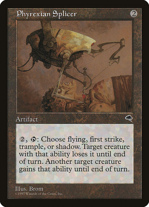
Two mana, an unassuming artifact, and a rule word salad that still manages to feel elegant decades later—Phyrexian Splicer is a perfect specimen for examining how typography and layout carry meaning in Magic cards. Dating to Tempest (the classic black-border era that defined late-90s card design), this card embraces a compact, no-nonsense presentation. The name sits boldly at the top, the mana cost is a crisp reminder of the artifact’s colorless nature, and the body text unfolds in a way that rewards careful reading. For fans who grew up with these frames, the typography isn’t just decoration; it’s a tactile guide to how the card will feel during combat and, frankly, in the deck-building ritual afterward 🧙🔥💎.
What the layout communicates at a glance
- Mana cost and color identity: A simple {2} mana requirement signals a straightforward tempo investment. In a world where colored mana can become a parsing obstacle, the colorless cost keeps the card approachable for any deck that can spare two mana. The absence of color in the identity reinforces the artifact’s utility across shards and wedges, a design choice that feels timeless even as sets evolve ⚔️.
- Type line and rarity: The line reads “Artifact,” a succinct label that sits above the long rules text. Its rarity—uncommon—queues expectations for playability and value, while mirroring Tempest-era print runs where artifacts could inhabit a surprising space in limited and constructed formats alike 🎨.
- Rules text composition: The centerpiece is a single, sprawling sentence: {2}, {T}, Choose flying, first strike, or shadow: Until end of turn, target creature with the chosen ability loses it and another target creature gains it. The line breaks and colon placement reflect an era when designers tumbled long, mechanical ideas into one breath of text. The result is readable even when you’re glancing at the board mid-combat, which is precisely what a good card should do 🧪.
Typography quirks that stand the test of time
Tempest’s typography favors legibility and a compact footprint. The font choices, while native to print of the era, emphasize the important nouns—abilities like flying, first strike, and shadow—through capitalization and a short, punchy cadence. The word Until end of turn signals a temporary state change, and the spacing around that phrase helps you parse the target, the ability, and the swap that follows. In modern design terms, it’s a study in information hierarchy: the card tells you what you can do, who gets affected, and for how long, all in one breath. For collectors and players who pore over a card for strategy rather than just value, that clarity still lands with a satisfying thud 🧙🔥.
Art, flavor, and the layout’s storytelling potential
Brom’s artwork for Phyrexian Splicer captures that late-90s sense of chrome-meets-creature—a visual language that makes “splicer” feel like a device with a mind of its own. The art’s machinery and flesh fusion echoes the card’s mechanical text: a device that can redistribute power in a flash. The art crop and border treatment of Tempest keep the focus close to the central illustration, ensuring the rules text remains legible while the imagery does the heavy lifting for flavor. That synergy between image and text is a reminder that layout isn’t purely functional; it’s the stage on which magic—the actual card—unfolds 🎲🎨.
Mechanics and the typography of choice
The card’s standout mechanic—“Choose …: Until end of turn, target creature with the chosen ability loses it and another target creature gains it”—is not just clever flavor; it’s a typography challenge as well. The sentence must convey a conditional effect and a transfer of a property in a single line. The way the rule text is structured makes the first clause (your two-mana commitment and tap) feel like a setup, while the subsequent clause delivers the payoff: a precise, targeted power swing. In a modern design sense, this is rare because dense templating risks ambiguity; Tempest-era typography handles it with a rhythm that rewards players who read aloud the card while planning their next attack 🧙🔥⚔️.
From playability to collectability
Phyrexian Splicer belongs to Tempest (set tmp), printed as an uncommon artifact in a time when colorless threats and artifacts were steadily carving out space in Legacy and Vintage decks. The card’s colorless identity means it slots into nearly any deck with a minimal mana investment, enhancing its appeal for players who enjoy offbeat win-cons and tempo plays. The price data from Scryfall—roughly a few tenths of a dollar in USD and euros—speaks to its status as a charming, budget-friendly specimen rather than a chase rarity. Yet as far as design preserved in print goes, it’s a gem for anyone who loves the intersection of readable text, clever effect, and iconic artwork 🧙🔥🎲.
Practical tips for modern players and collectors
For gameplay, think of Phyrexian Splicer as a toolkit card you deploy when you’re ready to tinker with creature abilities on the fly. Casting it with {2} and tapping can create a jolt of tempo by neutralizing a key blocker or attacker for a turn, while the temporary transfer of that ability can swing combat in two directions at once. In cube or casual Legacy builds, it shines as a flexible control piece: you pick a power that helps your board state and force your opponent to respond to your timing rather than your threat count alone 🧙🔥.
On the collecting front, this card is a reminder that “uncommon” can be a badge of character. It isn’t the flashiest reprint or a chase foil, but its design remains instructive for new designers and veterans alike: the typography supports a complex mechanic without burying it in the text box. And in a world where modern cards push for shorter rules text and streamlined keywords, Phyrexian Splicer stands as a bridge to the longer, more exploratory era of text layout—an opportunity to study how much, or how little, a line break can do to readability ⚔️.
If you’re curating a physical display or want a practical way to showcase your collection, consider pairing a card with a sturdy, stylish display option—like a polycarbonate card holder that’s MagSafe-friendly—so you can admire the art and the type at the same time. It’s a small ritual, but for many of us, it’s what makes the Multiverse feel tangible on a desk or in a case 🧙🔥💎.