Image courtesy of Scryfall.com
Inside the Wanted Scoundrels Text Box: Typography and Layout
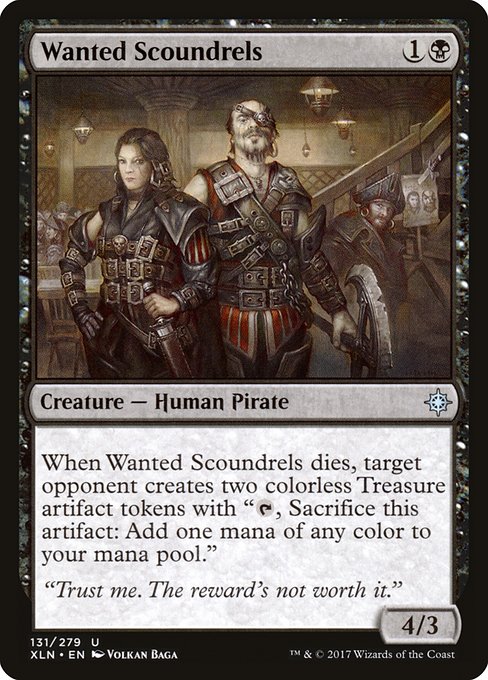
Magic card typography is more than just pretty fonts and decorative borders; it’s a carefully choreographed language that guides you through the card’s identity, timing, and potential futures. When we zoom in on Wanted Scoundrels from Ixalan, a lot of the design decisions become clear. The box presents a compact story in two colors—shadowy black text on a pale page—while the mana cost and creature type anchor the vibe of a lane-scrapping pirate with a wry, dice-rolling twist 🧙🔥💎. The layout balances legibility with mood, letting you scan the card quickly at the table and then linger on the flavor text and unique token mechanic that follows the creature to the graveyard ⚔️🎲.
Box structure, mana cost, and color identity
At the top-right, the mana cost announces the color identity and economy of the card: {1}{B}. This compact notation immediately tells you that Wanted Scoundrels is a black mana fixture, leaning into graveyard themes and opportunistic plays common in black’s color pie. The card’s rarity is marked as uncommon, a spot on Ixalan where slotting pirates and treasure-syndicate creatures into the midrange curve felt just right. The box’s typography mirrors this practical balance: crisp, readable font for the mana symbols, a slightly bolder treatment for the type line, and ample white space around the edges to keep the cost from crowding the creature’s name or abilities 🧙🔥.
The Type Line and Power/Toughness block
The line immediately beneath the name reads: Creature — Human Pirate. This concise descriptor communicates both creature type and the flavor of the archetype—an agile, opportunistic scoundrel with a knack for trouble on high seas. The power and toughness sit in bold relief at the bottom-right (4/3), a stat line that signals a sturdy, midrange role in combat while hinting at the card’s fragility once removed from the battlefield. The typography here is functional: legible numerals, clean punctuation, and a layout that keeps combat math quick to read during the chaos of a match 🎨⚔️.
Oracle text: line breaks, punctuation, and a treasure-trove of meaning
The Oracle text reads (in a single sentence on the card): “When this creature dies, target opponent creates two Treasure tokens. (They're artifacts with "{T}, Sacrifice this token: Add one mana of any color.")” The line-break choices and the parenthetical clarification are crucial. The initial trigger is immediate and clear, while the parenthetical expands the mechanic in a way that invites players to recognize Treasure tokens as a colorless multi-tool. The typography emphasizes the token’s identity—artifacts with a usable ability—without burying the reader in jargon. This is classic MTG typography: a short, punchy effect followed by a clarifying note that helps players understand how the token interacts with mana production across all colors 💎🎲.
“Trust me. The reward's not worth it.” — flavor text that underlines the risk-versus-reward ethos of scoundrel gameplay. The design treats flavor as a separate layer from rules text, allowing readers to savor the character while they plan their next move. The flavor typography uses a lighter weight and a distinct line spacing that separates it from the mechanical core of the card, reinforcing how story and strategy share space on the same card face 🧙🔥.
Treasure tokens and the color-mixing narrative
The card’s content is a doorway into the broader Ixalan Treasure ecosystem. Treasure tokens are colorless artifacts with a simple, flexible purpose: tap and sacrifice to add one mana of any color. That mechanic makes Wanted Scoundrels a meta-narrative piece—when it dies, it grants your opponent a resource that can swing the color balance of future turns. The text box subtly endorses a “long game” arc, where a single casualty becomes a supply line for a player who can navigate the mana multicolor landscape. The typography mirrors this complexity: a short trigger statement, followed by a parenthetical expansion that clarifies the token’s mana-producing potential across all colors—B, G, R, U, W—without overwhelming the reader with too much at once 🧭💎.
Art, flavor, and typography as a cohesive experience
Volkan Baǵa’s illustration—though not the sole determinant of typography—plays a big part in how the text box feels. The art’s pirate swagger and opportunistic grin set expectations for a card that rewards misdirection and clever timing. The frame and border choices of Ixalan, with their darker outlines and adventurous iconography, reinforce the balance of danger and possibility embedded in the text box. Typography, art, and layout work in concert: the reader’s eye moves from the mana cost to the type line, down to the rules text, and then to the flavor, all without losing track of the little treasure tokens that might appear on the battlefield in the next turn 🧙🔥🎨.
Practical takeaways for players and designers
- Clarity first: The mana cost and the trigger condition are immediately obvious, reducing cognitive load during fast-paced play.
- Font hierarchy matters: Distinguishing the name, type line, and rules text with subtle weight changes keeps the card readable at a glance.
- Flavor without distraction: Flavor text lives in a separate space, letting the card’s mechanical heart do the heavy lifting for gameplay while still offering personality and story.
- Token integration: When a card creates tokens, the card design can anticipate the token’s ongoing impact on color access and resource management across turns.
If you’re a player who loves decks that lean into tempo and misdirection, Wanted Scoundrels offers a compact case study in how typography can carry a card’s strategic promise. And if you’re a designer who wants to study how a single line of text can trigger a cascade of decisions on the battlefield, this Ixalan creature is a tidy, well-spaced example of how to balance rules clarity with flavorful storytelling 🧙🔥💎⚔️.