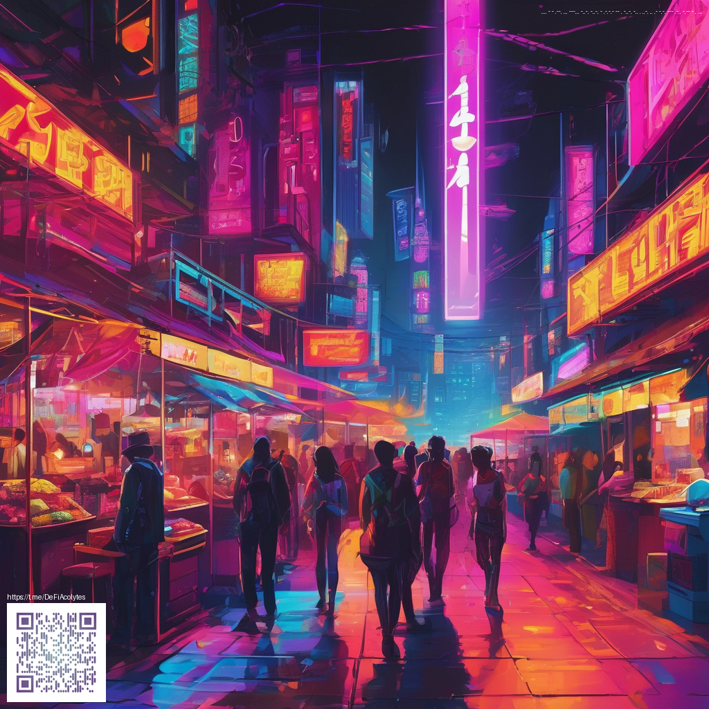
Neon Gradient Trends Shaping 2025 Design
As we step further into 2025, designers are leaning into neon gradient digital papers to create visuals that feel both futuristic and tactile. These luminous color blends—often pairing high-contrast duochromes with soft grain textures—are proving to be more than eye candy. They act as bridges between digital interfaces and physical media, guiding user attention while preserving legibility and personality. The trend isn’t just about flashy color; it’s about thoughtful transitions, subtle depth, and the way light seems to move across a surface.
What Makes Neon Gradients Stand Out
Neon gradients work because they exploit the psychology of color and motion. Electric blues fading into electric pinks or lime greens drifting into violet create visual energy that suggests motion even in static frames. When designers apply these gradients as background papers for digital surfaces, they can set a mood—dramatic, playful, or editorial—without relying on heavy imagery. The trick is to keep the gradient as a backdrop for content, not a distraction from it. Gentle grain or a soft noise layer helps anchor the gradient, making it feel organic rather than synthetic.
“Neon gradients unlock a new narrative cadence in brand storytelling—they’re vibrant without being loud, and they scale gracefully across screens.”
In practical terms, neon gradient digital papers shine in hero sections, title treatments, and social templates. They pair well with bold typography, metallic accents, and minimal iconography. When used as a repeating texture or a corner flare, the gradient can guide the eye toward critical actions or messaging, creating a cohesive journey from curiosity to conversion.
For designers exploring tangible inspiration, consider how digital aesthetics translate to physical products. The tactile play of a surface can echo the glow of a neon gradient. If you’re curating a visual family for a marketing launch, a product such as the Phone Case With Card Holder MagSafe Glossy or Matte Finish can become a real-world touchpoint for the gradient narrative. You can explore that product here: Phone Case With Card Holder MagSafe Glossy or Matte Finish. The contrast between glossy and matte finishes mirrors the way light interacts with gradient surfaces in digital layouts.
Practical Integration Tips
- Anchor content with contrast. When your neon gradient serves as a background, ensure headlines and primary CTAs sit on solid, legible layers or choose text colors with strong contrast to maintain readability.
- Layer textures strategically. Subtle grain or noise can prevent flatness, giving depth to the glow without muddying the palette.
- Balance vibrancy with whitespace. Allow breathing room around key elements so the gradient remains inviting rather than overwhelming.
- Use gradients as a storytelling device. Create a narrative arc by guiding color transitions across sections, evolving the mood as the user scrolls.
- Adapt across formats. Design digital papers that scale gracefully—from mobile headers to desktop hero images—and consider how the gradient behaves in different aspect ratios.
As you experiment with neon gradient digital papers, keep in mind the role of the page or canvas you’re designing for. The page you can reference for a curated collection of related visuals is available at the project page: https://frame-static.zero-static.xyz/cc657592.html. It offers a snapshot of how these gradients pair with typography, imagery, and layout frameworks used by contemporary designers.
Similar Content
See a related collection here: https://frame-static.zero-static.xyz/cc657592.html