Image courtesy of Scryfall.com
Art direction in humorous MTG cards: a closer look through a spider’s web
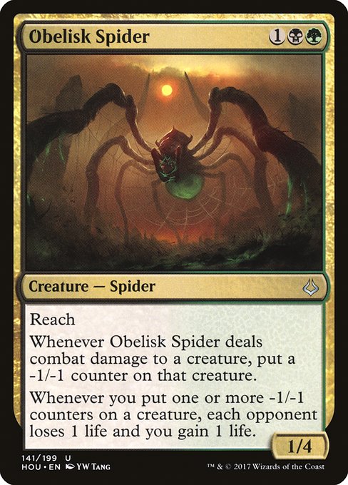
Humor in Magic: The Gathering isn’t just about cheeky flavor text or splashy punny cards. It lives in the way an artist, a color pair, and a mechanic collaborate to tell a story on a single card. In Hour of Devastation, a bold {1}{B}{G} uncommon spider spins a narrative that’s equal parts menace and wry wink. Its art direction embraces a delicate balance: menacing design motifs grounded in a desert-tinged palette, paired with a mechanic that rewards patient planning and clever lifegain angles. 🧙♂️🔥💎
Color, motif, and the mood of the deserts
Black and green in this block of cards carry a particular weight: the shadowy, carnivorous sense of life and death, tempered by a stubborn resilience. The Obelisk Spider embodies that tension. Its reach allows it to threaten from a safe distance, while the -1/-1 counter interaction creates a creeping, almost ritualistic game state where each exchange matters. The art direction leverages contrast—deep, earthy tones offset by brighter accents—to signal danger and the subtle humor of a creature that seems to enjoy turning the tide with a single, well-placed strike. The desert’s austere light is mirrored in the artwork’s stark lines, giving the spider a presence that feels timeless and a little wry. 🎨⚔️
The spider, the obelisk, and the visual joke worth telling
Visually, the spider is designed to read clearly across multiple formats—from a full card image to a thumbnail in a digital interface. The sculpted form, generous leg span, and prominent fangs imply a predator that takes its time, aligning with the mechanic’s cumulative nature: -1/-1 counters accumulate, producing a slow burn that culminates in lifegain for you and life loss for your opponent. This is a visual pun as much as a mechanical one. The obelisk motif—present in the set’s broader imagery—anchors the piece in a world where ancient power meets practical malice. The art direction uses geometric shapes and stony textures to suggest relics of a long-forgotten order, while the spider’s organic curves keep the subject from becoming merely architectural. The result is a memorable image that’s as much about atmosphere as about arithmetic. 🧙♂️🎨
Designing humor in MTG often means letting the mechanics do the talking, but the art must whisper the punchline. A great piece invites the viewer to think, “That figure isn’t just scary—it’s cheeky.”
Mechanics meet mood: how the text guides the eye
Obelisk Spider’s ability text is a compact narrative in itself. “Reach” signals a large-scale threat that can pin down airborne plans, while the -1/-1 counter on a damaged creature creates a visible, ongoing story on the battlefield. The follow-up life swing—each opponent loses 1 life and you gain 1 life whenever you place those counters—turns a grim tactic into a hopeful payoff for you. The art direction supports this duality by showing the spider as both a guardian of a ruin and a mischievous strategist. It’s a reminder that humor in MTG often rests on the contrast between fearsome appearance and playful, game-mechanical clarity. 🧭💥
Playstyle threads: how to read the art in your deckbuilding
- Strategic reach: The spider’s ability to threaten from afar pairs nicely with decks that can deploy efficient -1/-1 counter engines, such as black-green “Golgari-flavored” builds that lean into value from death triggers and incremental pressure. The art’s sweeping legs and elevated stance visually echo a plan that unfolds over several turns, not a rapid, sudden strike. 🕷️
- Life swing as a motif: The lifegain on encounter aligns with a classic MTG joke—the more your opponents invest in their board, the more you gain. The artwork’s tension between the creature’s menacing grin and the ancient obelisk surroundings hints at a deck that loves to turn a seemingly grim situation into personal victory. 💎
- Design for moments of humor: The card’s flavor text (where present) and the counter mechanic together encourage players to savor that “aha” moment when life totals swing in your favor for playing the long game. It’s humor that lands because it’s earned, not handed out. 🎲
From a collector’s perspective, the card’s foil variant is a glossy reminder of the set’s tactile fantasy. As an uncommon from Hour of Devastation, it occupies a sweet spot for players who enjoy the Golgari-black-green archetypes and the smart, pun-free humor that comes from clever text and iconic art by YW Tang. The 1/4 body and reach provide a sturdy, defensive profile that can scale well in Commander or casual Modern-legal play, especially in multi-player environments where lifegain and life drain become a shared, narrative beat. ⚔️
Artist, era, and the broader design philosophy
YW Tang’s contribution is a reminder that humor in MTG’s art direction isn’t about slapstick; it’s about crafting a moment that resonates with players who have pedometers for memory—recalling the moment a card’s art clicks with its mechanics. Hour of Devastation as a set leans into monuments, deserts, and the idea of power maturing under pressure. In this spider’s portrait, the quiet menace of a predator frames a narrative where simple creatures can shape complex outcomes. The humor is earned—as the lifegain flow and counter-strategy reveal a story of patience, calculation, and a little playful mischief. 🧙♂️🔥
Design notes for aspiring art directors
If you’re shaping humorous MTG cards yourself, start with the emotional beat: what should the viewer feel when they first glimpse the art? For this piece, the answer is a blend of awe and amusement—the awe of a towering predator coupled with a wink that the card’s text is the true punchline. Then align palette, texture, and composition with that beat: a strong foreground figure, a restrained but evocative background, and a balance between sharp lines and organic shapes to keep the artwork readable at every size. Finally, ensure the card’s mechanical text reinforces the art’s mood, so players read the sheet and think, “Yes, that makes sense—and yes, that’s funny.” 🧩