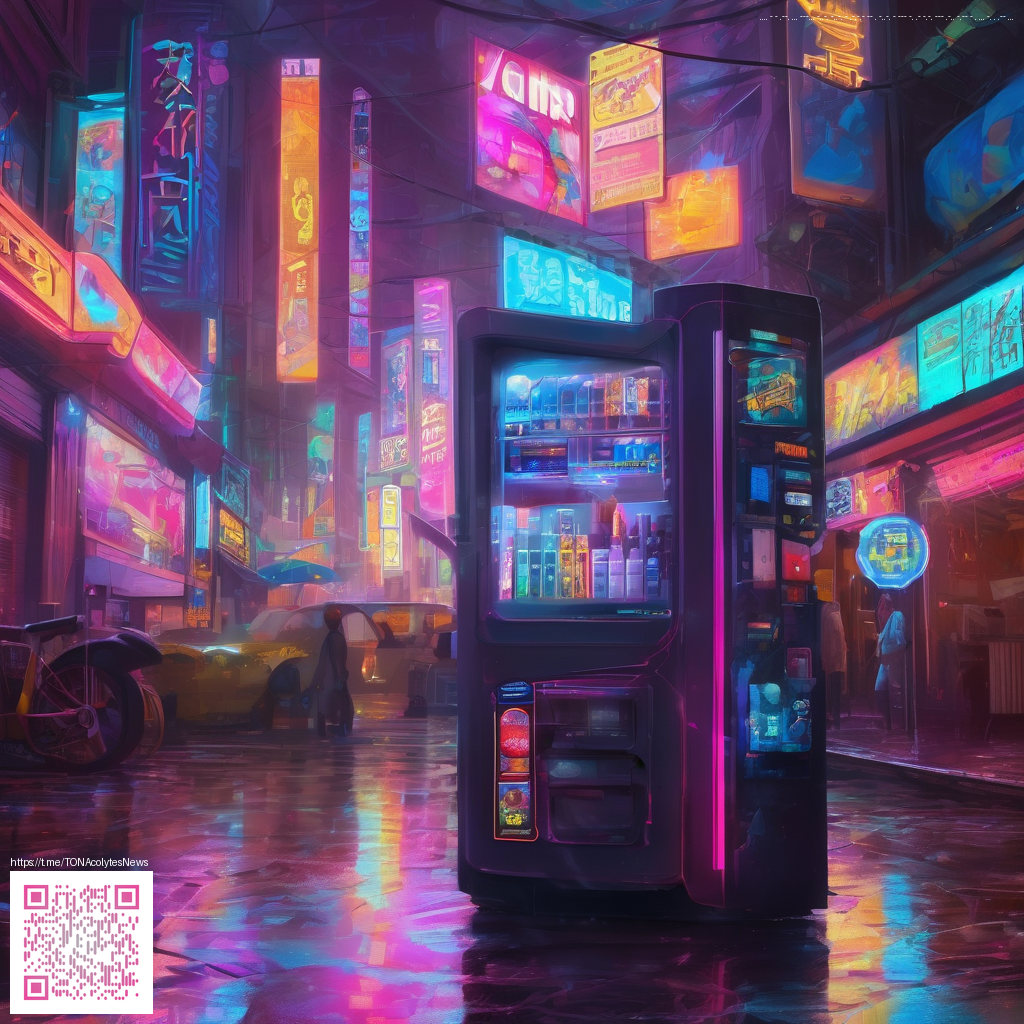
Exploring Paper Noise and Grain Effects in Digital Art
Paper noise and grain are more than decorative quirks in digital work—they’re tools that bring texture, warmth, and a sense of tangible materiality to otherwise smooth surfaces. When used intentionally, subtle grain can tie together color shifts, brush strokes, and lighting so your artwork reads as a cohesive, tactile vision rather than a flat digital screen. The goal isn’t to imitate every speck, but to create a convincing texture that supports mood, genre, and subject matter.
“Grain is not noise to be eliminated; it’s texture to be understood, a quiet anchor for light and color.”
Practical approaches to convincing paper noise
Begin with the right mindset: grain should harmonize with your image’s values, not dominate them. A few guiding ideas help you build texture without overpowering the piece:
- Choose your grain type: film-like grain tends to have uneven distribution and warm midtones, while digital noise can be more uniform. Start by deciding whether you want organic noise (gritty, imperfect) or clean grain (deliberate, even).
- Adjust scale and density: larger grain reads as bold and painterly; smaller grain reads as subtle texture. Use a low opacity to blend grain into your shadows and highlights so it doesn’t flatten the image.
- Color-aware grain: color noise or tinted grain can unify shadows and light with a mid-tone color cast. Test a light brown or blue-gray grain depending on your palette to avoid muddy whites.
- Blending and masking: blend modes like Soft Light or Overlay often feel more natural when grain follows the underlying color. Mask grain onto edges or textured areas to avoid uniform flat patches in pristine sky or skin tones.
- Consistency across elements: if you’re layering multiple textures or painting on different layers, consider applying grain with a consistent seed value or a shared texture tile to preserve unity across the composition.
A workflow you can try
Think of grain as a layered effect rather than a single filter. Start with a clean base, then build texture in stages. First, paint or import your artwork with a wide tonal range and soft edges. Add a grain layer at a modest opacity—roughly 5–15% is a good starting point, then fine-tune. If you’re printing, simulate the page’s surface by running a second, lower-opacity grain filtered through a light paper texture to mimic the slight absorbency of ink or pigment on paper. Finally, calibrate your color by slightly desaturating or tinting the grain to echo the overall mood of the piece.
Hardware and workspace can subtly influence your results. A stable, distraction-free desk surface helps you sample textures and compare iterations more efficiently. For example, a clean, reliable work surface like a Custom Mouse Pad 9.3x7.8 in White Cloth Non-Slip Backing can keep your tablet or drawing tablet steady during longer sessions, reducing tremor while you test texture effects. You can learn more about this product here: Custom Mouse Pad 9.3x7.8 in White Cloth Non-Slip Backing.
When exploring texture references, you’ll often want a side-by-side resource to spark ideas. A practical reference page like this page offers various grain and paper overlays that you can study and adapt to your own workflow. Treat these references as starting points, then tailor grain size, color, and distribution to your subject matter.
In practice, the most convincing results come from iterative testing—comparing print proofs, adjusting grain to emphasize focal areas, and letting the texture breathe within the composition. Don’t be afraid to lean into a slightly imperfect grain; it often reads as more natural than a perfectly uniform pattern. The key is restraint and deliberate tuning according to the image’s lighting, mood, and intended medium.