Image courtesy of Scryfall.com
Prismwake Merrow: Mastering Visual Composition and Art Direction
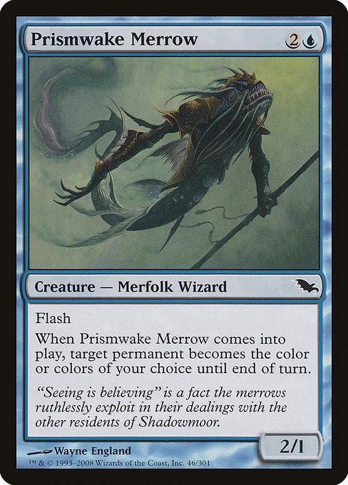
There’s a certain thrill in dissecting a card that wears its design philosophy on the art sleeve as boldly as Prismwake Merrow does. From the moment you glimpse its auteur-grade illustration, you sense a conversation between water and light, tempo and transformation. Born in Shadowmoor’s moody, color-warped world, this blue Merfolk Wizard arrives with a modest mana cost of 2U, a testament to blue’s discipline: tempo, permission, and a dash of mystique. 🧙♂️🔥 In a single frame, Wayne England threads a visual narrative that invites players to think about color as both identity and tool—the very essence of how this card functions on the battlefield. 💎⚔️
Visual Language: Shadowmoor’s Prism Within the Depths
Shadowmoor is famous for turning familiar color palettes into haunting, saturated landscapes where light bends and reality wobbles. Prismwake Merrow sits squarely inside that design ethos. The illustration foregrounds a Merfolk figure—a graceful, elusive presence—while ambient blues and teals ripple outward like a prism through water. The art direction uses negative space and shimmer to imply a moment just before or after a change, an ideal match for a spell that abruptly alters the color identity of a permanent. The card’s Flash keyword becomes not just a gameplay trick but a visual cue: something surprising appears in a heartbeat, and the color story shifts as swiftly as a ripple across the surface. 🎨🧭
The artist, Wayne England, brings a confident line quality and a luminous contrast that makes the merrow’s silhouette pop against a moody aquamarine backdrop. Notice how the light seems to wrap around the figure, carving edges with a glow that feels almost tangible. This is not simply illustration; it’s a study in how prismatic texture can convey a strategic mechanic before you even read the worded text. The flavor text—“Seeing is believing” is a fact the merrows ruthlessly exploit in their dealings with the other residents of Shadowmoor—reads as a wink to the viewer that art and magic share the same trickster’s heart. 🧙♂️💎
Mechanics as Mood: How Color Becomes a Tool on the Table
Prismwake Merrow’s ability is deceptively simple on the surface: “Flash. When this creature enters, target permanent becomes the color or colors of your choice until end of turn.” That one line bridges tempo and color, because you’re effectively telling the board: for one moment, any permanent can wear a new hue, a new aura, a new potential pathway. The card’s mana cost reinforces this paired concept: it’s affordable enough to threaten a quick tempo play, yet it rewards clever timing. In practice, you might flash this Merrow in during your opponent’s end step and set up a turn where your lands, or a key creature, or even an opposing permanent, swing into a color identity that unlocks your next sequence. It’s a design that thrives on misdirection and plan-ahead thinking—a hallmark of blue’s ethos. 🧭🔥
The visual design mirrors the mechanic: the art’s prism-like glints hint at color-shifting, and the surrounding currents suggest the ease with which a permanence could “change its mind” under the Merrow’s spell. In this light, the card’s layout—creature in motion, water textures whipping around, and a color palette that spikes toward a bright highlight—reads as a storyboard of what happens when discovery meets control. The result is not just a card you play; it’s a small kinetic sculpture you watch as it pivots the board state, then pivots again as the spell resolves. ⚔️🎨
Design Details: Frame, Foil, and Collectibility
Prismwake Merrow is classified as common, a reminder that some of the sharpest design ideas live at accessible rarities. In Shadowmoor, the 2003-style black frame signals a print era defined by bold silhouettes and strong contrast, while the foil versions glow with a more flamboyant prismatic sheen that echoes the card’s theme. The set’s aesthetic leans into a world where magic feels tactile, sometimes viscous, and always atmospheric—an environment where a single card like Prismwake Merrow can carry a signature moment that resonates beyond its mana cost. The card’s market data—foil often priced slightly higher than nonfoil, with modest but steady demand—speaks to the collector’s love of completing a theme, especially in a set that sees fans trading heavily on “Shadowmoor vibes.” 🧙♂️💎
For players who like to map lore to function, the flavor text and the art direction combine to give Prismwake Merrow a distinct personality. It’s not just a spell catalyst; it’s a symbol of how blue’s trickery can be both beautiful and dangerous. The artistry confirms why some players prize blue cards for their capacity to redefine the board in an instant, while the lore invites you to imagine the merrows as shrewd negotiators of a submerged court. ✨🧜♀️
Practical Play: Deck Building and Commander Potential
On a practical level, Prismwake Merrow shines in tempo-rich strategies where you want to keep options open while preparing a bigger turn. Its mana cost fits well into early-game plays, and its Flash ability ensures you aren’t telegraphing every move to your opponent. In Modern and Legacy environments where blue control and tempo are celebrated, this Merrow offers a flexible tool for color manipulation and strategic disruption. In Commander, where the singleton format rewards clever one-turn swings and color-myriad interactions, Prismwake Merrow can slot into decks that appreciate surprise color-shifts and the pressure they create on enemy boards. The card’s lean body (2/1 for 3) keeps it efficient enough to fit into midrange packages that want a reliable tempo engine with a bit of prismatic flair. 🧭🎲
For builders who relish synergy, consider pairing Prismwake Merrow with effects that capitalize on color transitions or look for permanents that become vulnerable or valuable based on their color attributes. The art’s prism motif invites a thematic deck idea: a blue-led strategy that morphs targets to produce favorable combat or artifact interactions. It’s a small, elegant lever you can pull to tilt a tense moment in your favor. ⚔️🧙♂️
“Seeing is believing” is a fact the merrows ruthlessly exploit in their dealings with the other residents of Shadowmoor.
Connecting with Fans: Aesthetic, Nostalgia, and a Subtle Nudge Toward the Brand
Moonlit art, a practical mechanic, and the whisper of lore together create a memorable card that remains approachable for newer players while holding a soft glow for longtime enthusiasts. If you’ve ever marveled at how a single spell can rewrite a board state in a flash, Prismwake Merrow offers a perfect lens. The Shadowmoor era’s lighting and texture echo the feeling of peering into a pool that reveals not just reflections but possibilities. It’s a reminder that MTG is as much about art direction as it is about rules—a discipline where illustrator’s brushstrokes and strategic card text share the same creative frontier. 🧙♂️🔥💎
Playful Tips and Quick Folds
- Use Prismwake Merrow to set up a sudden color synergy that unlocks your own key spells or blocks your opponent’s multi-color threats.
- Pair with other flash enablers to surprise opponents during combat or at the end of their turn.
- Appreciate the foil versions as collectible art—each foil variant can feel like a miniature prism in your binder.
- In Commander, leverage color identity manipulation to tilt mana bases toward your strongest color combos when you need a sudden edge.
Looking for a practical way to carry a little MTG magic with you? While Prismwake Merrow might not fit inside your pocket, you can keep the vibe going with a sleek accessory that travels as well as your deck. If a stylish, MagSafe-friendly phone case with card-holding capability ticks your boxes, check this product—an ideal companion for the game-night crowd and the casual fan alike. Accessible, sturdy, and ready for the next draft!