Image courtesy of Scryfall.com
Art Style Trends Across MTG Decades
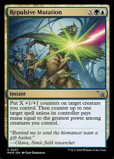
Magic: The Gathering has always been a visual collage of eras—each era crawling with its own sensibilities, from the brushy fantasy of the early 1990s to the sleek, digital sheen of today. As players, we don’t just draft or play—we study the art like archaeologists of color and composition. When a card from the Murders at Karlov Manor set slides onto the table, it doesn’t just function as a spell; it speaks a little about the era it was born into and the artistic ambitions of its time 🧙🔥💎⚔️. The featured piece, crafted by Filip Burburan, embodies a distinctive bridge between meticulous anatomical detail and the evolving design language of modern MTG.
In the earliest days of MTG, illustrators built worlds with painterly textures and dramatic lighting, drawing heavily on classic fantasy art. Think bold linework, lush oil textures, and a sense of scale that invites a heroic, almost mythic, reading of the scene. As digital tools began to infiltrate the process, the 2000s introduced cleaner lines, sharper edges, and more dynamic color control. By the 2010s, the art commonly embraced cinematic lighting, dramatic close-ups, and more complex environmental storytelling. The 2020s ushered in even greater experimentation—hybrid techniques, high-fidelity digital rendering, and an openness to stylistic cross-pollination across sets and universes. Each decade didn’t erase the last; it layered on top of it, creating a palimpsest of MTG’s visual memory 🧪🎨.
Repulsive Mutation sits squarely at a nexus of these influences. The image-forward design language—glassy, motile textures, and biomechanical hints—speaks a modern Simic aesthetic while nodding to the mid-century fantasy tradition of biomechanical intrigue. The green-blue palette is a deliberate signal: growth, adaptation, and a tinkerer’s curiosity. The art’s clinical precision—pulsing bio-matter, tendrils, and tendons wrapped around sinewy forms—echoes a long-standing MTG curiosity about life as a laboratory experiment. In this sense, the card is less about a single moment and more about a scientific moodboard, a snapshot of what happens when biology and magic shed their pretense and start mutating together 🎲🧬.
A Case Study: Repulsive Mutation in Focus
The card’s mechanical text anchors the art in a playful, strategic biome. It is an Instant with an X cost and a blue-green color identity that rewards careful board development. Put X +1/+1 counters on a creature you control, then counter up to one target spell unless its controller pays mana equal to the greatest power among creatures you control. That “greatest power” clause is a clever bit of game design: it scales with your board, turning your growing creatures into a moving tax on opponents. The art and the text together paint a moment of controlled chaos—your Biomancer team pushing growth while you tilt the spell-countering dial in your favor. The flavor text—“Remind me to send the biomancer team a gift basket.”—delivers a wink to Simic scientists who treat mutation as both art and experiment, a theme that resonates with the set’s mood and the broader evolution of MTG’s lore 🧪💫.
“Remind me to send the biomancer team a gift basket.” — Olana, Simic field researcher
Filip Burburan’s illustration, with its crisp anatomy and luminous greens and teals, demonstrates how art style can communicate card identity beyond the words on the page. The 2015 frame era—evident in the card’s border and layout—gives the image a contemporary feel without sacrificing the rich, painterly textures that fans first fell in love with in the 1990s. For collectors and players, this piece exemplifies how modern MTG art often blends scientific curiosity with fantasy drama. The result is not just a pretty picture; it’s a narrative cue that invites players to imagine a world where mutation is a measured, replicable process, not a random spark of chaos 🎨🔬.
Design Patterns You Can See Across Decades
- Painterly to cinematic: Early art favored visible brushwork; later pieces embraced cinematic lighting and high-detail rendering, which Repulsive Mutation nods to with its sharp focus and glowing, biological textures.
- Color as function: The blue-green identity of this card isn’t just pretty—it signals a Simic connection to growth and adaptation, a trend echoed across many sets where color identity aligns with mechanic themes.
- Biomechanics in narrative art: The infusion of life science motifs became a staple for multicolored collaborations between lore and visuals, echoing in both the card’s image and its automaton-like mechanicality.
- Frame and print evolution: The 2015 frame era introduced consistent, modern borders that keep the art legible in foil and non-foil formats alike, ensuring that even the most intricate mutation remains readable at a glance.
Gameplay Tips: Getting the Most from a Mutating Moment
When you cast Repulsive Mutation, you’re investing in a two-step payoff: you empower one of your creatures and apply pressure to your opponent’s hand. A practical approach is to hold back until you have a clearly favorable X value—enough +1/+1 counters to make your threat sizable, plus a board state that makes the targeting of a spell by “the greatest power” meaningful. If you’ve poured power into a single behemoth, your tax on opposing spells becomes a conversation about tempo and resource management. Use synergy with other Simic or +1/+1 counter strategies—cards that accelerate growth or protect your pump—so that your mutated creature becomes harder to remove than the spell you’re contesting ⚔️🛡️.
In a broader sense, this card demonstrates how color-minted design can blend offense, defense, and disruption. It’s not just about the moment of mutation; it’s about the ongoing narrative of growth you build on the battlefield. The art’s emphasis on living, mutating forms mirrors the card’s dual function: propel your own board forward while applying pressure on your opponent’s next move. The art and the policy rhyme—growth and restraint—creating a memorable, interactive moment every time you draw and resolve Repulsive Mutation 🧙♂️💎.
Collectibility, Value, and Where It Fits in Your TCG Cartography
As an uncommon from the Murders at Karlov Manor expansion, Repulsive Mutation sits in a tier that many players overlook in favor of flashier rares and mythics. Yet the piece has a distinctive appeal for fans of Simic, biomechanics, and the set’s flavorful mix of mystery and menace. Non-foil prints hover around the low-dollar range, with foils a touch more expensive, making it a reasonable pick for budget builds that aim to lean into niche themes or decorative playmats. Its event and EDH (Commander) relevance is clear for players who love hybrids and mutate-focused strategies—the kind of deck-building that rewards careful planning and a bit of surgical mutation of a plan into reality 💎🧩.
Whether you’re chasing the art or the arc of mutation itself, this card is a tactile reminder that MTG’s decades-long design journey can be as thrilling as any game you’ll draft. The retro-modern aesthetic, the science-meets-magic flavor, and the crisp illustration all work in concert to tell a story that feels both collectible and playable. If you’re crafting a Simic-centered theme or simply admiring artwork that bridges eras, Repulsive Mutation offers a compact, elegant entry point into MTG’s evolving visual language 🎨⚗️.