Image courtesy of Scryfall.com
Typography and Layout Analysis
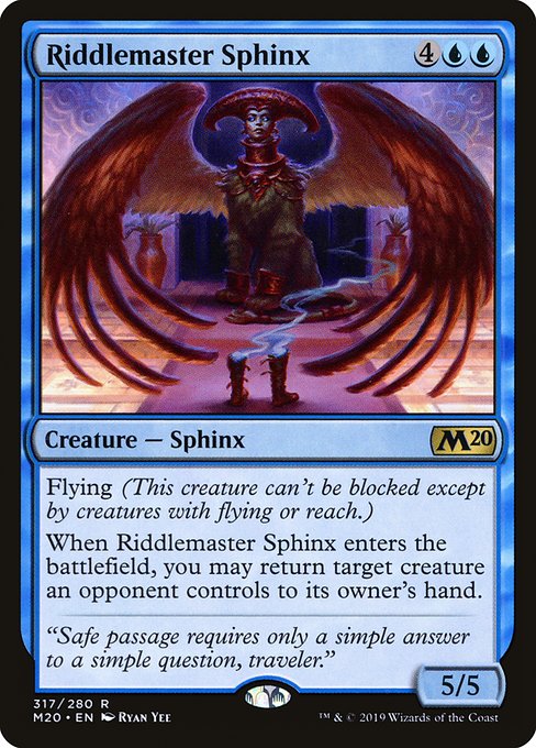
Blue mana, a 6-mana creature, and a soaring sphinx—all wrapped in a crisp Core Set 2020 frame—offer a rich case study in how MTG’s typography balances flavor with function. The card’s mana cost, "{4}{U}{U}," sits neatly to the upper-right, using a compact glyph system to convey a lot of information in a small space. The blue mana symbols glow with that characteristic azure tone, signaling at a glance that this is a thinker’s creature—one that rewards careful planning more than raw aggression 🔷🧩. The layout guides your eye from the name at the top, through the type line, and into the body text with a rhythm that feels deliberate and readable, even when a crowded board state tempts you to skim.
The core of the design rests on three pillars: a readable type line, legible rules text, and a clear emblem of the card’s rarity and identity. On a rare blue sphinx with flying, the rules text is kept tight yet expressive: “Flying (This creature can’t be blocked except by creatures with flying or reach.) When this creature enters, you may return target creature an opponent controls to its owner’s hand.” The line breaks follow natural breath points, helping the eye parse the clauses quickly. This is especially important in blue-heavy decks where tempo and calculation dominate the play pattern; the typography must empower that play without forcing you to pause and decipher. The result is a balance between elegance and utility, a hallmark of MTG’s modern design philosophy 🧙♂️🔥.
One notable feature is the emphasis pattern inside the text box. Keywords like Flying are showcased prominently, often bolded or highlighted in the card’s styling to catch recognition during a jam-packed sequence. The “When this creature enters” trigger sits in a way that nudges players to consider timing windows—the moment the sphinx hits the battlefield, you’re weighing the option to bounce a threat back to the opponent’s hand. The type line—“Creature — Sphinx”—is concise, letting the creature’s identity and color identity slip cleanly into the background of the frame so you can focus on the art and the strategic decision ahead. This micro-typography serves as a cognitive map, reducing the mental load as you navigate your next move 🔎🎯.
Art, Flavor, and Readability in Concert
Ryan Yee’s illustration anchors the card’s personality, delivering a poised, ancient-lectern aura that matches the sphinx’s role as a cryptic guardian. The art’s composition leans into symmetry and contemplative gaze, inviting players to ponder the riddle before the game begins. The typography works in concert with this mood: serif-like flourishes in the flavor text and the stat line support the theme of measured wisdom and calculated risk. The flavor line—“Safe passage requires only a simple answer to a simple question, traveler.”—reads like a whispered invitation, and the surrounding typography keeps pace with that invitation: precise, measured, and legible at a glance. In practical terms, the alignment and spacing prevent the flavor text from overwhelming the mechanical text, a subtle but essential balance for long sessions and casual pickup games alike 🎨⚔️.
Safe passage requires only a simple answer to a simple question, traveler.
Color Identity, Set Identity, and Readability Considerations
As a blue card from Core Set 2020, this sphinx carries a single-color identity (U). The type line, mana cost, and the rarity indicator all read with clean contrast against the frame’s midtone background, ensuring legibility across various lighting conditions and play surfaces. The M20 frame preserves consistent margins and padding, which reduces the perception of clutter and helps the player focus on the card’s core messages: evasion (Flying), card advantage potential (enter-the-battlefield bounce), and board presence (a sturdy 5/5 body for a 6-mana investment). For players building a tempo-oriented deck, this readability matters; it translates to quicker snap judgments during the chaos of a multiplayer table or a tense one-on-one duel 🧙♂️💎.
Layout Takeaways for Designers and Players
- Balanced whitespace: The card maintains enough breathing room around the text box to prevent lines from crowding, which aids rapid comprehension in the heat of play.
- Keyword emphasis: Visual cues for Flying help players recognize threat types and blockers, a crucial advantage when timing is everything ⚡.
- Art-to-text harmony: The art’s mood aligns with the flavor, and typography reinforces that mood without overpowering the artwork.
- Color clarity: The blue palette and mana symbols pop against the borders, making color identity instantly legible from across the table 🔷.
Lore, Flavor, and the Reader Experience
Beyond the mechanicals, the flavor text hints at a world where words can be as potent as wars. The sphinx’s riddle is a nod to the long tradition of enigmatic guardians in MTG lore, a reminder that not every victory is measured by raw power—some are won by wit and timing. The flavor, paired with the card’s layout, invites players to slow down, read carefully, and appreciate the craft that goes into each print. It’s a microcosm of the MTG experience: a clash of strategy, storytelling, and art—all conveyed through typography and layout that feel effortless once you’ve trained your eye for them 🧙♂️🎲.
If you’re curating a deck, this sphinx’s presence can anchor a control or blink strategy, where cycling and value plays are as important as the board state. And if you’re a collector, the rarity, the classic M20 frame, and Ryan Yee’s signature style all contribute to the card’s lasting charm—even at a modest market price (~$0.12 on some platforms) where readability and nostalgia combine to create real tactile pleasure in play and collection 🔥💎.
Bringing It Home: a Practical Card-Layout Perspective
Seasoned players and new collectors alike benefit from recognizing how typography affects decision-making sits at the heart of how MTG cards read in real time. The Riddlemaster Sphinx exemplifies a robust balance between legibility and thematic depth, ensuring that a well-tuned layout can support complex play patterns without becoming a distraction. The card’s blue identity, flying keyword, and enter-the-battlefield bounce capability come to life in a frame that’s both aesthetically pleasing and functionally precise. It’s the kind of design that makes you feel like you’re not just playing a card, but participating in a crafted experience that respects your cognitive flow as much as your strategic ambitions 🧙♂️⚔️.
And if you’re enjoying the tactile side of MTG while also upgrading your everyday gear, consider pairing your hobby with practical accessories that match the color and mood of your play space. For a touch of lime-powered flair that travels with you, check out a lime green abstract pattern tough phone case—stylish, durable, and designed to keep your phone as ready for the next game as you are. It’s a small but satisfying bridge between the table and the street, a nod to the multi-faceted MTG culture we all love 🔥🎨.