Image courtesy of Scryfall.com
Show of Valor: Designing for both physical and digital MTG audiences
White in Magic: The Gathering has long been the discipline of defense, tempo, and the soft control of the battlefield. When a card like Show of Valor enters Core Set 2020, it embodies a compact, high-leverage moment: pay two mana to grant a single creature enough punch to swing combat in your favor or secure a critical block. On paper, it’s a straightforward instant: Target creature gets +2/+4 until end of turn. In the digital realm, that simplicity becomes a canvas for clarity, feedback, and pacing—three pillars that design teams chase as they translate physical cards to pixels and code 🧙🔥. The core idea—empowering a creature for a single, decisive moment—travels cleanly between formats, but the execution reveals true design philosophy.
A quick snapshot of the card’s DNA
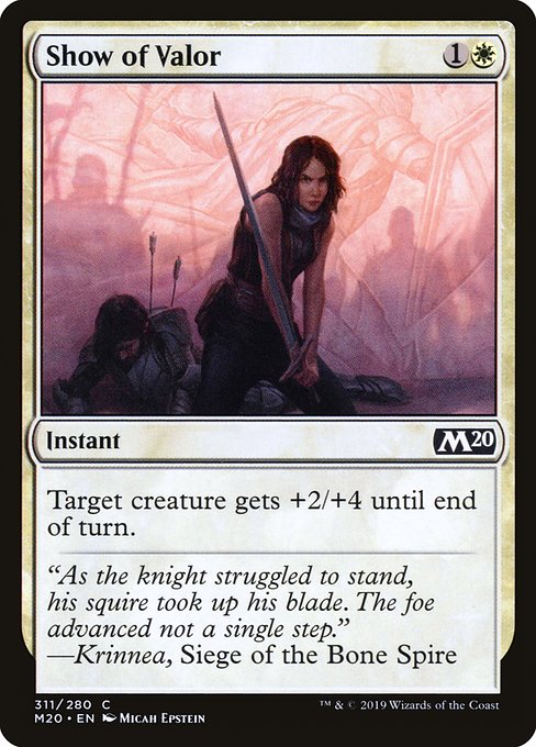
- Name: Show of Valor
- Set: Core Set 2020 (M20)
- Mana cost: {1}{W}
- Type: Instant
- Rarity: Common
- Text: Target creature gets +2/+4 until end of turn
- Colors: White
- Flavor text: "As the knight struggled to stand, his squire took up his blade. The foe advanced not a single step." —Krinnea, Siege of the Bone Spire
Flavor-forward moments like this remind players that even a single card can shift the momentum of a game, echoing the old-school chivalric vibes while landing in the modern tempo of MTG.
Micah Epstein’s artwork for Show of Valor captures that moment of push and resolve—the knight’s rally, the squire stepping up, and the shield-wall of white mana shimmering in the air. In design terms, the art isn’t just decoration; it’s a directional cue. In digital interfaces, the imagery invites you to imagine timing, ambition, and the rush of combat doubles as an intuitive target for your next play 🧙🔥. The card’s stance—two mana, one instant, a powerful buff—maps cleanly to a player’s decision curve in both formats, whether you’re at a kitchen table or in a queued match on Arena.
Design challenges: readability, tempo, and accessibility across formats
Translating a physical card like Show of Valor into a digital experience means solving a few practical questions. How do you convey “until end of turn” clearly without clutter? How do you ensure the target is obvious in a fast-paced combat step? In paper, players rely on memory and track counters with tokens and notes. In digital, you can animate the buff, highlight the affected creature, and show a countdown or glow to reinforce the temporary nature of the effect. The result is a more immediate feedback loop that keeps new players oriented, while still delivering the crisp, quick tempo that veteran players expect 🎲.
Another nuance is readability of the mana cost and effect text. Show of Valor’s {1}{W} cost is compact, but for new players, white’s identity is tied to timely, impactful plays rather than huge, splashy effects. Digital design can emphasize timing windows with subtle UI cues—hover tooltips, line-of-sight indicators for target selection, and a predictable, consistent layout across all white instants. In practice, this means less cognitive load during the moment of decision, which helps both newcomers and seasoned players enjoy the game without losing the strategic bite that white brings to the table ⚔️.
From print to pixels: the magic of interaction and pacing
Print cards are self-contained; you glance at the mana cost, the effect, and you understand the risk-reward instantly. Digital MTG adds a layer of interactivity: targeting choices, visual effects, and the possibility to animate the buff. Show of Valor’s effect can be represented with a clean, bright aura around the chosen creature, a pop of numbers showing +2/+4, and an end-of-turn countdown in the corner of the battlefield. This is not just cosmetic—it's a deliberate design choice to reinforce tempo and situational awareness, particularly in larger multi-player formats where sequencing matters and quick reads are essential 🧙🔥.
Art, flavor, and cross-media resonance
The story embedded in the flavor text—Krinnea’s siege, the knight’s faltering stance, the squire’s immediate action—speaks to a timeless heroic motif. In digital design, that resonance is amplified by how the card’s illustration leads into the moment of judgment: when to press the advantage, when to shield a crucial frontline, and how a single spell can pivot a skirmish. The colors, the crisp silhouette, and the composition all guide player perception. Across physical print runs and digital card libraries, the same emotional beat remains intact: valor shown not just in what you cast, but when you cast it 🎨.
Strategic takeaways for players and designers
For players, Show of Valor is a compact reminder that tempo can come from modest numbers when the game state is right. A creature facing a critical block or a fragile alpha strike can become a game-turning threat with the right instant. In digital spaces, the card’s interface can nudge you toward that timing with subtle hints or a slight delay before the buff resolves, reinforcing strategic pacing. For designers, the card exemplifies how a straightforward effect can translate cleanly across formats while still offering opportunities for UI enhancements, visual feedback, and accessible text that remains faithful to the original card text 🧙🔥.
In a broader sense, Show of Valor embodies the ongoing dialogue between physical and digital MTG design: keep the essence of the card intact, but lean into format-specific affordances. Print welcomes tactile engagement and card-trading culture, while digital rewards quick recognition, precise targeting, and dynamic feedback that makes every instant feel decisive. The result is a cohesive MTG experience that respects tradition while inviting experimentation—an ideal balance for fans who straddle both worlds 💎⚔️.
Whether you’re drafting with friends around the kitchen table or climbing ladder with a brew built around white tempo, this little instant demonstrates how design adaptation can elevate the moment of valor into something players remember long after the game ends. And if you’re looking to keep your own setup tight as you immerse yourself in these tabletop adventures, a sturdy grip on your device never hurts—enter the practical side of this cross-media love story with a handy Phone Click-On Grip. It’s the kind of everyday accessory that makes long sessions smoother and more enjoyable 🎲.
As you explore more cards from Core Set 2020 and beyond, consider how each design choice translates across formats. The balance between cost, size of effect, and clarity of wording matters as much as the image on the card. That careful calibration is what keeps MTG feeling both timeless and thrilling—no matter where you draw the line between paper and pixels.