Image courtesy of Scryfall.com
Typography in Practice: Spellshift and Planar Chaos
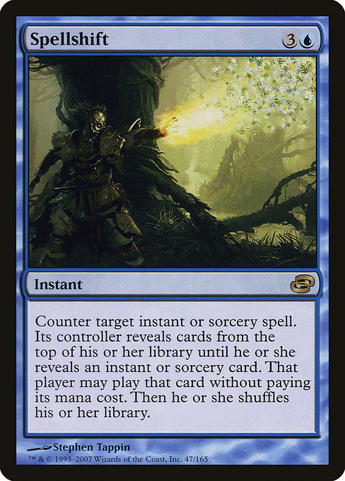
If you’ve ever paused mid-play to admire the little typographic choices that MTG’s designers weave into a card, Spellshift in Planar Chaos is a perfect specimen. This blue instant, with the mana cost of {3}{U}, sits in the rare slot of PLC’s quirky flavor-forward era. The card’s layout isn’t just about making the text readable; it’s a miniature typography tour—one that balances function, myth, and the occasional wink at the player’s eye. 🧙♂️🔥💎
The Planar Chaos set—an expansion released in 2007—was crafted to evoke a sense of “what if” across Magic’s history. The typography on Spellshift reflects that tension: the rules text is compact enough to fit a dense effect in a single paragraph, yet generous kerning around punctuation and bold cues helps the eye scan quickly during a rush of action. The color identity is unmistakably blue, and the currency of the mana cost is rendered with the clean, crisp symbols that fans love to study in high-resolution scans. In this frame, the balance between name, mana symbols, and the type line remains legible even on small screens, a nod to the card’s enduring playability on MTG Arena and in paper alike. 🎨
Layout anatomy: where each element earns its keep
- Name and mana cost: Spell name sits at the top with a bold presence, while the blue mana cost sits to the right, drawing the eye toward the spell’s potential cadence. The blue color cue isn’t just aesthetic—it signals the card’s tempo: countering threats while unlocking your own draw of power. ⚔️
- Type line and rarity: The card’s type line reads “Instant,” anchoring the action in a single moment of decision. The rarity mark sits subtly, reminding collectors and players alike that this is a rare piece with strategic weight rather than a run-of-the-mill cantrip. The PLC frame style anchors the card in a storied era of MTG design, where retro flair met modern flexibility. 🧙♂️
- Rules text: The long ability—“Counter target instant or sorcery spell. Its controller reveals cards from the top of their library until they reveal an instant or sorcery card. That player may cast that card without paying its mana cost. Then the player shuffles.”—is laid out in a legible, readable block. The typographic solution here favors a compact line height with clean margins, so the reader doesn’t stumble over the sentence breaks during a heated moment of play. The emphasis remains on clarity, with line breaks that respect the cadence of a chained spell sequence. 🔎
- Flavor and art integration: The art doesn’t just decorate the card; it interacts with typography through framing and white space. In high-res prints, the illustration breathes against a margins-and-grids system that keeps the text from feeling crowded. The result is a card that looks as good as it reads, whether you’re poring over a decklist or dissecting a key counter in the middle of a game. 🎨
How the design supports strategy and memory
Spellshift’s core mechanic—countering an instant or sorcery and revealing cards from the top of the library—creates a mental map for the player: blue’s control toolkit is not just about negation; it’s about risk management. The typography guides that memory with deliberate pacing. The counter effect is nicely separated from the reveal-and-cast component, so players can parse what they’re facing: the instant or sorcery being countered, followed by the revealed set of options and the potential free cast. The layout’s rhythm mirrors the gameplay rhythm: the critical action sits near the edge where you’d expect to click or decide, and the supporting lines recede just enough to avoid cognitive overload. 🧙♂️⚔️
For collectors and nostalgists, the PLC frame offers a special flavor. The rare status, combined with a foil and nonfoil printing path, means that the typography has to scale across finishes without losing legibility. Spellshift remains legible in foil glare and nonfoil clarity alike, ensuring that the eye doesn’t need to recalibrate when the card shines under showroom lighting or the glow of a kitchen table game night. The subtle balance between uppercase emphasis in the name and the more restrained rules text fosters a smooth reading flow, a small but meaningful victory for long sessions of deck-building banter. 💎
Illustration, rarity, and market whispers
Stephen Tappin’s illustration anchors Spellshift in a moment of arcane cadence, where the spell’s potential swirls like a shifting tide. The card’s market footprint—totalling roughly a few dollars for nonfoil copies and a touch more for foils—speaks to the card’s collector’s value in a world where blue control remains a staple across formats. The PLC set itself is known for reimagining old-school concepts with modern constraints, and Spellshift exemplifies how typography can carry the weight of a mechanic while still feeling fresh and readable on release day and beyond. The numbers (USD ~0.27, foil ~0.47, EUR ~0.12, EUR foil ~0.60, and tix around 0.02) give you a sense of its staying power as a niche but beloved piece for a blue mage’s shelf. 📈🧙♂️
“Typography is a spell in itself—every size, spacing, and symbol is a tiny incantation guiding the reader through the card’s moment of truth.”
Final impressions for typography nerds and casual players alike
In the end, Spellshift isn’t just about what it does on the table; it’s about how the page itself invites you to think like a strategist. The Planar Chaos era gave designers a sandbox to experiment with a mix of old frame accents and new print diction, and the result is a card whose typography remains legible under pressure, a reliable anchor in chaotic plays, and a small work of art that’s fun to study as you shuffle, count, and counter. If you love the way Magic’s text box feels—its margins, its line-height, its punctuation—Spellshift stands as a quiet, well-crafted homage to the craft of card design. 🧙♂️🎲
If you’re gravitating toward a curated space that celebrates the tactile magic of MTG, consider pairing your interest with a little cross-promotion magic. The Neon Cyberpunk Desk Mouse Pad—while not a Spellshift card—offers a design-forward complement to your gaming rig, marrying neon glow with desk-top ergonomics. It’s a playful nod to the same energy that makes blue control feel so timeless at the table. 👾🔥