Image courtesy of Scryfall.com
Standing Stones and the art of cross-dimensional design
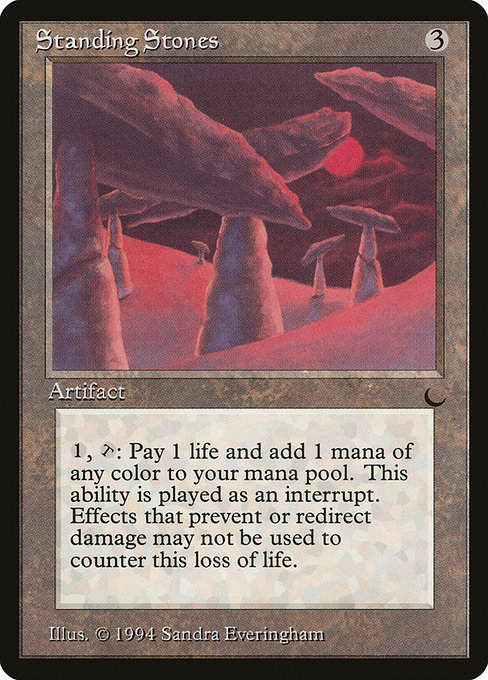
For many MTG fans, Standing Stones evokes the old-school thrill of The Dark era—a time when color identity and mana flexibility were being hammered into new shapes by Wizards of the Coast. This uncommon artifact costs {3} to cast and features a deceptively clean line of text: {1}, {T}, Pay 1 life: Add one mana of any color. In a world dominated by five-color decks, this little circle of rock becomes a passport to color versatility—at the price of life. The card sits at the confluence of tangible physical design and the emerging digital mindset, where information architecture, user interfaces, and risk management all shape how a mechanic feels on the tabletop and on screen. 🧙♂️🔥
What Standing Stones does in practice
To parse the card’s function: you pay three mana upfront, tap the artifact, and spend one life to conjure a single mana of any color. That tiny bargain—life for colored flexibility—kicks open a door to five-color strategy, hybrid builds, and experimental fixes that don’t hinge on one specific basic land type. In a vacuum, it’s a modest price to pay for deck-thinning flexibility; in play, it can swing tempo, color-splash capabilities, and mana consistency across turns that would otherwise require a more expensive or fragile fix. The five mana colors (B, G, R, U, W) all become part of your immediate toolkit, one life at a time. ⚔️💎
Design translation: physical form meets digital interface
When you translate Standing Stones from a paper sheet to a digital client, the core idea doesn’t just survive—it can flourish. In the physical card, you glimpse a pragmatic solution to color demands: pay life to smooth out color dead zones. In digital, that same logic can be animated with color prompts, life counters, and mana-pool visuals that breathe life into a rule that might feel abstract on cardboard. Imagine the color wheel shimmering as you activate the ability, the life total dipping subtly with each color you summon, and a quick tooltip reminding you that this is a loop of risk and reward. The card’s aura—an ancient artifact humming with possibility—translates beautifully into a modern UI: a tactile, readable mechanism that rewards planning and punishes rash play. The digital design can also nudge players toward thoughtful sequencing, balancing your life calculus against the urgency of a five-color board state. 🧙♂️🎨
Format impact and strategic value across eras
In Vintage and Legacy, Standing Stones has a home among color-fixing strategies that lean into ancient mana ecosystems and paradoxical color demands. In Commander, the value proposition shifts toward five-color identity and multi-turn planning, where paying life can be a survivable price if it unlocks explosive turns or protects a crucial color ramp. The card’s rarity—uncommon—reflects its balance: powerful, but not game-ending in a vacuum. Digital implementations can showcase its potential in a deck’s mana graph, illustrating how often you’ll reach for that life-sacrificing fix versus simpler color sources. And while the surface text remains modest, the strategic texture is rich—a design choice that invites both nostalgia and experimentation. 🧠💎
Art, lore, and the moody charm of The Dark
The Dark’s aesthetic—dark, moody, and a touch mystic—laces Standing Stones with a lore-friendly vibe. Sandra Everingham’s illustration (the artwork credited on this print) channels ancient stone circles that hum with latent potential. In physical form, you can feel the artifact as a tangible piece of the puzzle; in digital form, that same mood is carried through with lighting, textures, and a UI that respects the artifact’s gravitas. The concept of paying life to fuel mana aligns with the era’s darker fantasy mood, where risk and reward intertwine like roots around a long-forgotten pedestal. The design remains faithful to the card’s spirit: a straightforward effect that invites clever uses and mindful resource management. 🎨🧙♂️
Collector value and historical significance
Standing Stones, as part of The Dark, sits in the early era of colorless support and experimental mana design. Its value on the secondary market reflects nostalgia and the card’s utility in multi-color configurations for older formats. While it isn’t a cornerstone staple, its rarity and historical vibe make it a sought-after piece for collectors who relish the era’s distinctive flavor. If you’re mapping a vintage tour of artifacts that helped shape how players thought about mana, this card is a compelling stop. The current price points, listed on community price trackers, give a snapshot of its modest yet steady appeal. And for those who love deep-dade lore and set history, Scryfall’s card page remains a treasure trove of details, from rulings to print runs. 🧳⚔️
Across generations, Standing Stones exemplifies how a single artifact can thread through design philosophy: color flexibility balanced by a personal resource cost, the charm of ancient imagery, and the enduring question of when to spend life for color—and when to hold tight to life total. For players building with a sense of history in mind, this card is a tasteful reminder that the mana you crave can arrive from the most unassuming of stones, provided you’re ready to pay the price. 🧙♂️💎
As you chart your next five-color expedition, you might also appreciate a small desk companion that’s equally modern and practical. While pondering color-tuning decisions, you can grab a handy Phone Grip Click-On Reusable Adhesive Holder Kickstand to keep your notes, cards, or device at the ready. It’s a tiny crossover moment—tech convenience meets timeless magic—that keeps your game day flow smooth and stylish.