Image courtesy of Scryfall.com
Managing Complexity: Font of Magic and the Cognitive Load of Big Spells
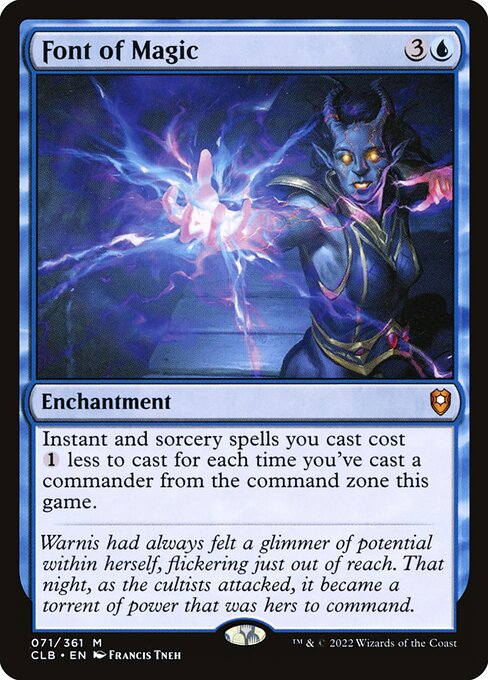
Magic: The Gathering thrives on elegant interactions, but some plays come with a mountain of mental bookkeeping. Fonts of Magic, from Commander Legends: Battle for Baldur's Gate, embodies a brilliant paradox: a card that reduces the cost of the very spells that stretch your memory and focus. This blue enchantment for {3}{U} may feel straightforward at first glance, but its true power rests in how it reshapes your decision space as the game unfolds. The mechanic—“Instant and sorcery spells you cast cost {1} less to cast for each time you've cast a commander from the command zone this game”—turns every cast into a memory puzzle, a test of how you manage tax, tempo, and the shifting value of each spell in your hand. 🧙♂️🔥💎
In a multi-player Commander game, the command zone becomes a dynamic ledger. Each time you launch a commander to the battlefield and then send it back to the command zone, Font of Magic starts shaving mana off other spells. The cognitive load isn’t just about counting discounts; it’s about tracking how many times you’ve whisked a commander into play, how that tally interacts with your hand of threats and answers, and how you time a big finish that would otherwise be prohibitive. Font of Magic invites you to reimagine your spell catalog as a sliding scale of value rather than a fixed price tag. The result is a delightful mental challenge that can be as thrilling as a top-deck moment. 🎲
Practical strategies to tame the load
- Create a reliable accounting rhythm. Use a simple token or die to keep count of commander casts in a game. A quick visual cue helps you know whether a 6-mana plays becomes a 5- or 4-mana spell, which is essential when you’re juggling multiple threats and answers. Font of Magic rewards discipline just as much as it rewards imagination. 🧭
- Build around scalable costs. With Font of Magic on the battlefield, you can plan for big spells that would normally burst your mana curve. For instance, a 7- or 8-mana sorcery could drop dramatically after a couple of commander casts, turning a dream finish into a achievable reality. This is where the card’s design shines: it makes blue ramp and spell-heavy lines suddenly more approachable mid-game, elevating your late-game options without double-clicking your brain for every minute detail. 🔥
- Pair with tutoring and draw cycles you trust. In blue, you’re often balancing card advantage, permission, and tempo. Font of Magic nudges you to sequence your draws so you can leverage the discount on: counterspells, wheel effects, or big wheel-ups that refuel your hand while you stay on-curve. The key is to pace your plays so the discount never becomes a trap of overextension. 🎨
- Use external aids in non-critical moments. In casual play, a quick note on your command count or a shared memory aid among players can reduce miscounts. The discount is powerful, but misreading it can waste precious turns. A small, agreed-upon convention keeps cognitive load manageable and the game flowing. ⚔️
Font of Magic isn’t just a clever math puzzle; it’s an invitation to reframe how you think about cost and tempo in blue. The card’s rarity—mythic in a set that teases big, character-rich themes—also signals its role as a potential game-changer that rewards patient planning as much as flashy bursts. The flavor text and the artwork by Francis Tneh—conveying a character awakening to power amid danger—ground the card in a narrative of discovery that mirrors the cognitive journey players undertake when managing complex spell costs. The design aligns with CLB’s “draft innovation” spirit, offering a fresh lens on how interactions between players can tilt a game’s balance toward memory, mastery, and momentum. 🧙♂️🎨
From a gameplay-design perspective, Font of Magic serves as a gentle reminder that complexity can be inclusive when the rules provide a clear, trackable path. You’re not simply asking the game to resolve more math; you’re inviting your brain to choreograph a sequence of plays where each decision influences the next with a visible, predictable rhythm. The permanent nature of Font of Magic ensures the discount remains a steady drumbeat, pushing you toward bigger plays only when you’re ready to handle the tempo. This balance—between flexibility and cognitive hygiene—is what makes cost-reduction mechanics so compelling in Commander blue. 💎⚡
“Warnis had always felt a glimmer of potential within herself, flickering just out of reach. That night, as the cultists attacked, it became a torrent of power that was hers to command.”
The flavor text nails the sense of awakening that Font of Magic embodies: a gradual accumulation of power that suddenly surges when the conditions are right. In the lab bench of deck design, Font of Magic becomes a catalyst for creative, memory-conscious builds. It’s not merely about lowering numbers; it’s about shaping a storytelling arc where your spells become overtures in an ebb-and-flow of strategy, bluff, and control. The card’s elegant simplicity—an enchantment that pays dividends when you’ve learned to read your own board state—makes it a favorite for players who appreciate both craft and calculation. 🧙♂️🔥
Appearance, design, and the collector's angle
Font of Magic’s mythic rarity, blue coloration, and its placement in Commander Legends: Battle for Baldur's Gate reflect a design that rewards long-form play and signature moments. The art and flavor text pair with a reliable, repeatable effect that scales with your own gameplay tempo, rather than relying on one-shot disruption. For collectors, the card’s foil variants and pricing—while modest in absolute terms—signal a strong ceiling in EDH/Commander circles, where the card’s utility persists across countless game states. The edge between “cool idea” and “must-have staple” is where Font of Magic often lands for players who enjoy synergy-heavy, commander-focused media and gameplay. 🎲
As you consider how Font of Magic can ride shotgun with your next blue-heavy build, think about the physical space where you game. A well-organized play area, complemented by a clean desk setup, helps cognitive load stay manageable even when you’re stacking counterspells and big-ticket sorceries. If you’re shopping for gear that keeps your focus sharp and your setup stylish, you might like a Custom Neon Desk Mouse Pad 9.3x7-8 in—bright, practical, and designed to help you keep track of your spells as you navigate the shifting discounts Font of Magic offers. Custom Neon Desk Mouse Pad 9.3x7-8 in can be a playful, tactile touchpoint during marathon sessions. 🧙♂️💡
Custom Neon Desk Mouse Pad 9.3x7-8 inMore from our network
- https://blog.digital-vault.xyz/blog/post/nearby-solar-analogs-and-a-distant-scorpius-blue-giant/
- https://blog.digital-vault.xyz/blog/post/kamahl-pit-fighter-visualizing-set-level-rarity-balance/
- https://blog.digital-vault.xyz/blog/post/boost-conversions-with-social-proof-on-your-sales-pages/
- https://blog.digital-vault.xyz/blog/post/sirocco-winds-digital-card-prices-vs-physical-market-realities/
- https://crypto-acolytes.xyz/blog/post/steam-deck-game-deals-worth-buying-top-picks/